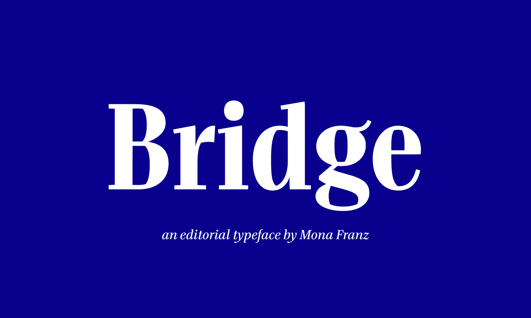
Bridge
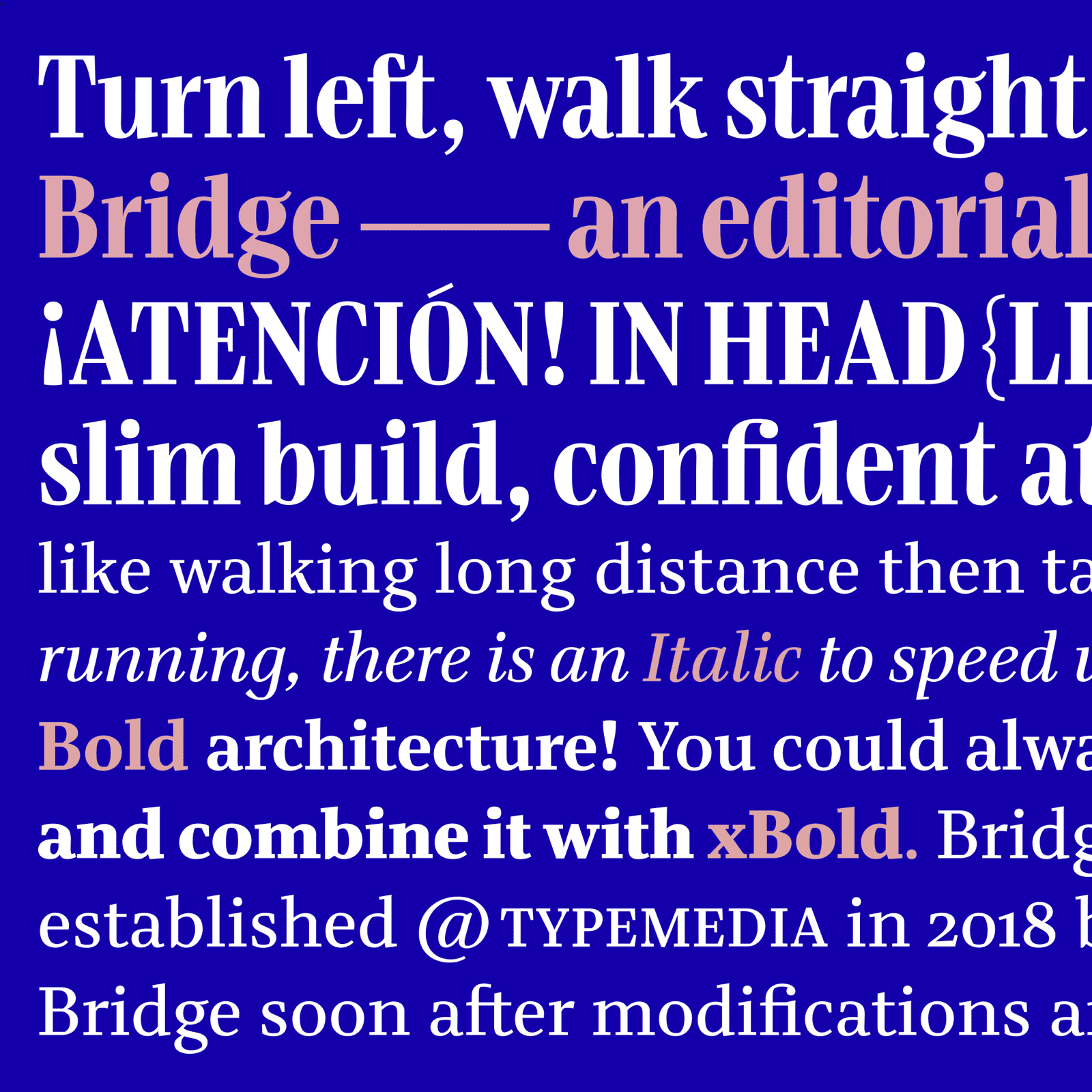
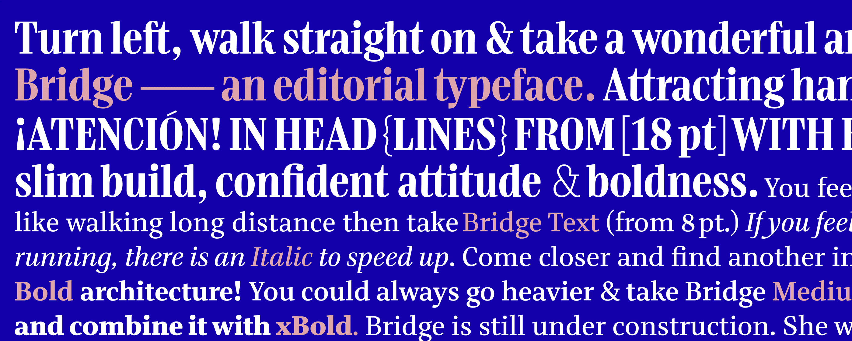
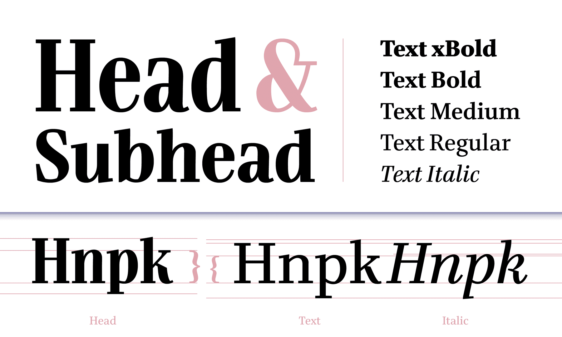
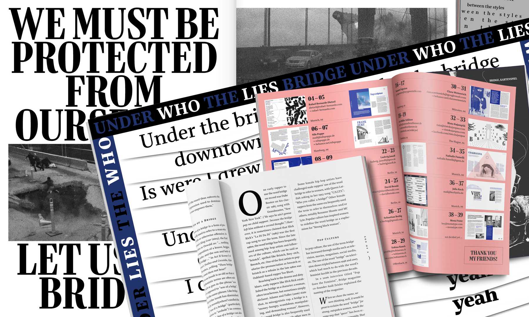
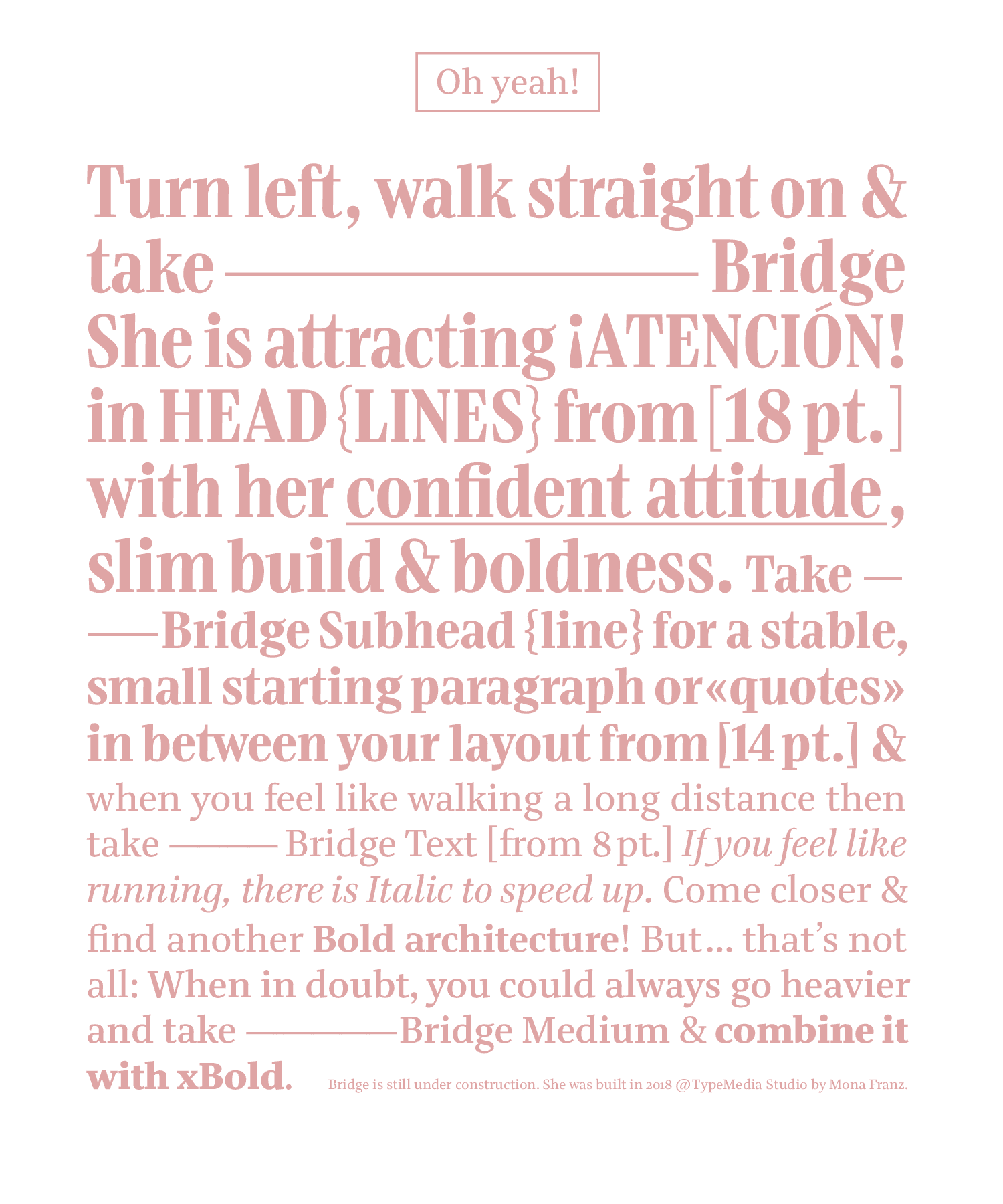
A confident and visionary editorial typeface builds the bridge between a static headline and a perceptibly dynamic text version. An expressive geometric countershape and high contrast attract attention in large sizes from 18 pt, while the text typeface turns into an asymmetric, more driving counter shape for reading sizes. Slightly narrower proportions and reduced contrast achieve high levels of legibility and efficient use of space. Bridge is all you need to tell stories and build functional typographic hierarchies for a traditional magazine layout. With experiments on a variable width axis, the text version helps to create a better line adjustment. Bridge is currently under construction: The family will be extended and updated to get released at my favorite foundry, TypeMates.
Mona Franz
GermanyAfter graduating from TypeMedia, Mona Franz moved back to her chosen home in Munich. She is currently living and working on the other side of the bridge to connect everything she loves: Working on type projects and talking about it with nice people. Having a beer with her previous colleagues from the Lufthansa Rebranding. Jumping into the Isar or climbing a mountain to see the bigger picture.
Layout by Ludwig Janoff
Process Notes
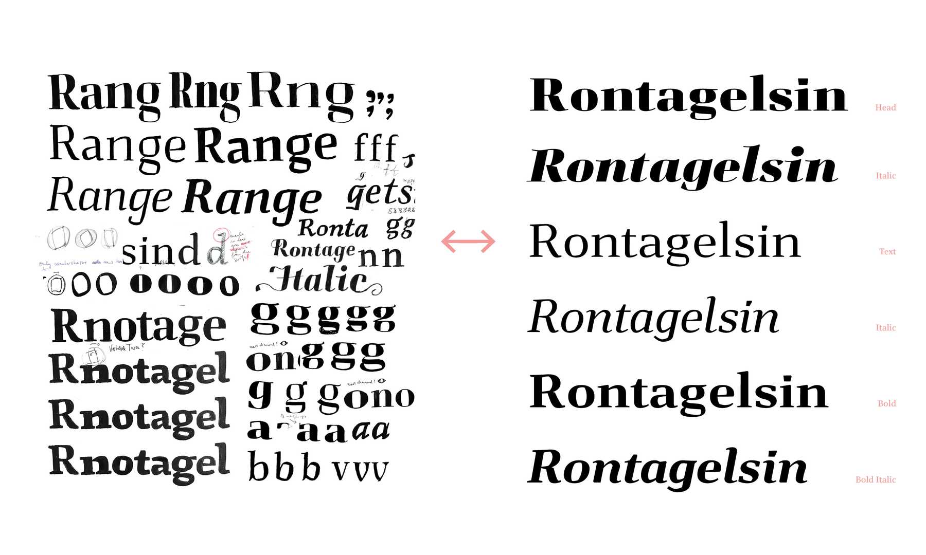
From sketch to screen from screen to sketch Thanks to Petr I have internalized that sketching is a process to test ideas and at the same time be able to scrap them anytime. Obviously, I am not into drawing on paper for hours. Nevertheless, I like to try out different forms with quick sketches. Instead of redoing the sketching, I am jumping from paper to the screen and then back to drawing a few letters by hand again as long as it it helps my process.
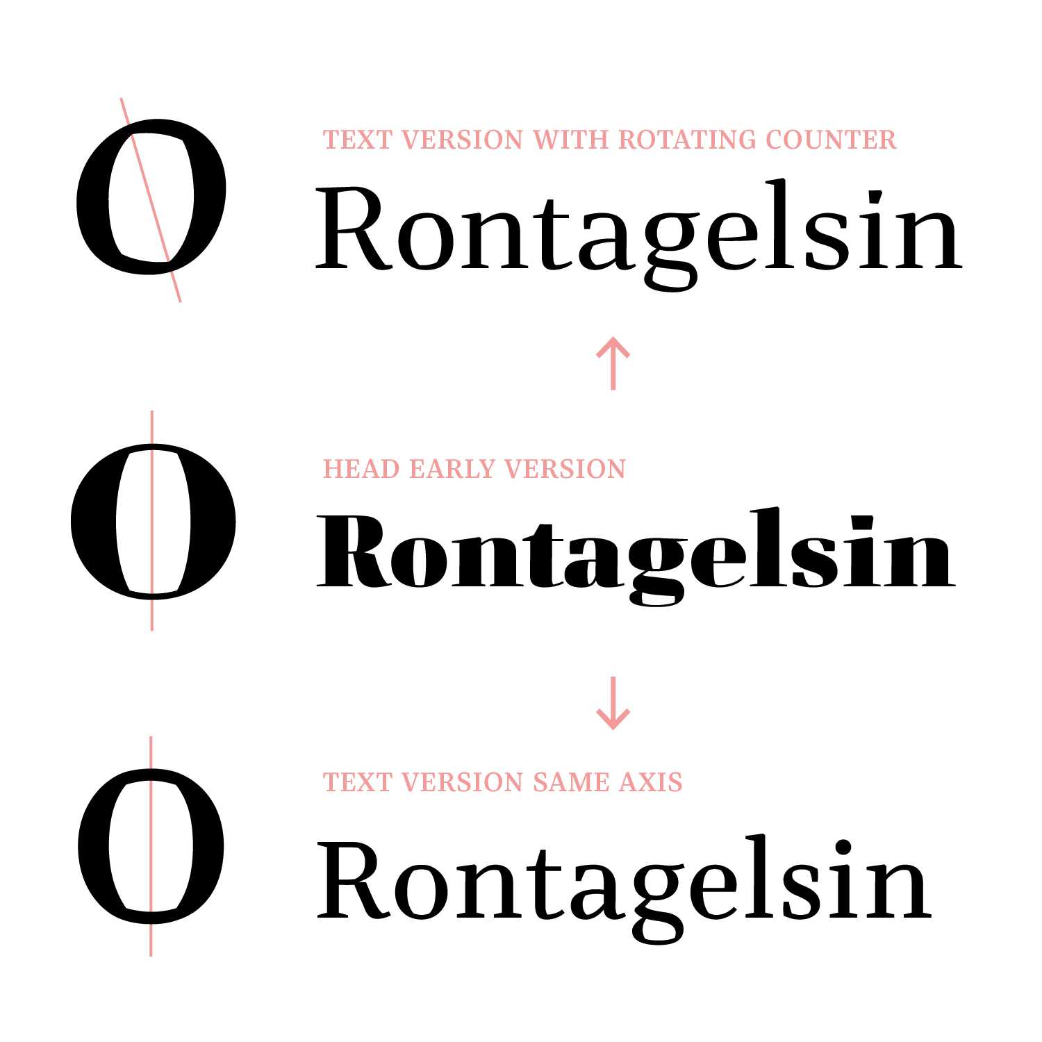
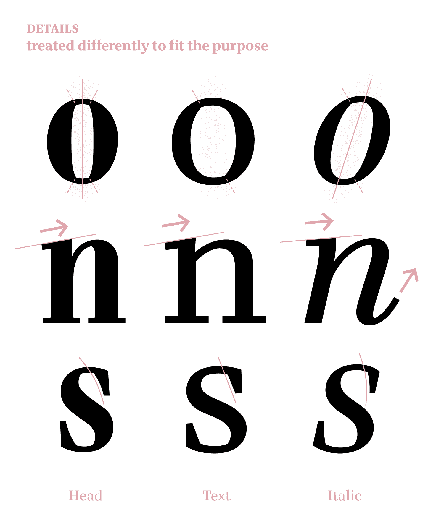
Rotation from static to dynamic Turning from a static, geometric counter shape of the Head version to a dynamic Text version with twisting the inner counter of the letters to the left, was my first idea. This kind of movement made by a variable font has generated an attraction. In the end, I decided against unconvincing in-betweens near the end of the sliders and focused on what is important for editorial use.
«Counter-Strike» After I have decided against a rotating counter and I went a while with a text version that was just an optical adoption to the Head. It was Paul, especially, who questioned my counters and noted I shouldn’t stick too much to my bridge shape. This remark helped me a lot in regard to decisions on how I should treat the styles and letter shapes to fit their purpose: to attract attention in large sizes and expressive geometric counter shapes, while for longer reading less sharp and more driving counter shapes are pleasant in text sizes.
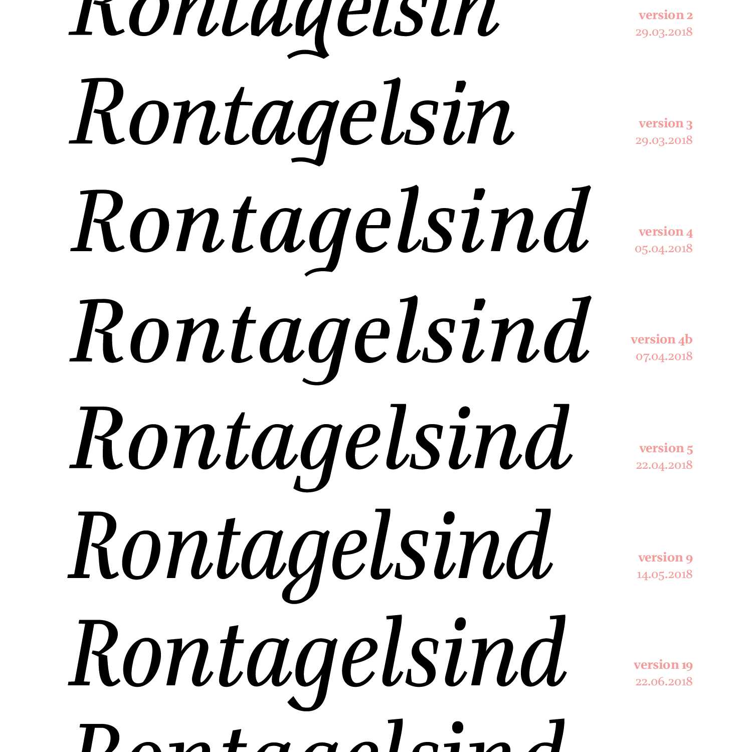
She is running… It took a while until my Italic companion was going in the right direction. My challenge here was to find a good match to the roman text in grayness and x-height. Moreover, I had to find a pleasant mixture to distinguish in slant, width, contrast, or alternative shapes. The development of the italic «g» will probably end with the upcoming release at Type Mates in September😉
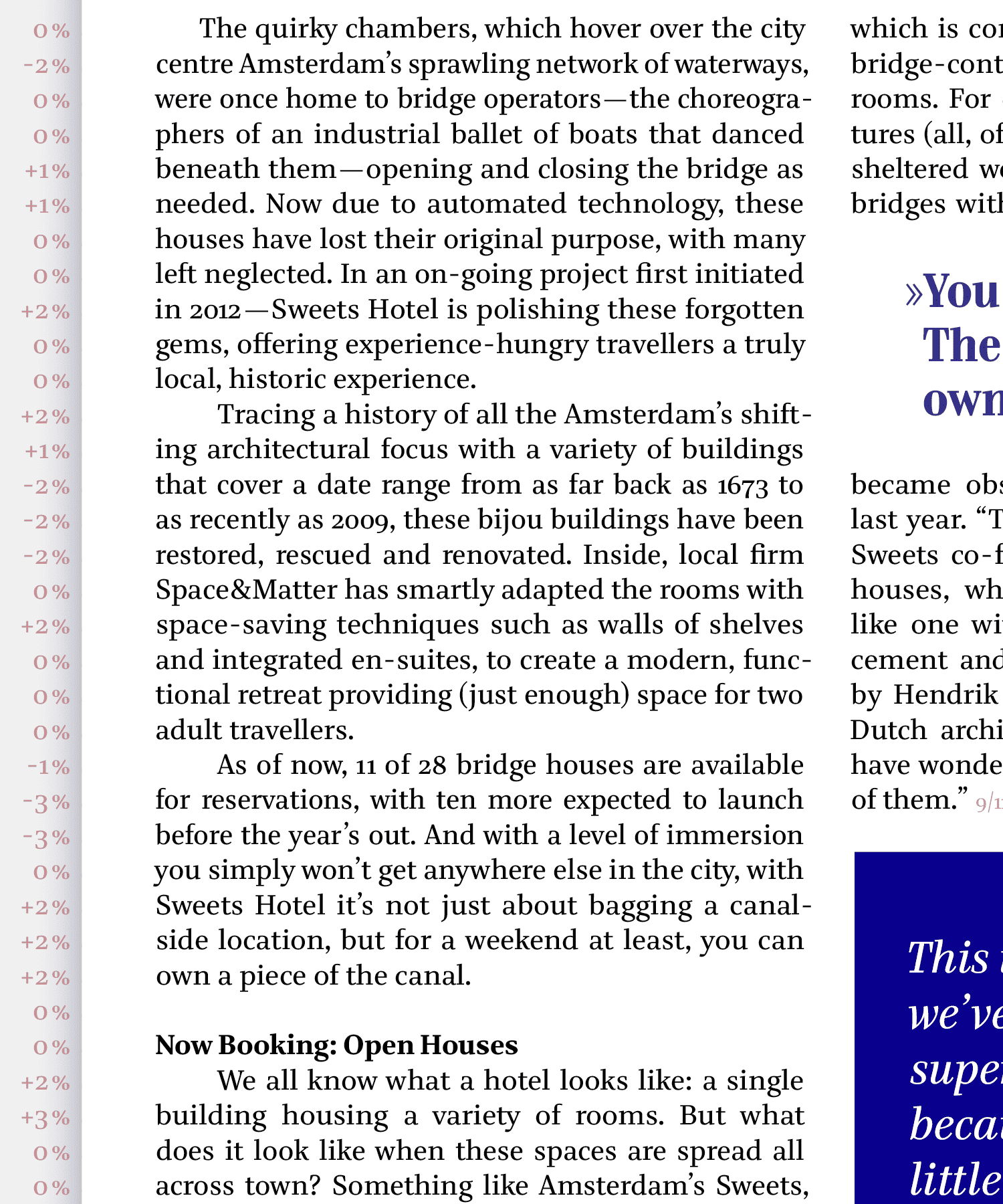
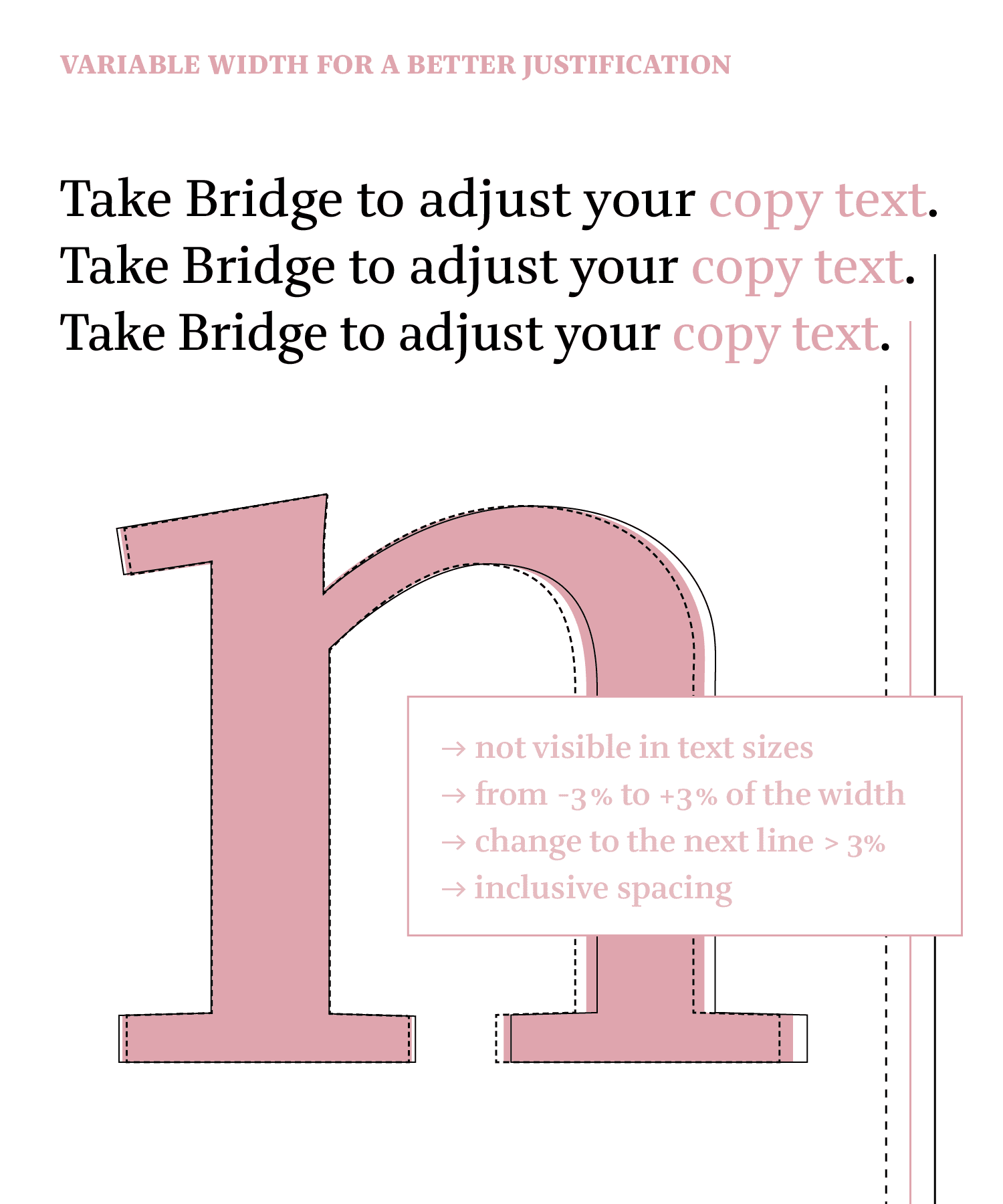
Variable & visionary The visionary aspect of my editorial type family concept was the idea to create a variable width for nicer text justification. Inspired by a speech by Bram Stein at the Robothon conference in 2018 who showed a tool for digital use, I wanted to test this idea for printing as well. Minimal width variations of less than 3% difference to the following line achieved a better grayscale and improved hyphenations without distracting the reader.
»I’d like to thank the Academy!« A gigantic thank you to Paul van der Laan, Peter Verheul, Erik van Blokland for taking me to my Bridge and supervising this project. Thank you for the additional feedback by all my TypeMedia teachers and type designers I met during this year. Cheers to my beautiful classmates of TypeMedia2018 and Marja! Thänksi to all my type testers, lovely friends and family. Not to forget Studio Meeer for the 3D visualizations! Thänksi to Fabian for programming a website where you can test Bridge.