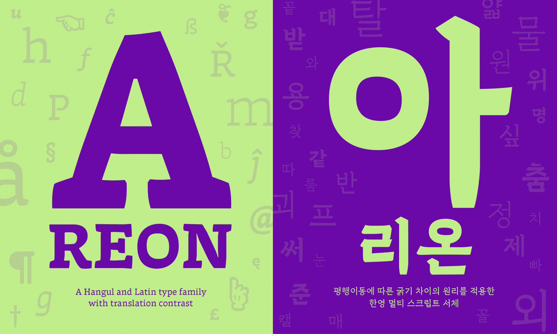
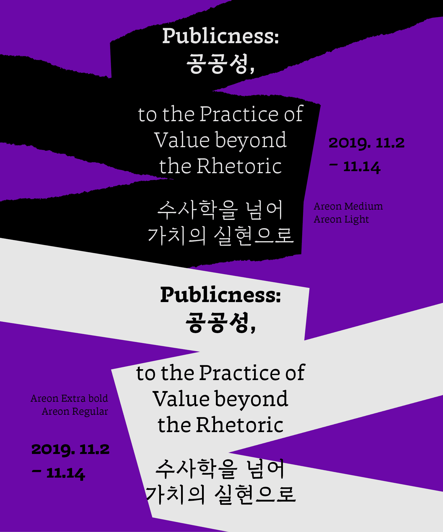
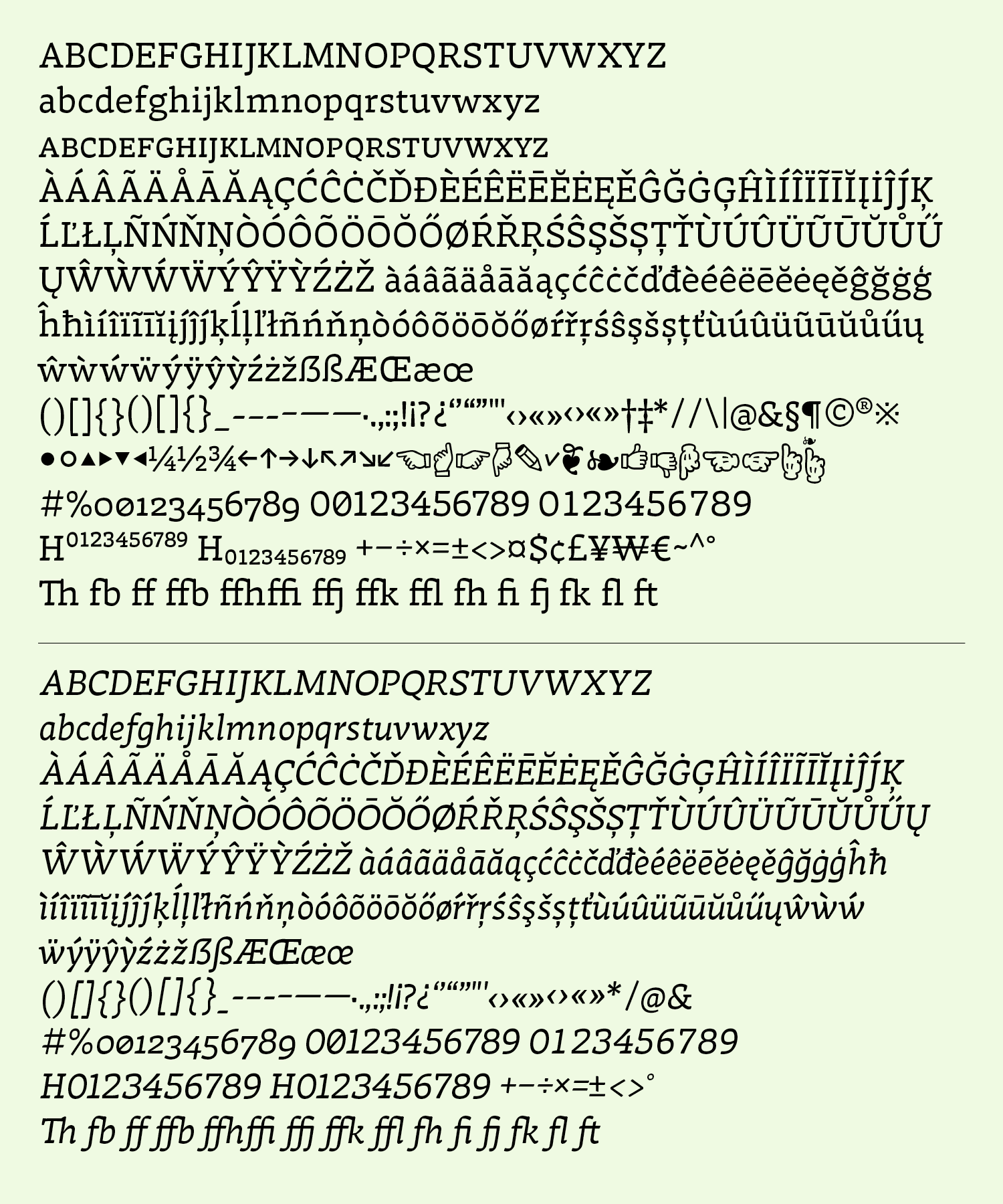
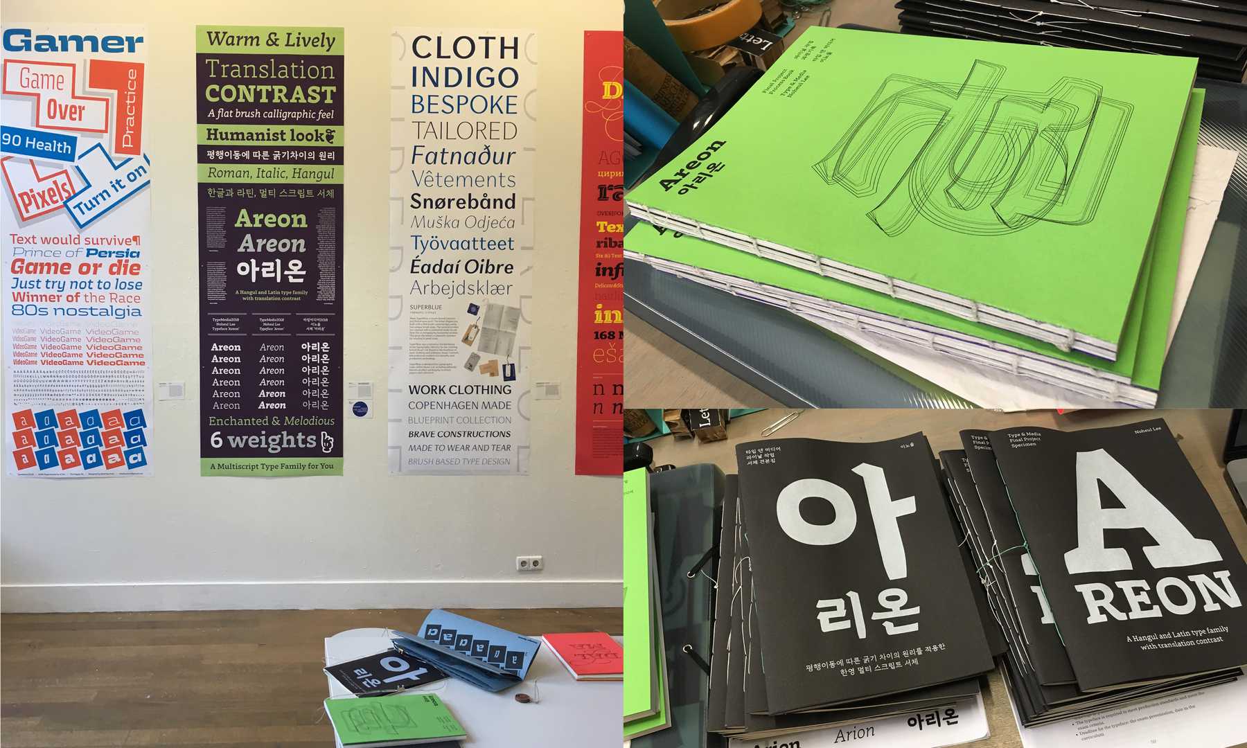
Areon
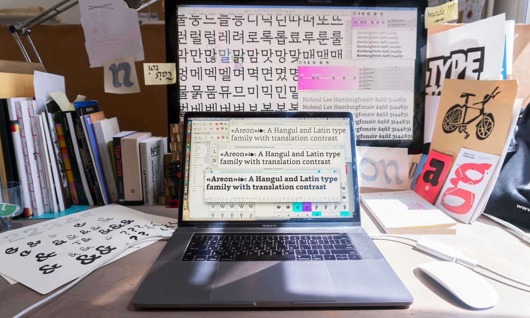
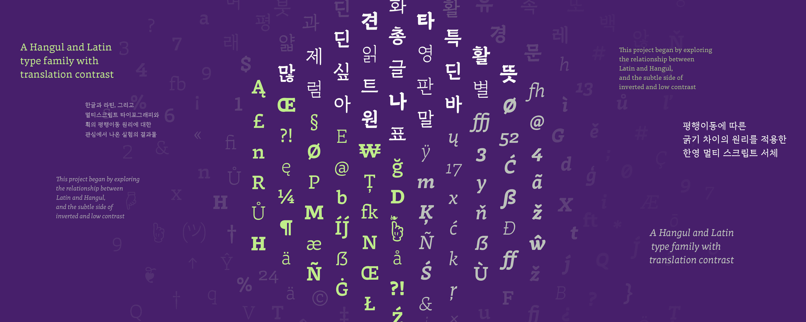
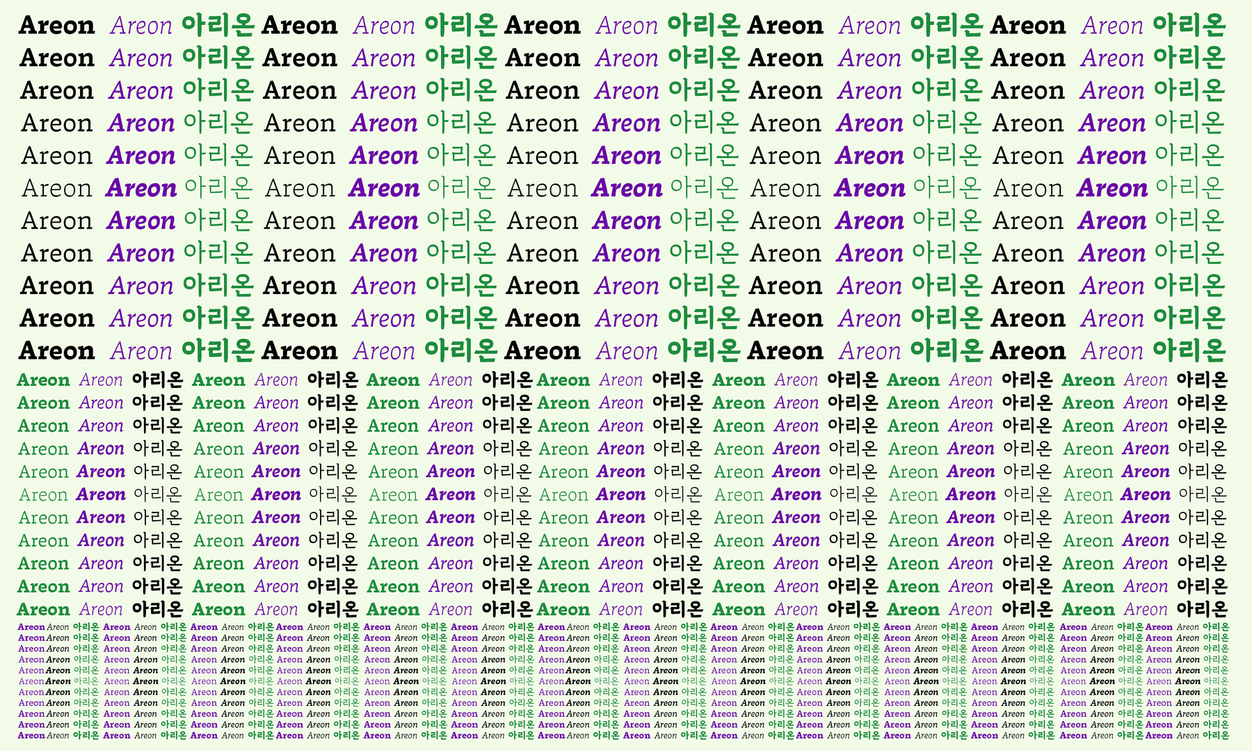
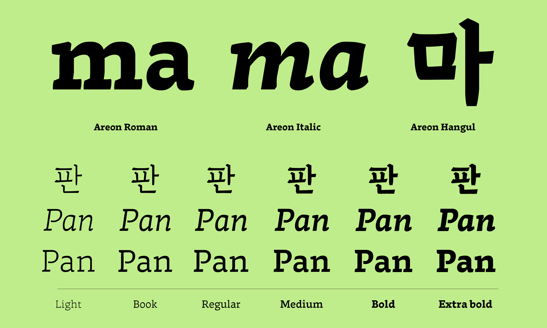
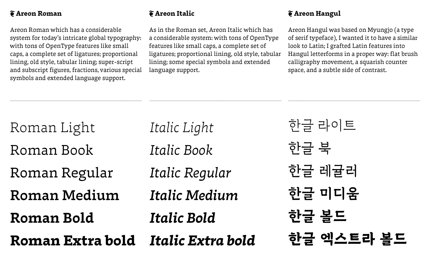
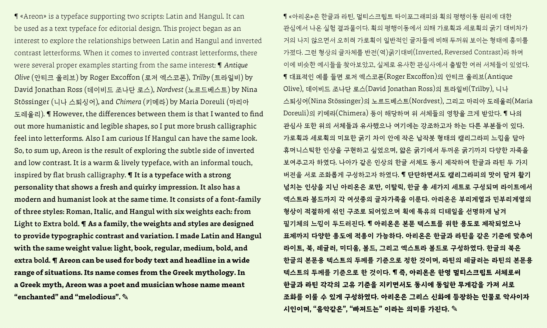
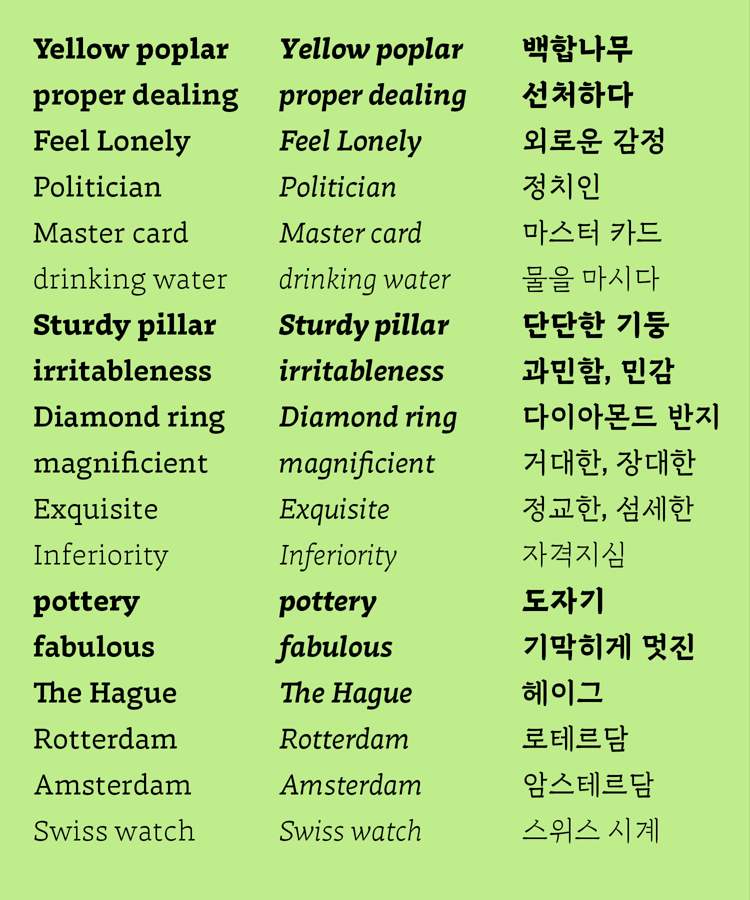
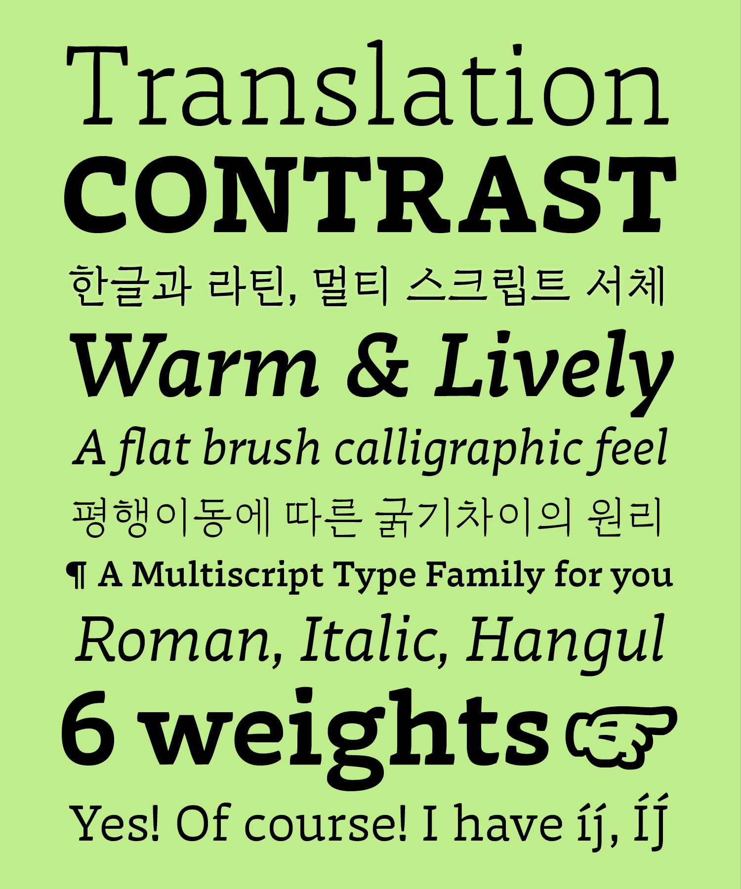
Areon is a typeface supporting two scripts: Latin and Hangul. It can be used as a text typeface for editorial design. This project began by exploring the relationship between Latin and Hangul, and the subtle side of inverted and low contrast. It is a warm and lively typeface, with an informal touch, inspired by flat brush calligraphy. It is a typeface with a strong personality that shows a quirky and humanist look. It consists of three styles: Roman, Italic, and Hangul with six weights for each: from Light to Extra bold. Areon can be used for body text and headlines in a wide range of situations. Its name comes from the Greek mythology. In a Greek myth, Areon was a poet and musician whose name meant “enchanted” and “melodious”.
Noheul Lee
South KoreaNoheul Lee obtained a bachelor in visual communication design from Sangmyung University, Korea. She pursued a Master in visual communication design from Kookmin University, Korea. Passionate for typography, she flew to the Netherlands in 2017 to study type design. Noheul graduated from the Type and Media program at the Royal Academy of the Arts, in The Hague, in 2018. Currently she is working as a multi-script type & graphic designer. Starting in 2020, she will be a partner at lo-ol type foundry, a studio based in Switzerland.
Process Notes
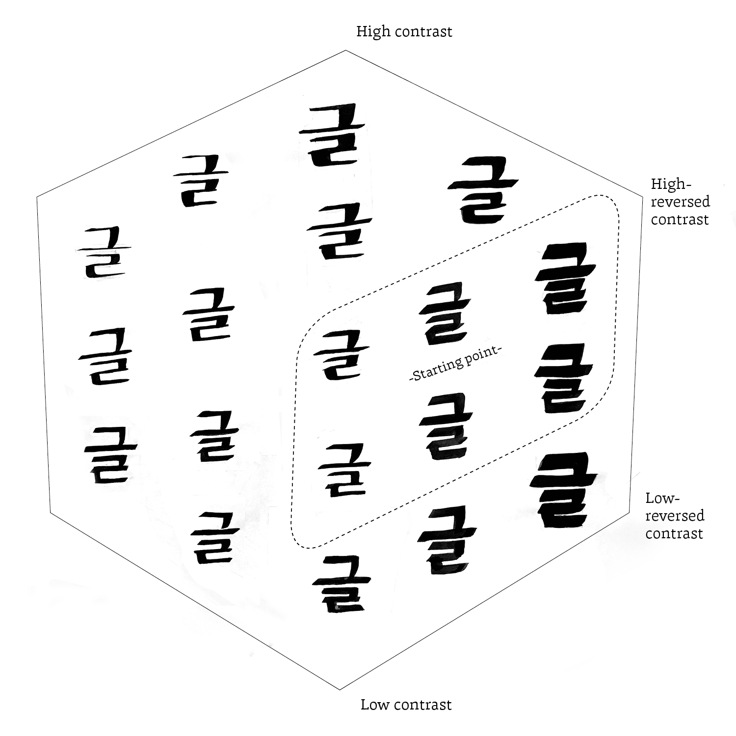
Areon has started as an interest in the Gerrit Noordzij stroke cube. The two axes are respectively called translation and expansion, named according to the type of contrast each tools make. Translation relates to broad nib pencils while expansion is based on the contrast created by flexible and sharp nib pen. A lot of type designers know that the cube is an essential model for understanding the basic structure of writing and contrast. I began to wonder how would this theory could be applied to the Korean script. As an experiment, I tried to make a Hangul version of the stroke cube with a flat brush. This sketch is a variation of the existing cube that I have reinterpreted for Hangul. I was most intrigued by the forms of the reversed contrast letters, and there started a deeper interest.
Since the beginning, I have had a huge interest in the relationship between Latin and Hangul. Added to that, inverted contrast letterforms also triggered my attention. Of course, reversed contrast is not a common feature in Latin type. However, this is an even bigger challenge in terms of Hangul script. Originally, there is no reversed contrast Korean typeface in either display or text. I wanted to obtain a different result from conventional style of Korean typefaces. Honestly, I have wanted to design a reversed-contrast typeface for body text in Latin for a long time.
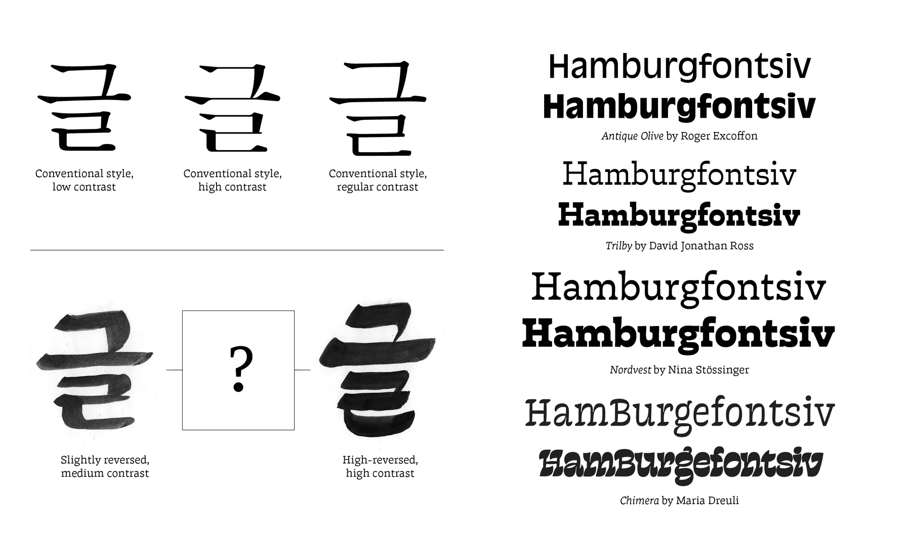
I picked two letterforms from my version of the stroke cube. The left image has a small amount of reversed contrast, that looks actually quite neutral. On the other hand, the image on the right has reversed high contrast version of Hangul, which dramatically deforms the angle in the most common style of Hangul. I wanted to look for a specific form between these two letters: not too conventional, not too extraordinary.
When it comes to reversed contrast letterforms, there were several remarkable examples. And of course, there are many good examples but the ones I have mainly looked for are somewhat less exaggerated and can be used for body text. Among them, Trilby and Nordvest have a more neutral look, which was a great inspiration to think about better letterforms in the process.
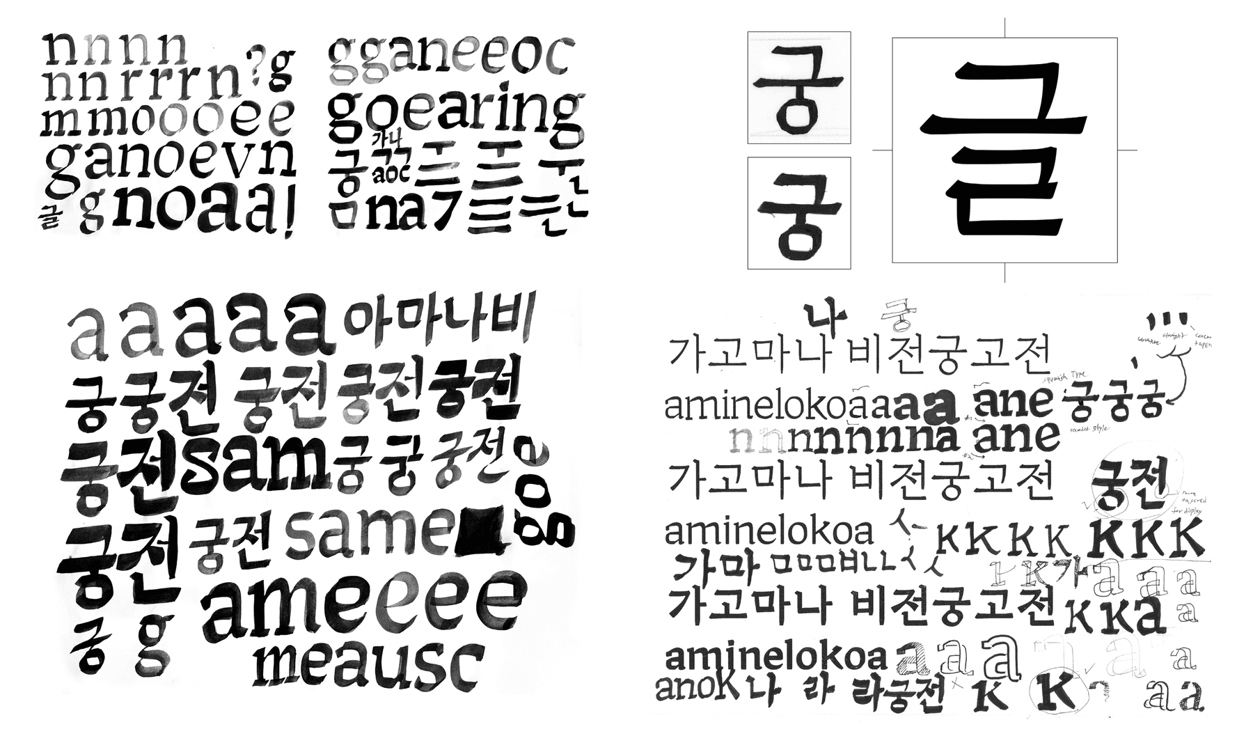
I have extended the practice of brush calligraphy that I did at the beginning of the semester and was experimenting with various forms to match the concept. However, I wanted to try a little differently from the original brush calligraphy. I was aiming for a bit more squarish with a subtle smoothness to it. I was drawing Hangul as well. I remember that the initial stage of the project for sketching experiment was the most interesting.
On the basis of those sketches, I started to draw sample sketches for Hangul. After a few attempts, luckily, I was able to get a proper sample of Hangul. Although this was still at a very early stage and it required much more experimentation. I wanted to make sure that I have a clear concept for Hangul before expanding the Latin exploration.
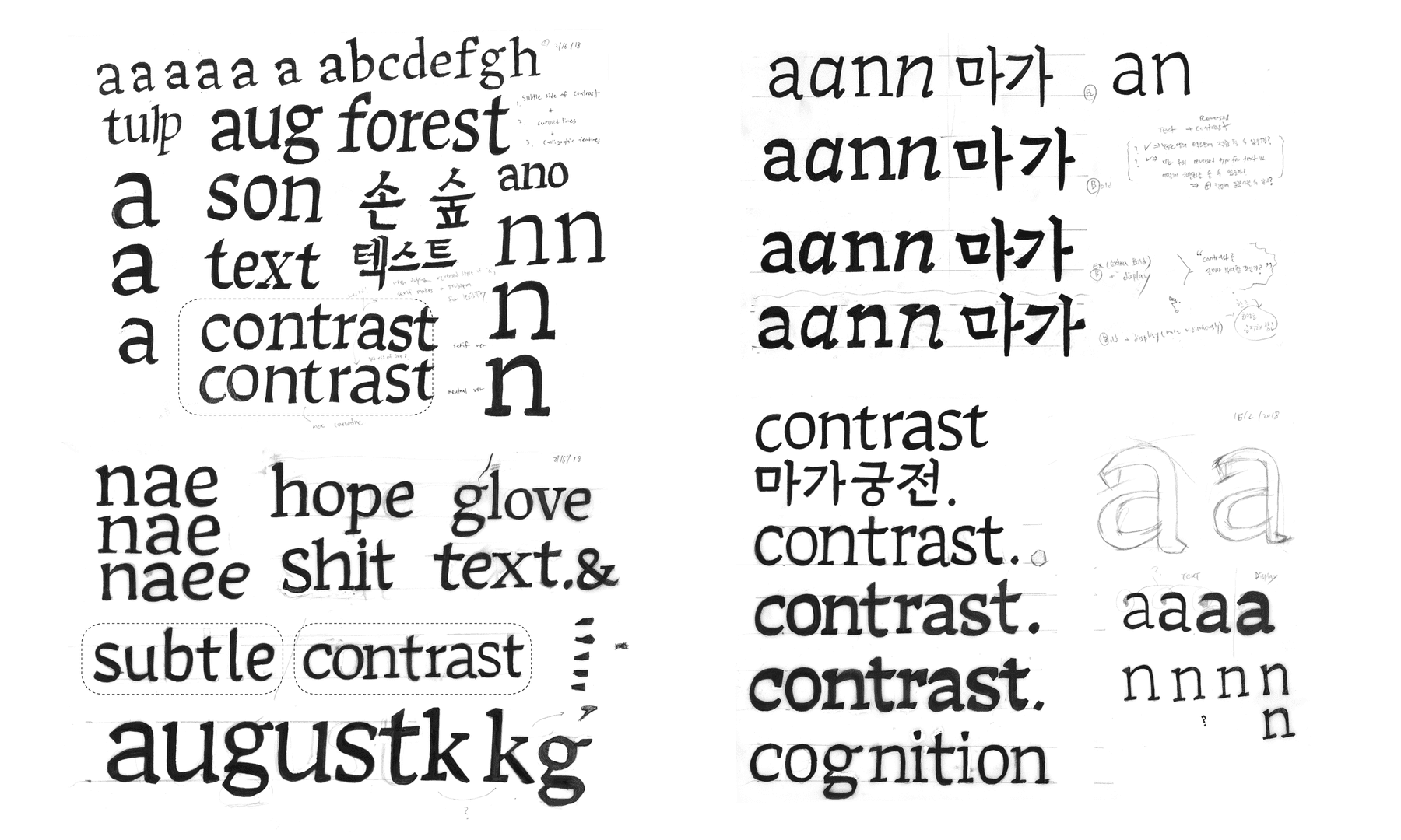
To explore a subtle side of reversed contrast, I have tried to draw some with and without serifs. I kept considering the amount of contrast to find out a proper texture for a text typeface.
I have also drawn small size versions to figure out how it looks. I came to realise that all looked weird in spite of the same basis. This can be explained by the fact that there was no consideration for spacing.
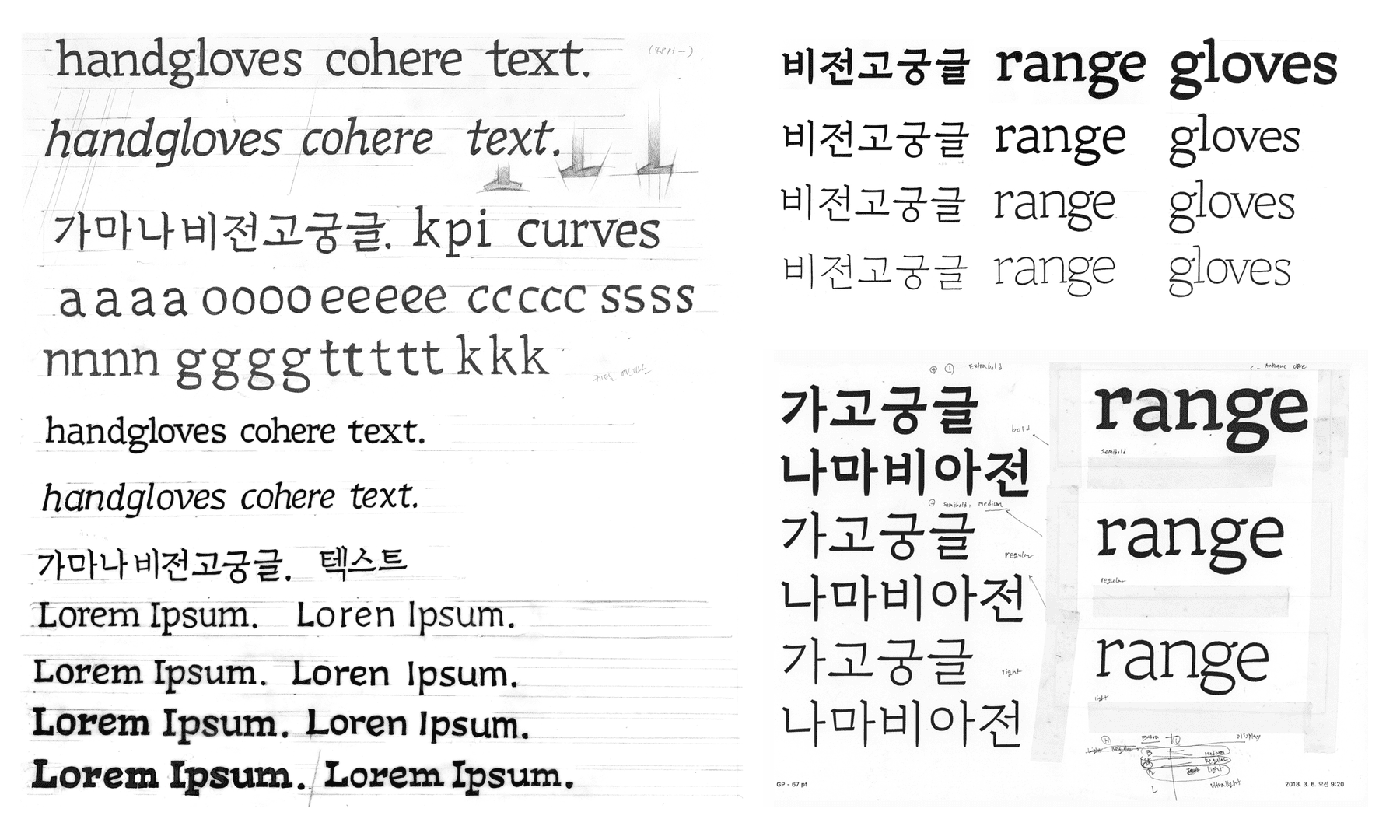
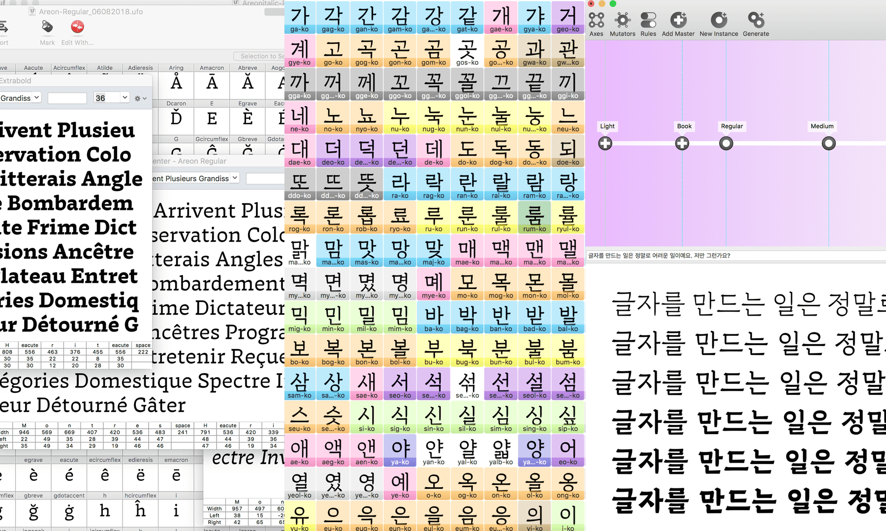
After doing several sketches, I have found that I needed to digitise some basic shapes. I have started using Glyphs and Robofont to make Hangul and Latin seperately. I thought it would be good for me to learn both programs at the same time.
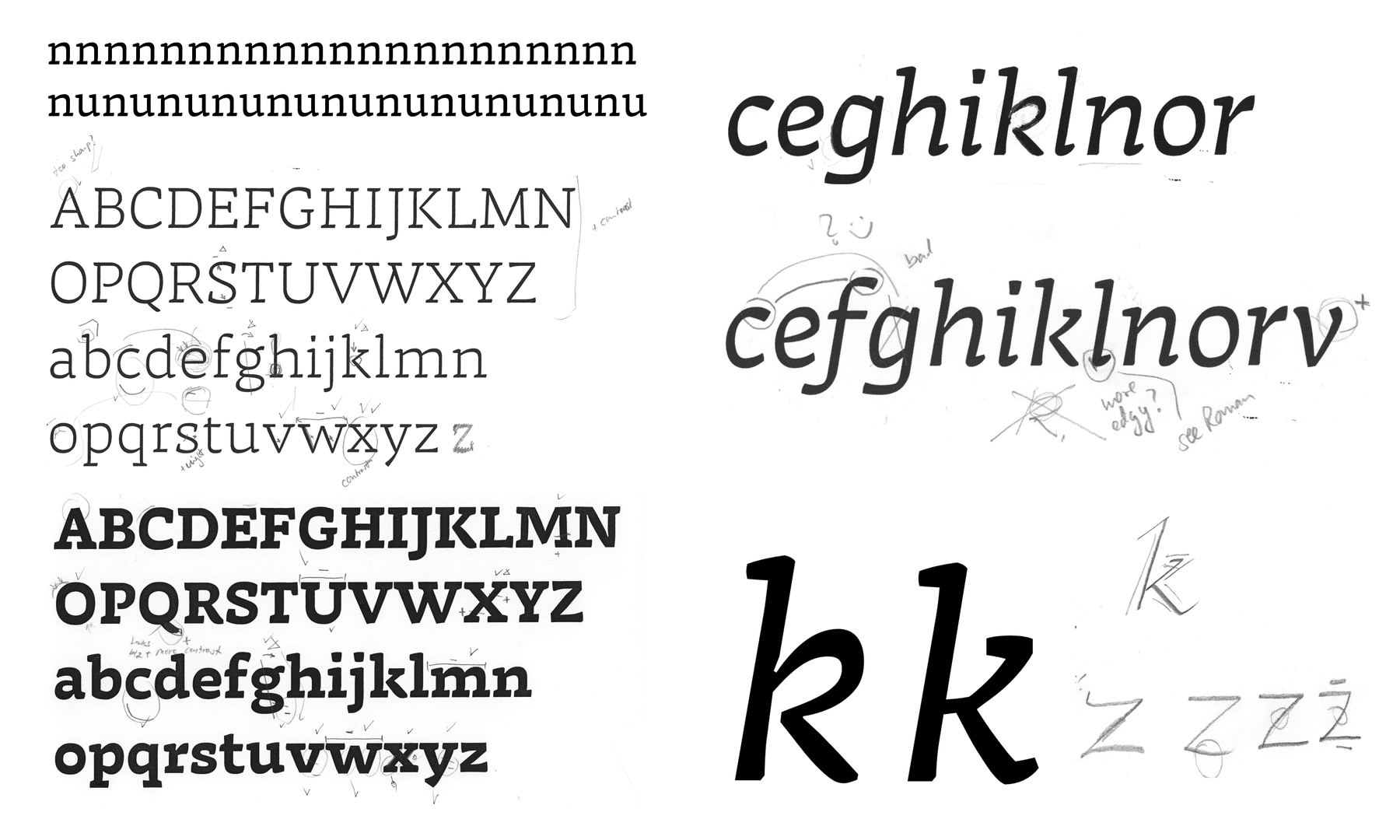
While digitising the Roman, I got lots of advice from teachers and mentors. I remember Erik’s advice about spacing being the most important thing. However, after the conversation with Erik, I have realised that I was overlooking its importance while I was working on it.
Drawing an Italic was considerably more difficult than I expected. So I had to be careful when I adjusted the amount of space for Italic. Not only must it look right on its own but it also needs to fit with the Roman. When it comes to proportion, Italic should be more condensed than the Roman counterpart. In my project, Italic and Roman should have the same density on a page. For this, the Italic should be lighter than the roman. In order to achiever that, I made the stems of my Italic a bit lighter than my Roman (around minus 5-6 units).
When drawing Italic, I have talked about the shape of the k a lot with the teachers. This specific k shape was quite tricky for me. Consequently, I decided not to make a looped bowl and put serif on the top of the diagonal stroke.
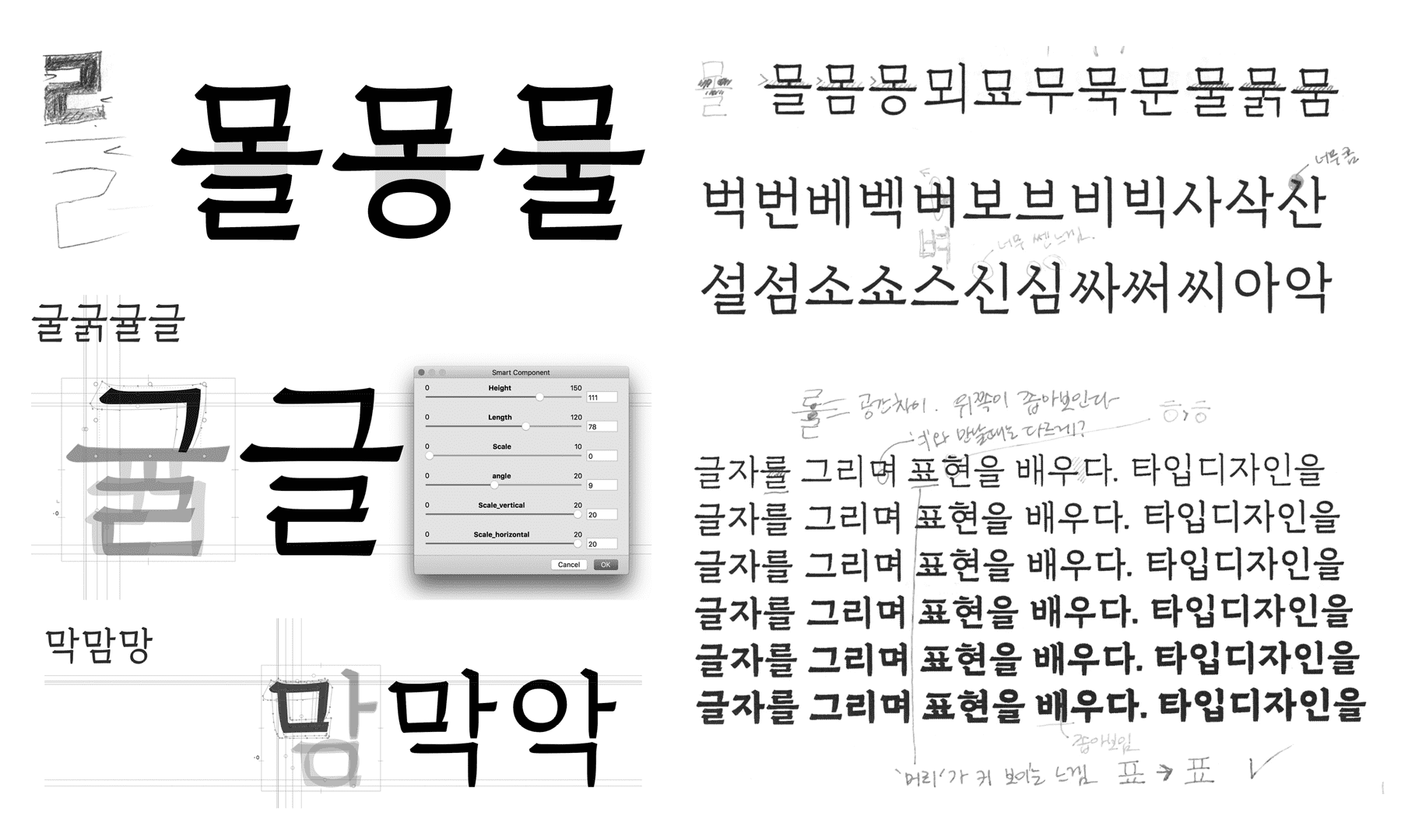
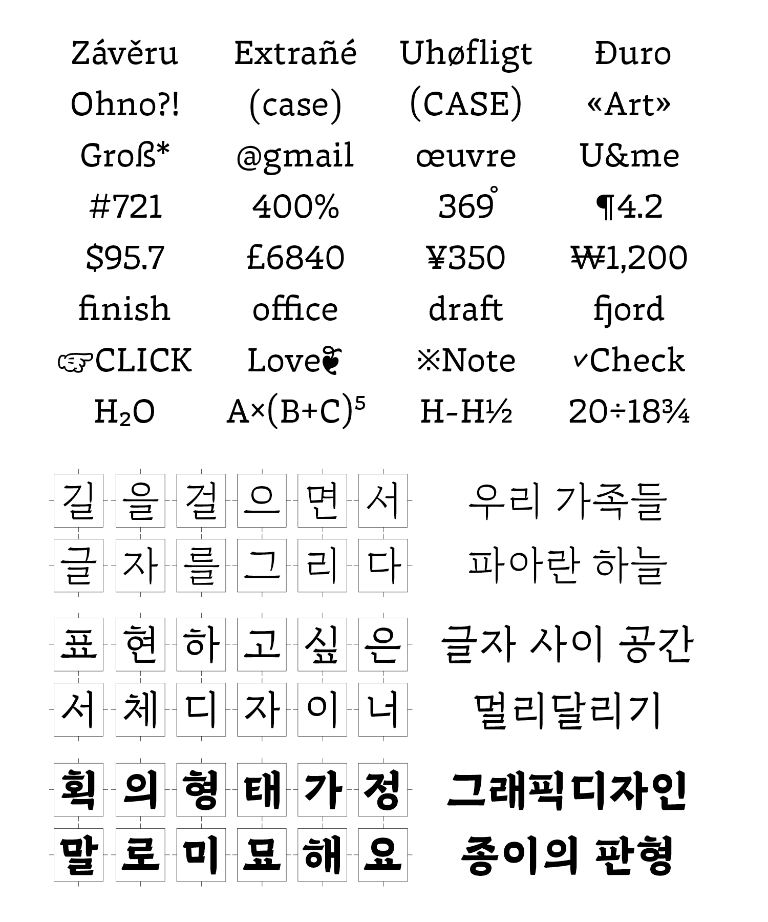
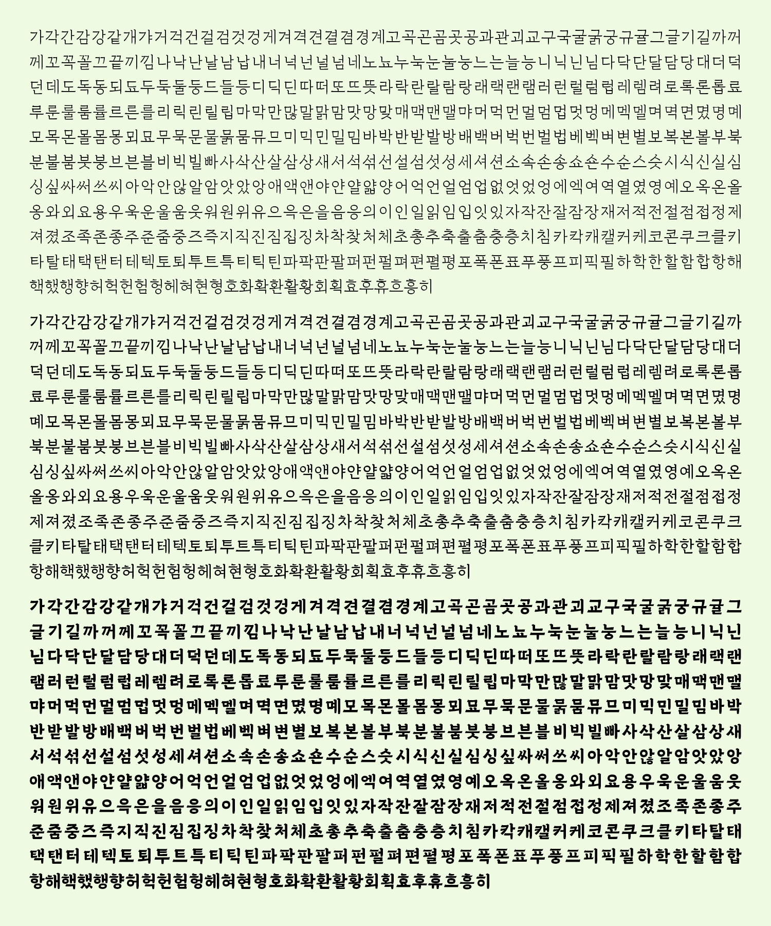
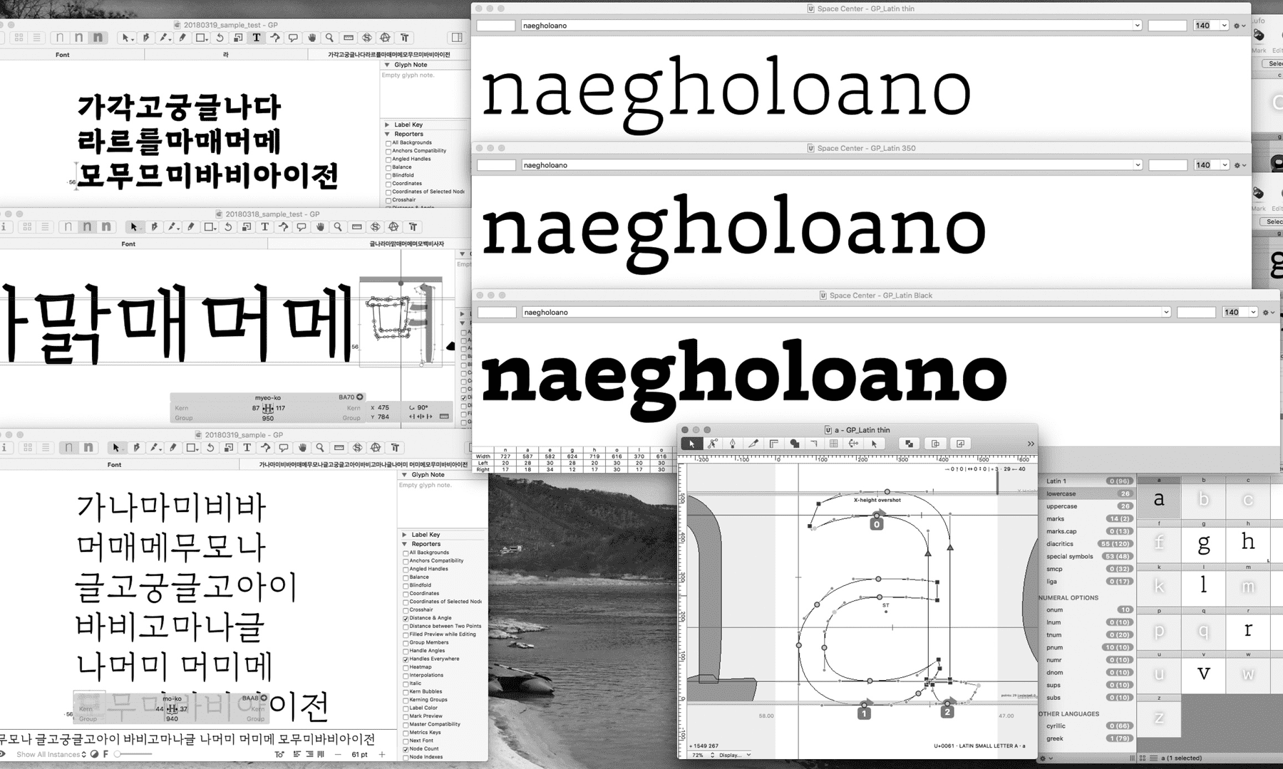
Hangul has a modular system that consists of a combination of consonants and vowels. It makes it possible to apply the same component to similar letters, for example, ‘Geul’ and ‘Gyeul’. To optimize this system, I have used a smart component function which makes it possible to adjust the components easily.
Space distribution in Hangul was a challenge. The black weight was especially complex due to its important amount of horizontal stems. The glyph ‘Reul’ is probably one of the most complex to solve. The thickness of the horizontal strokes and compensation of the vertical one had to be balanced. Generally, designing the heaviest weight in Hangeul is a tricky challenge. In order to fit in the same proportional space than other characters, I needed to reduce the counter space. By doing so I am blackening the whole glyph which might create, if not designed properly, a very dark character.
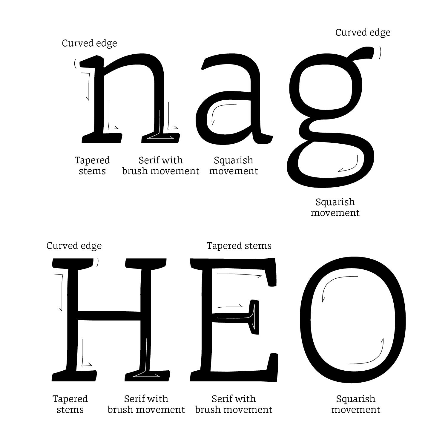
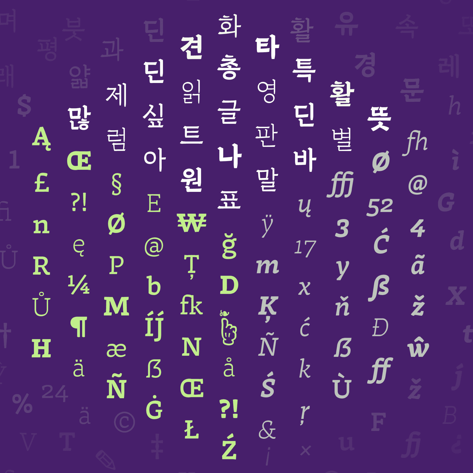
Areon Roman lowercases and uppercases letters show flat brush movement with translation contrast. However, the contrast has been worked in order to not stand out too much. The whole has a subtle balance between squarish and round curves.
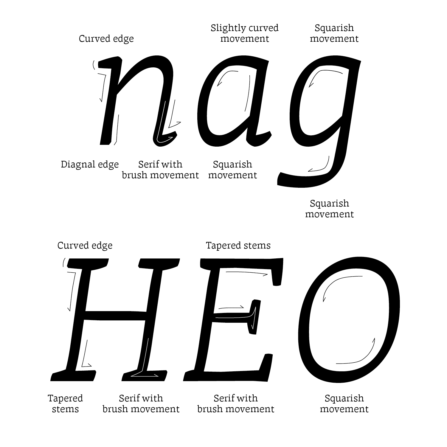
Areon Italic also follows the same concept as Roman. It has a flat brush calligraphic feel, which is dynamic. The rhythm is made of a harmonious combination of straight lines and curves. This allows a smooth reading of long texts.
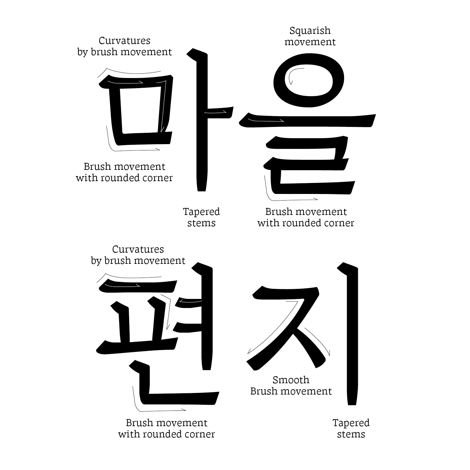
Areon Hangul has a similar look to Latin. I have grafted Latin features into Hangul letterforms in a specific way: flat brush calligraphy movements, squarish counter spaces, and subtle contrast angle. As the number of letters increased, I compared it with Latin and adjusted the details to make both fit together.
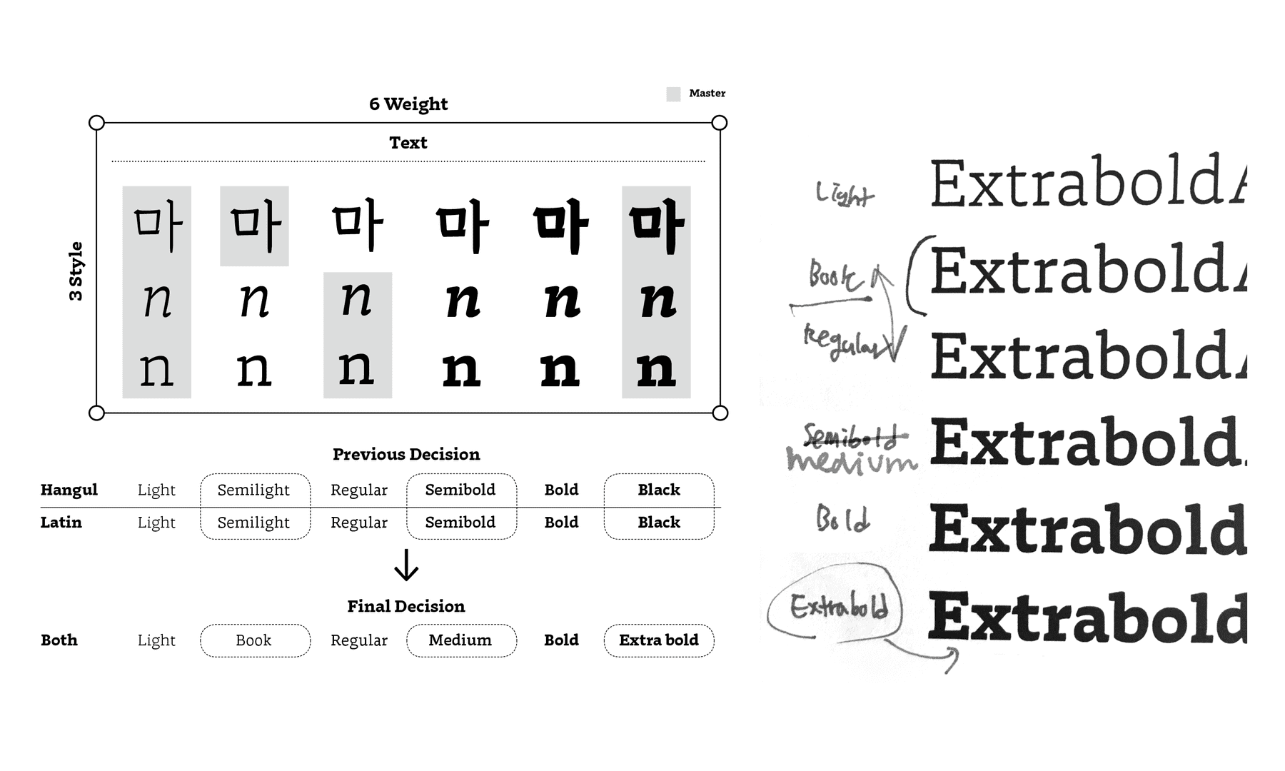
The naming of each weight was probably the most difficult thing during this project. As the correction continued, the letters which should have become black weight gradually became more bold. I was confused whether I should give the different weight value for each script or combine together. During the course of the project I changed the name of weight many times. All teachers had different opinions.
In the end, I decided to stick with having one value, not different ones. One of the main reasons why I determined that is because It would be more convenient for users. If it has one united value, users don’t need to switch the weight for each script. Even though there is a common tendency for naming weight, there is no perfect ratio between weight in two different scripts. Somewhat there were many considerations, and I think that this was the compromise decision. For a better result, I started kerning at the same time. While refining all details, I had to recheck everything.
There were tons of hardships and difficulties while working on this project: how to match Latin and Hangul harmoniously in a different direction than conservative principles; how to adapt the same features into both scripts well; and how to complete Roman, Italic, and Hangul in time. All of these processes were both obstacles and pleasures. There were a lot of mistakes and failures, and there are still many of them. However, these experiences have given me the confidence to embark on new challenges, throw myself outside of my comfort zone, and think through problems in a much more critical manner. This project is not yet finished, which means there is a huge possibility to improve more and more.