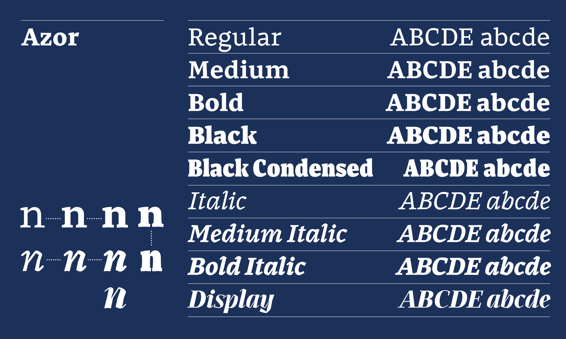
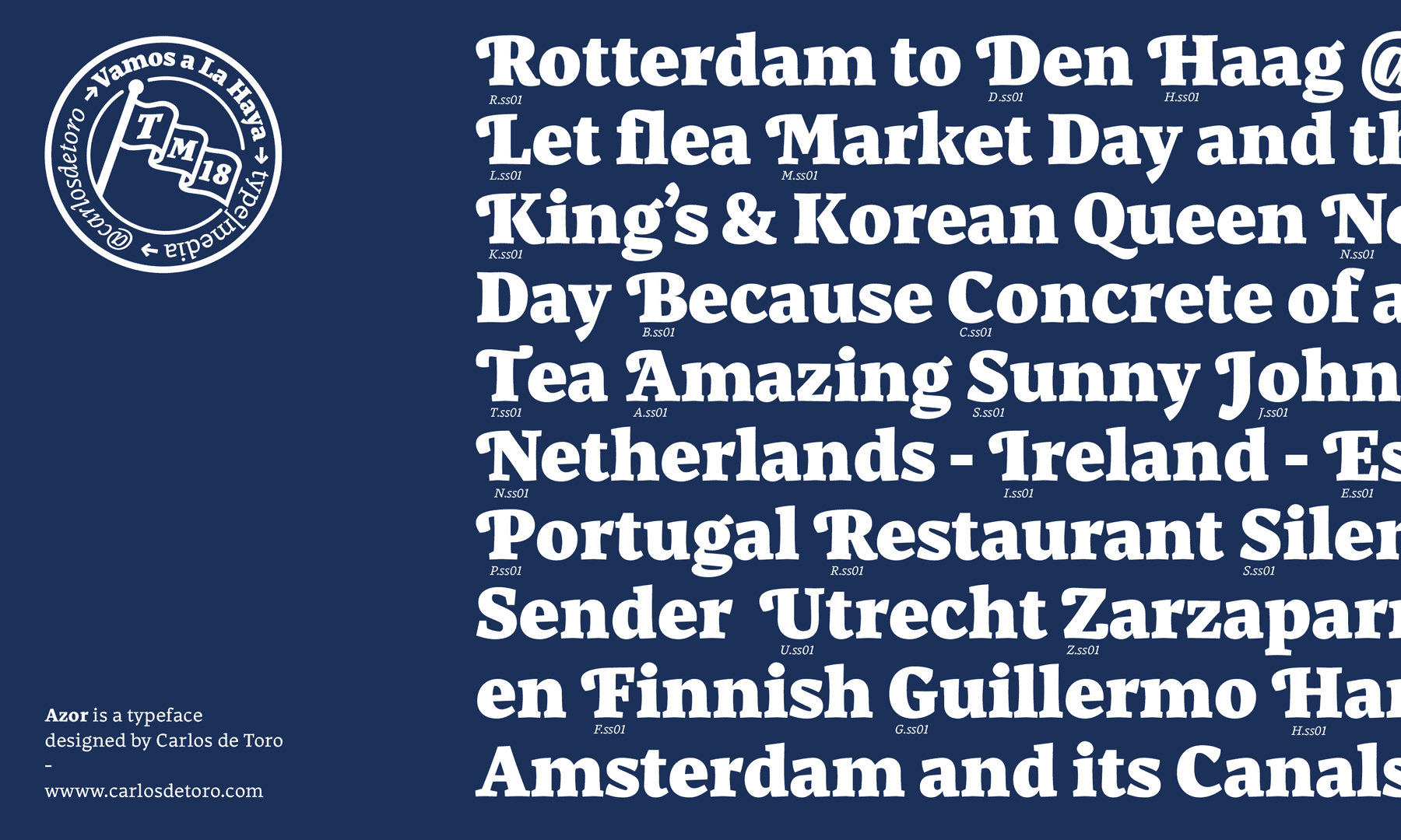
Azor
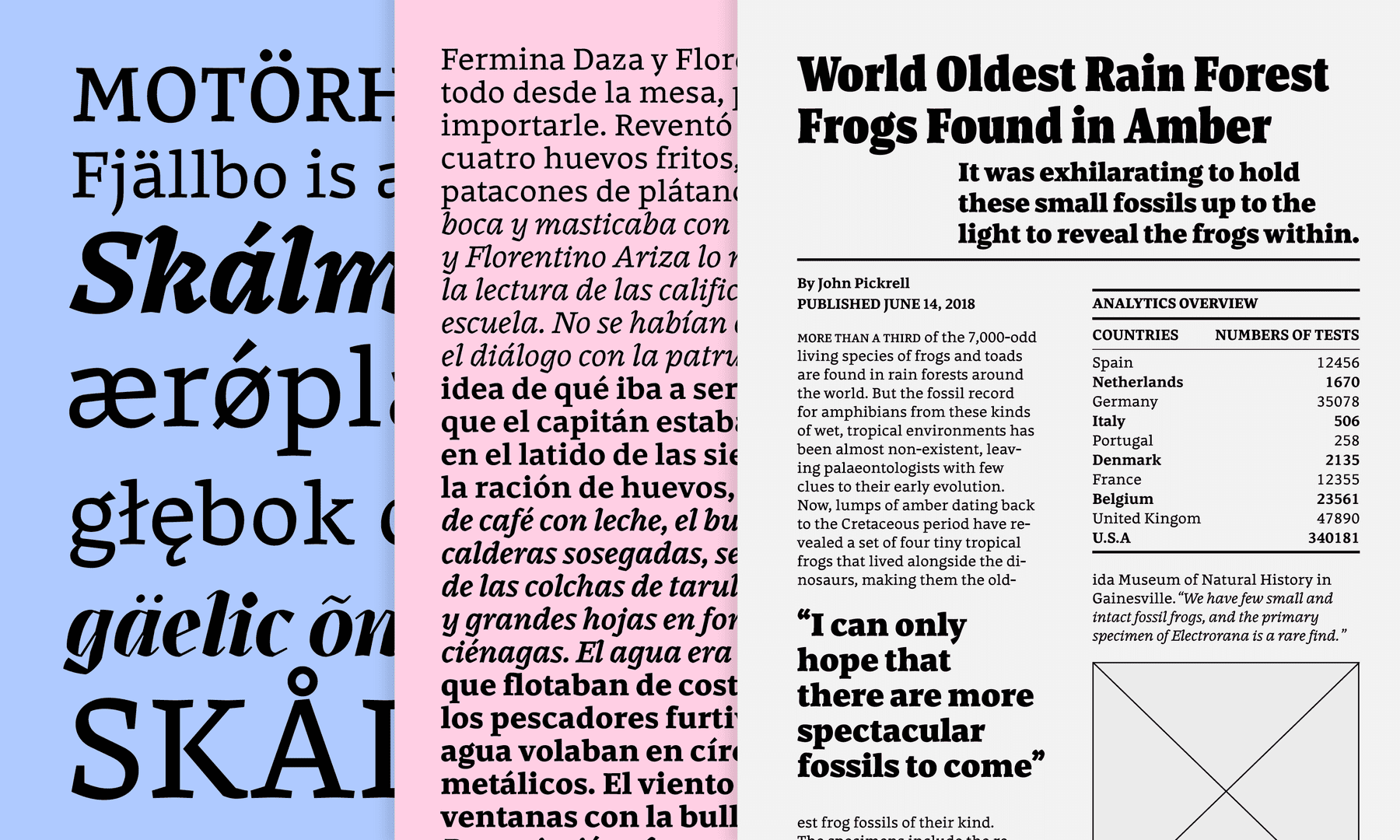
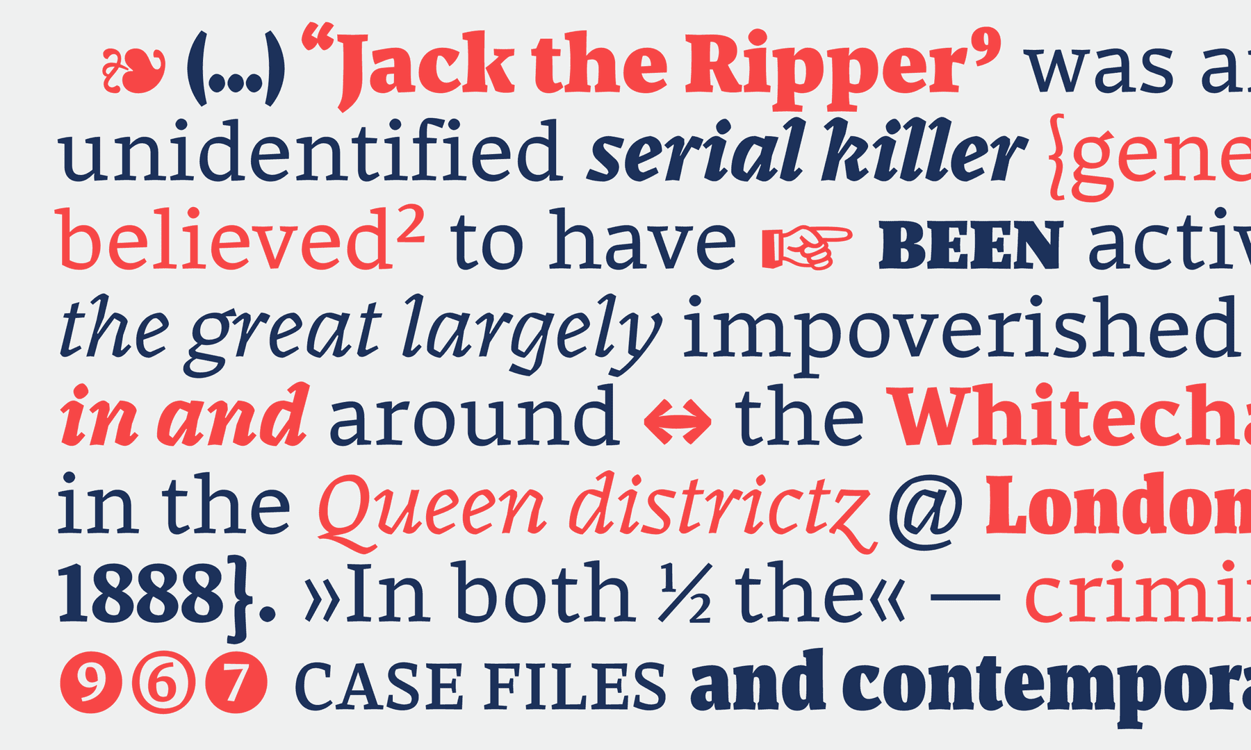
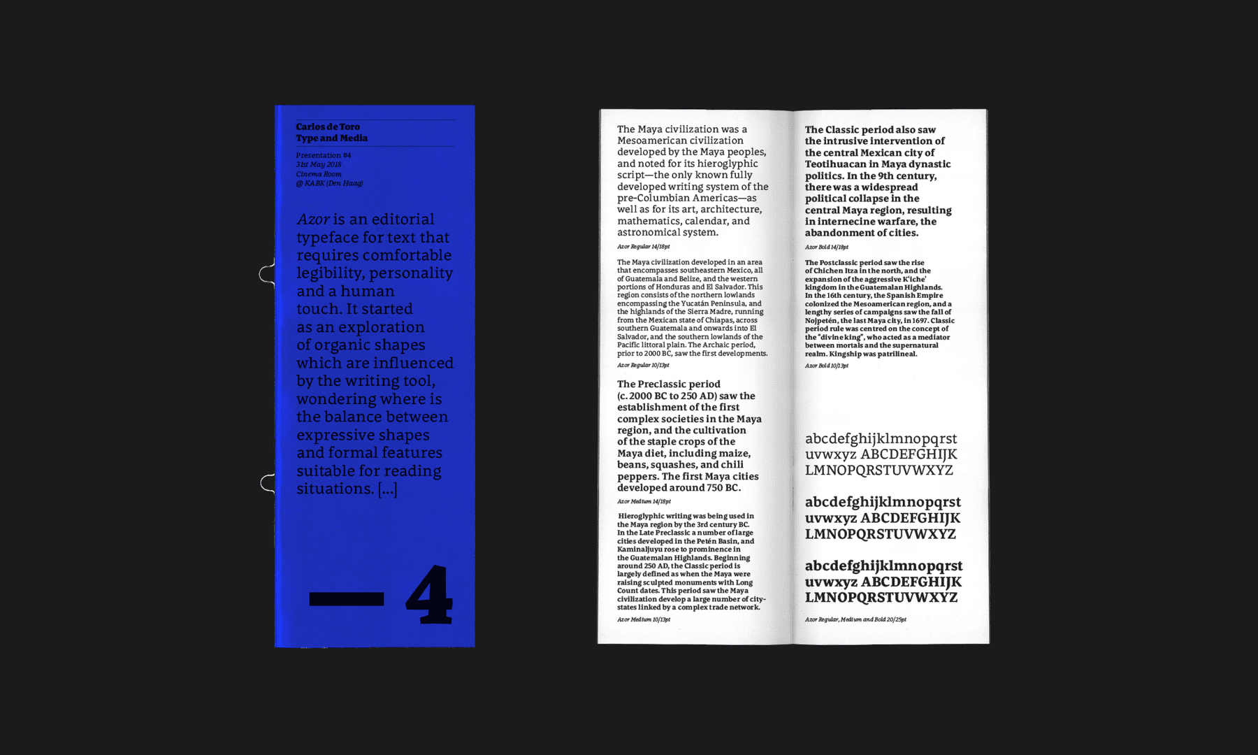
Azor is a typeface for display and text that requires comfortable legibility, personality and a human touch. It started as an exploration of organic shapes which are influenced by the writing tool, searching for the right balance between expressive shapes and formal features suitable for reading situations. ¶ Although text styles are shyer in terms of expression, exciting and playful details emerge in heavier and stouter weights. ¶ Meanwhile, the regular italic is an exploration of legibility and presents sharp shapes and large counters which solve text situations when matching with the roman, but also small-sized paragraphs such as captions. Display reveals shapes to a great extent demonstrating elegant design and radical contrast. These features highlight the differences from other styles. All the styles have a calligraphic influence that retains visual consistency throughout the whole family.
Carlos de Toro
SpainCarlos studied graphic and type design (ESDIR and EINA) within his native Spain. His interest in type emerged whilst employed as an editorial designer for a newspaper. ¶ He has worked for various graphic design studios and agencies in projects related to branding and packaging, and additionally as a freelance type designer. His work has been recognised with a Laus Award. Currently he is a type designer and font developer based in London and is enthusiastically expanding his skills and interest within both the design and technical aspects of letters and communication.
Process Notes
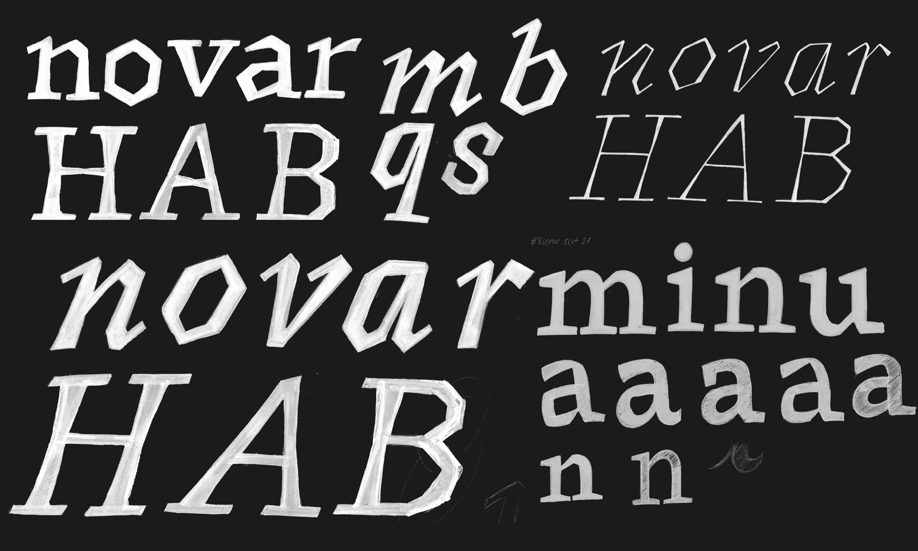
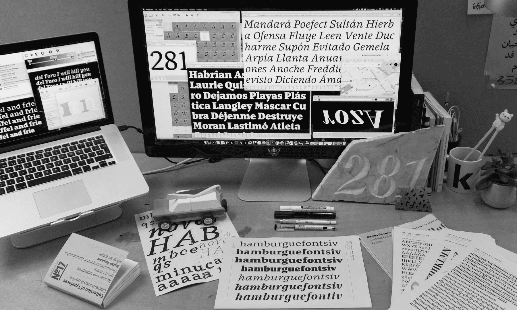
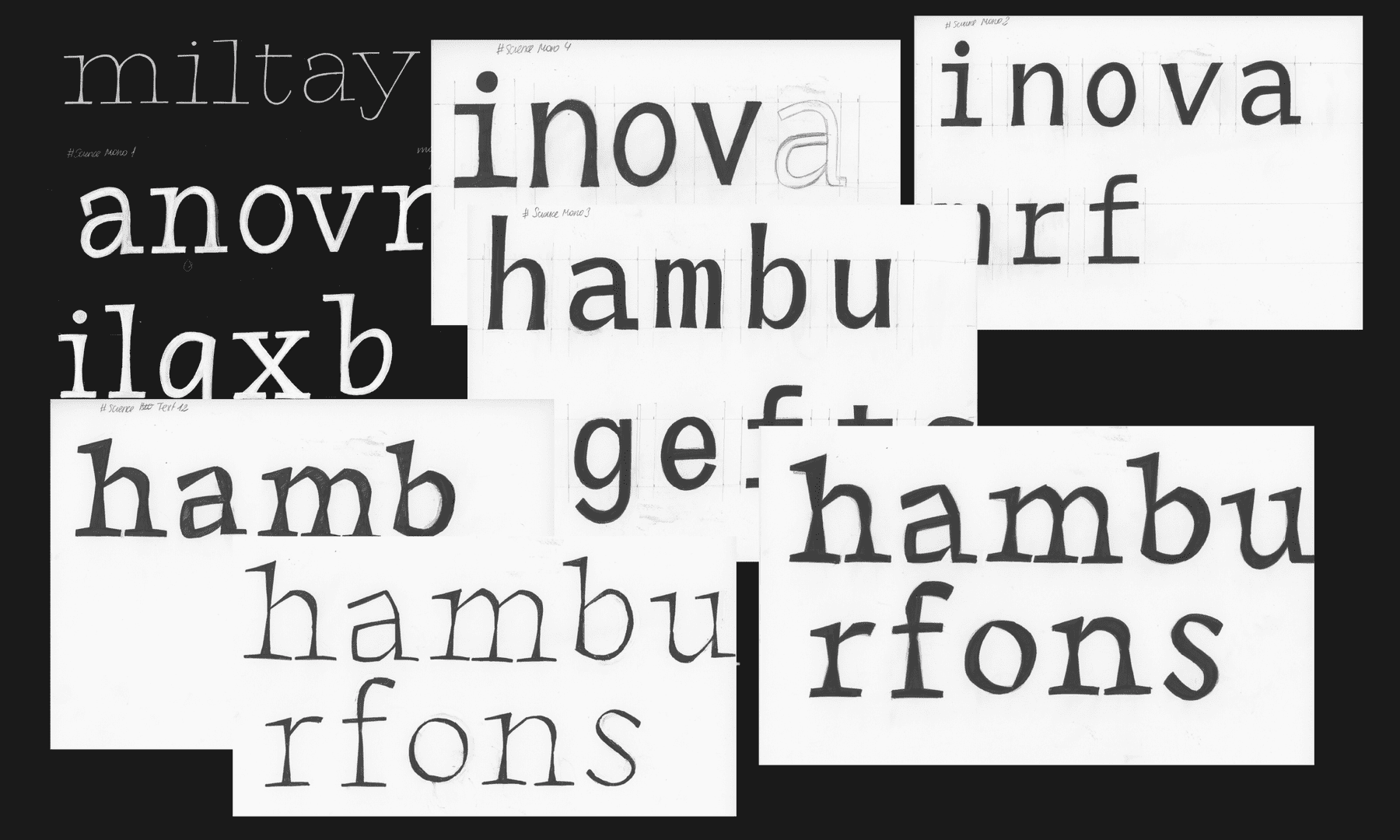
The aim of this project from the beginning was to explore new shapes and face new challenges. Additionally I wished to establish my own way of working on a type design project by defining my workflow. I have always held an interest in how tools traditionally defined shapes in typography and I felt that my type project should be full of those details which produce a warm, human and organic typeface.
Working on an editorial typeface was the result of many (good and bad) decisions combined. Additionally, it was the result of pursuing interests in areas of design that defined myself and my background as a designer before this Type and Media programme. I arrived at this point, designing letters and pursuing this dream, originally via a connection to editorial design.
Defining a design space was performed by analysing various hypothetical environments (such as bioinformatics and science articles but also magazines and other publications which are design guidelines related) and discovering their problematic situations (in terms of how the information is organised and displayed). This raised questions to determine the best way of solving typographic needs with a versatile type family.
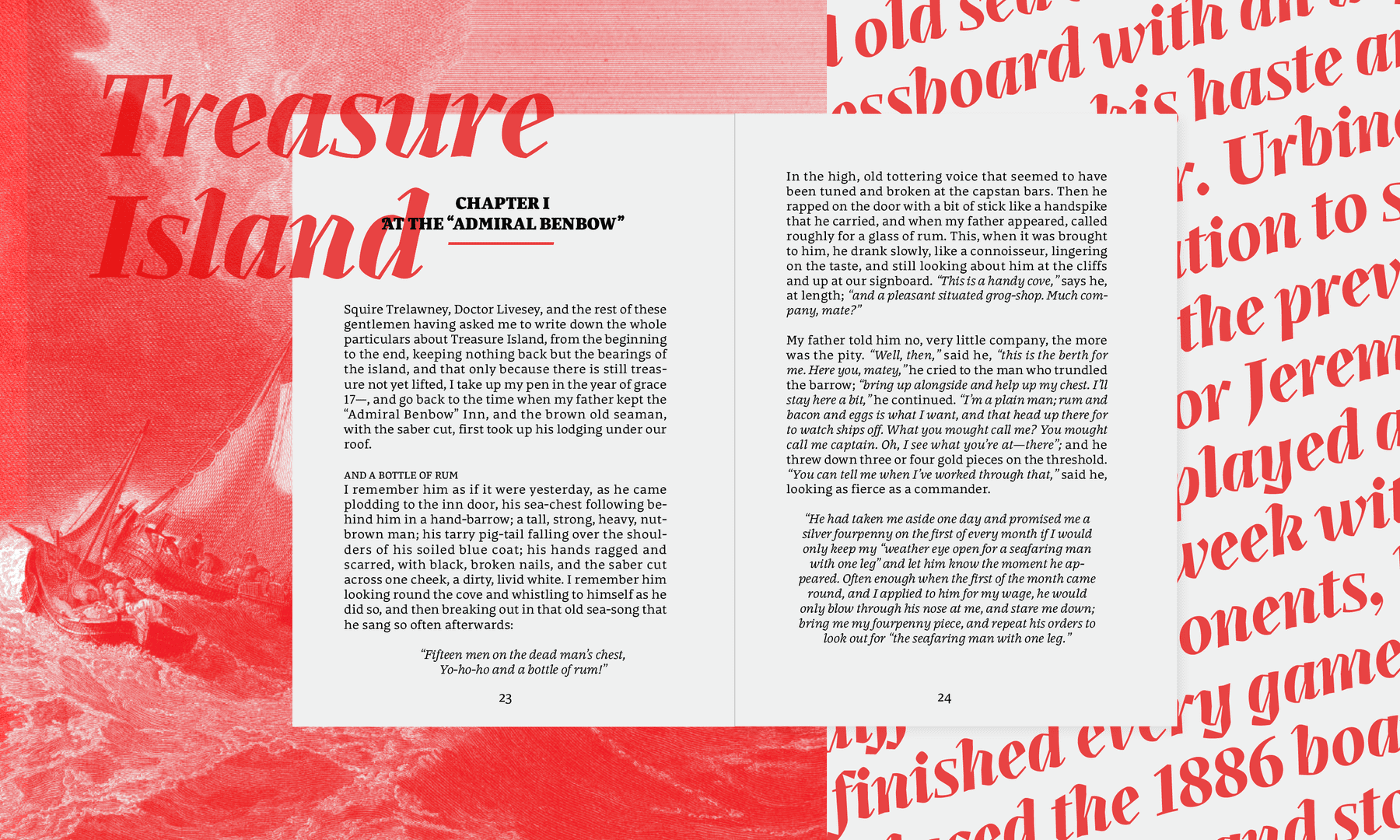
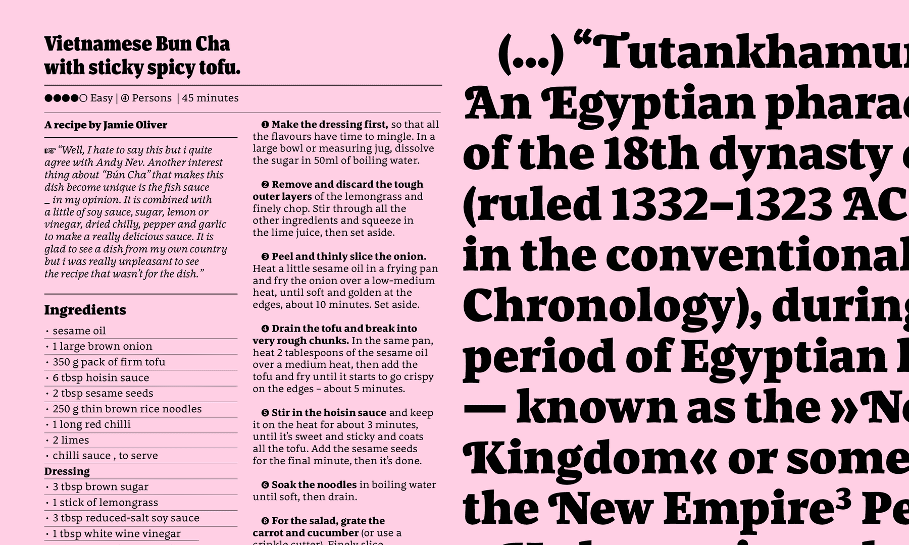
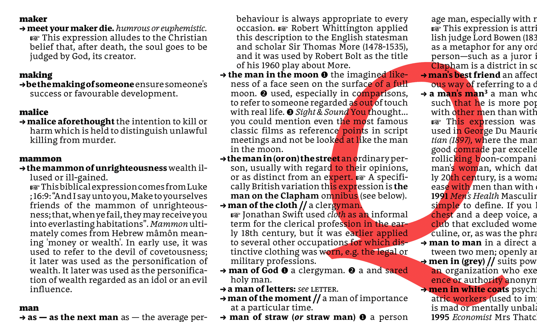
The various styles of Azor solve long texts, display (both expressive and headline) and caption situations, utilising the least amount of masters as possible. Whilst long dreaming about this project, time whilst living within The Netherlands was limited so I was required to define the priorities at that time.
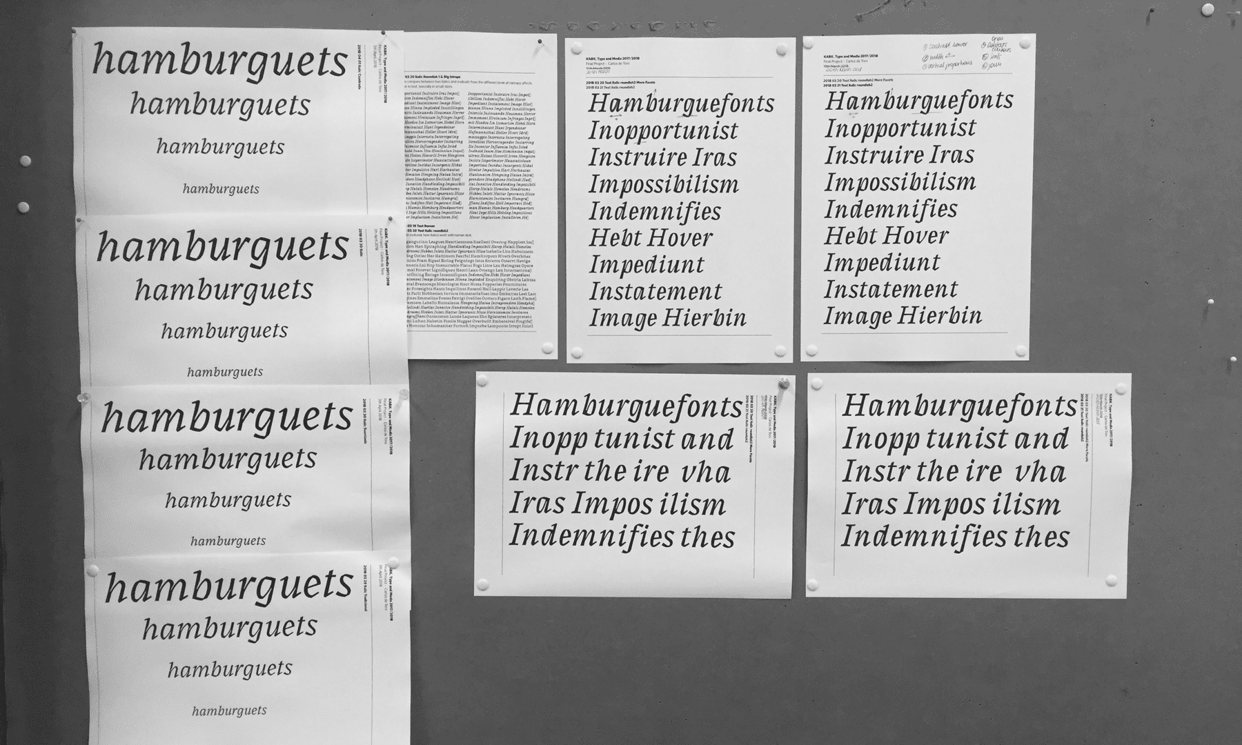
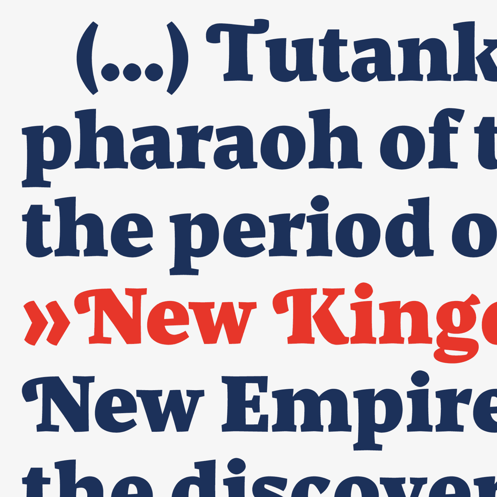
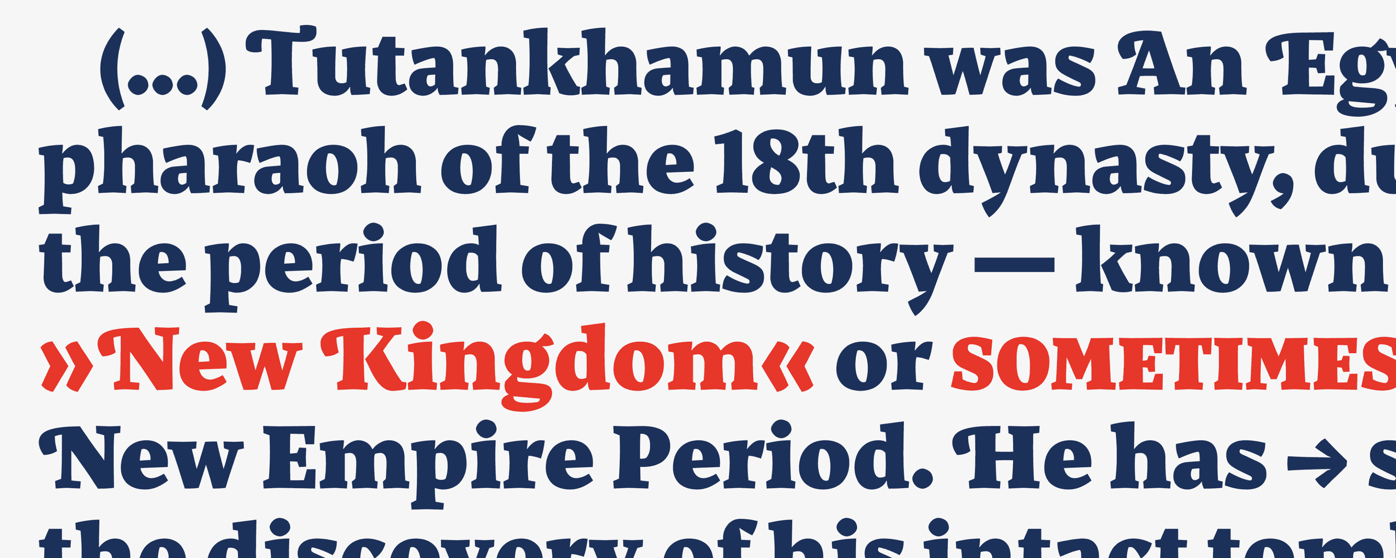
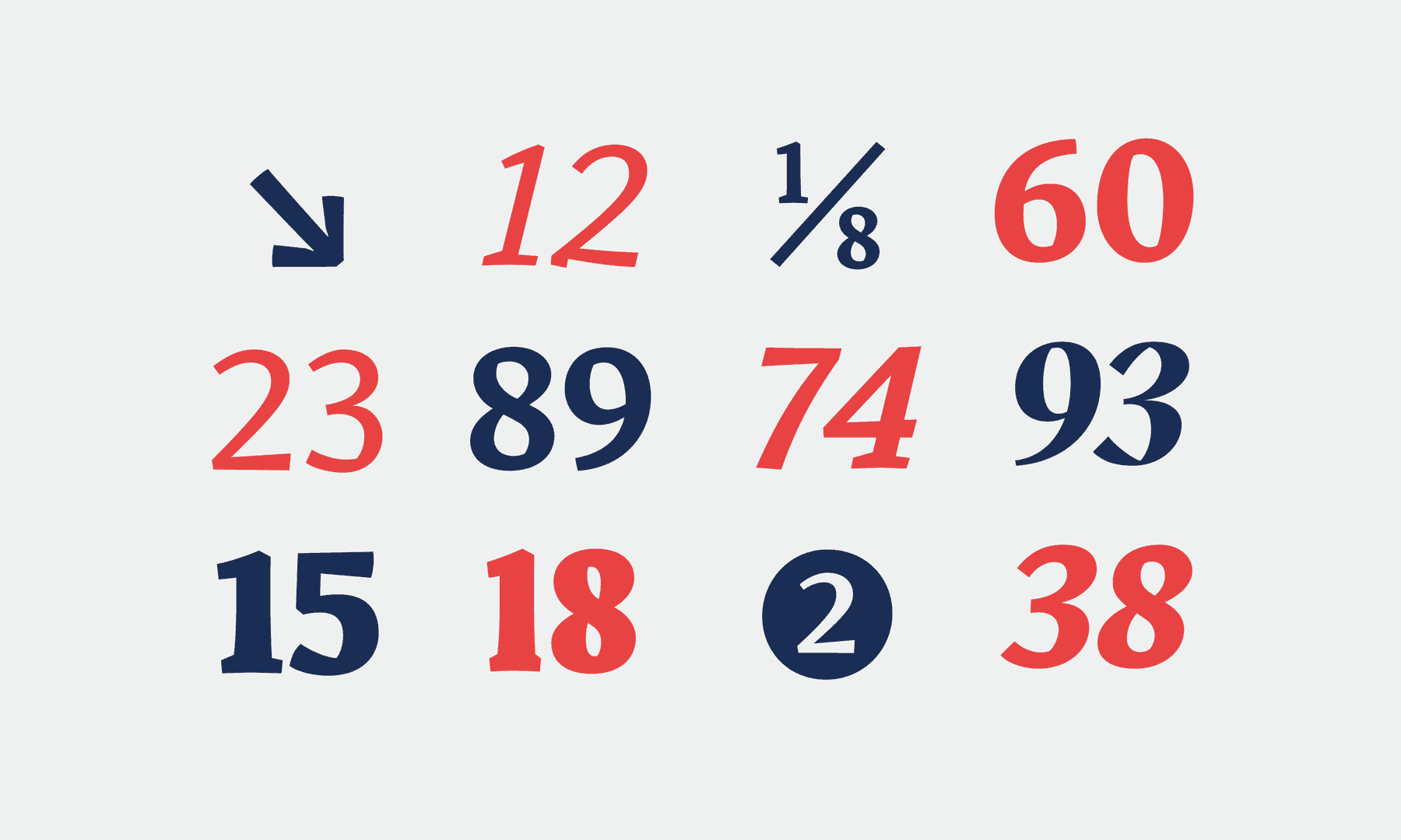
Italics design was one of the highlights. Since starting to read about, research and experiment with micro-typefaces, I took some main adjustments and features in order to apply them in my italics since they were quite characteristic. Firstly, they were different and recognisable enough next to the roman but were sharing some features and calligraphic gesture. This would produce a difference in tone and content during the text. Once the micro typeface features were applied, this style was emerging as a hybrid that could perfectly work in small sizes as captions. During this process, various legibility tests were performed. Aesthetic and more superfluous details were slowly disappearing whilst sharp, hard and angular shapes appeared. Constantly, decisions were taken which favoured legibility.
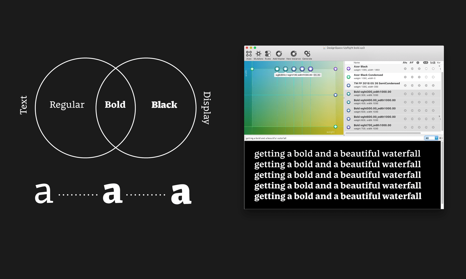
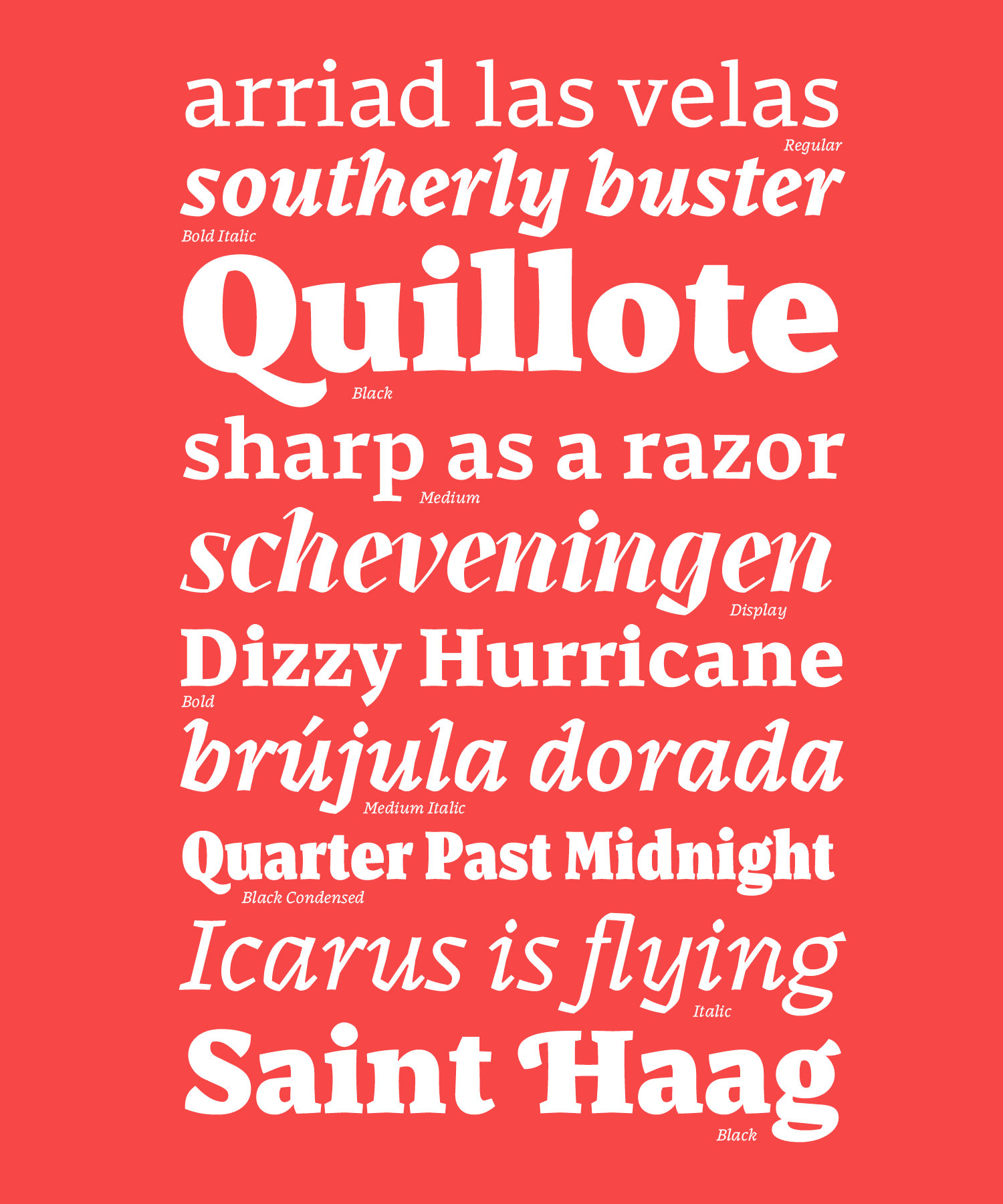
Weight tests were performed in context, in order to choose the most accurate weights based on situation needs. Bold Style started as an interpolation, soon it emerged on a separate master where expressive features were tamed and adapted to long text needs. Whilst Regular, Bold and Black can be used together and their skeletons being part of the same system, Black Style is more appropriate for display-headline situations.
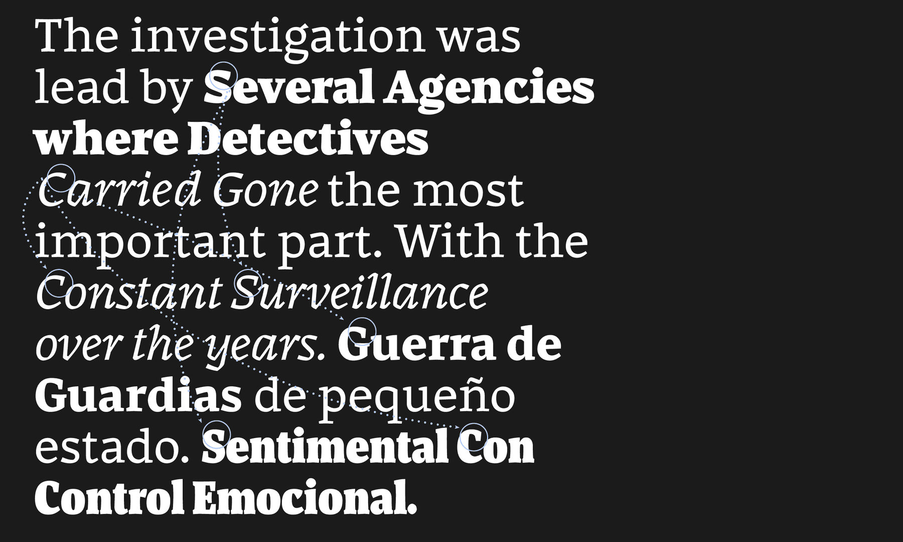
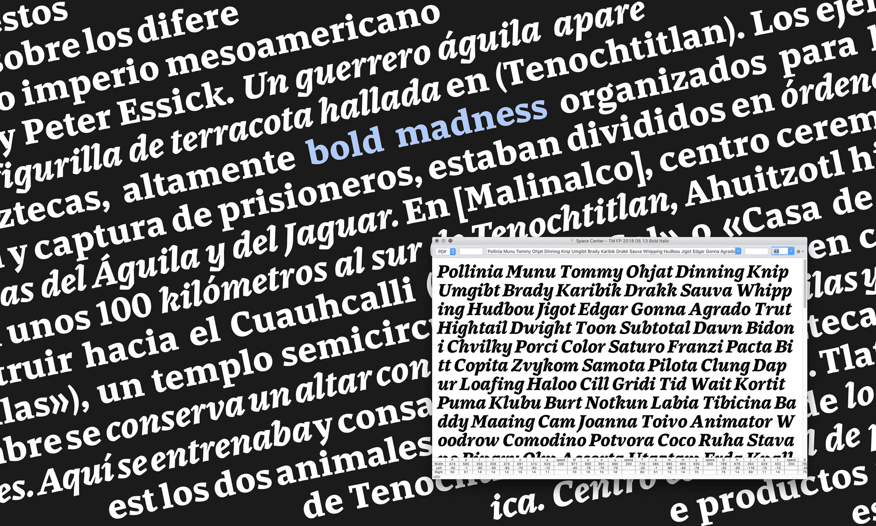
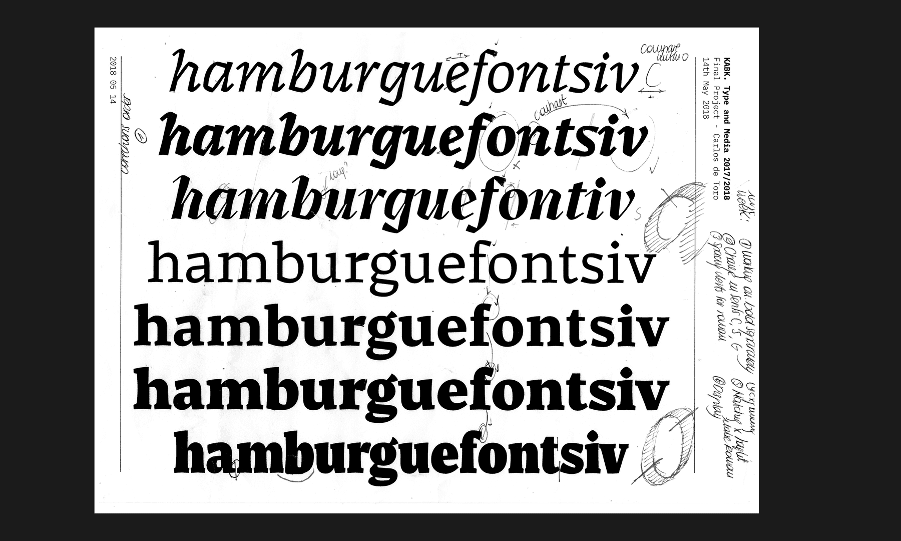
Display is an outstanding style which shouts by utilising a very expressive tone whilst at the same time being completely connected with tool shapes and other styles such as italics. Its aim is to mark a contrast with the rest of the family with dynamic and angular shapes that guide the reader throughout the text.