Recursive
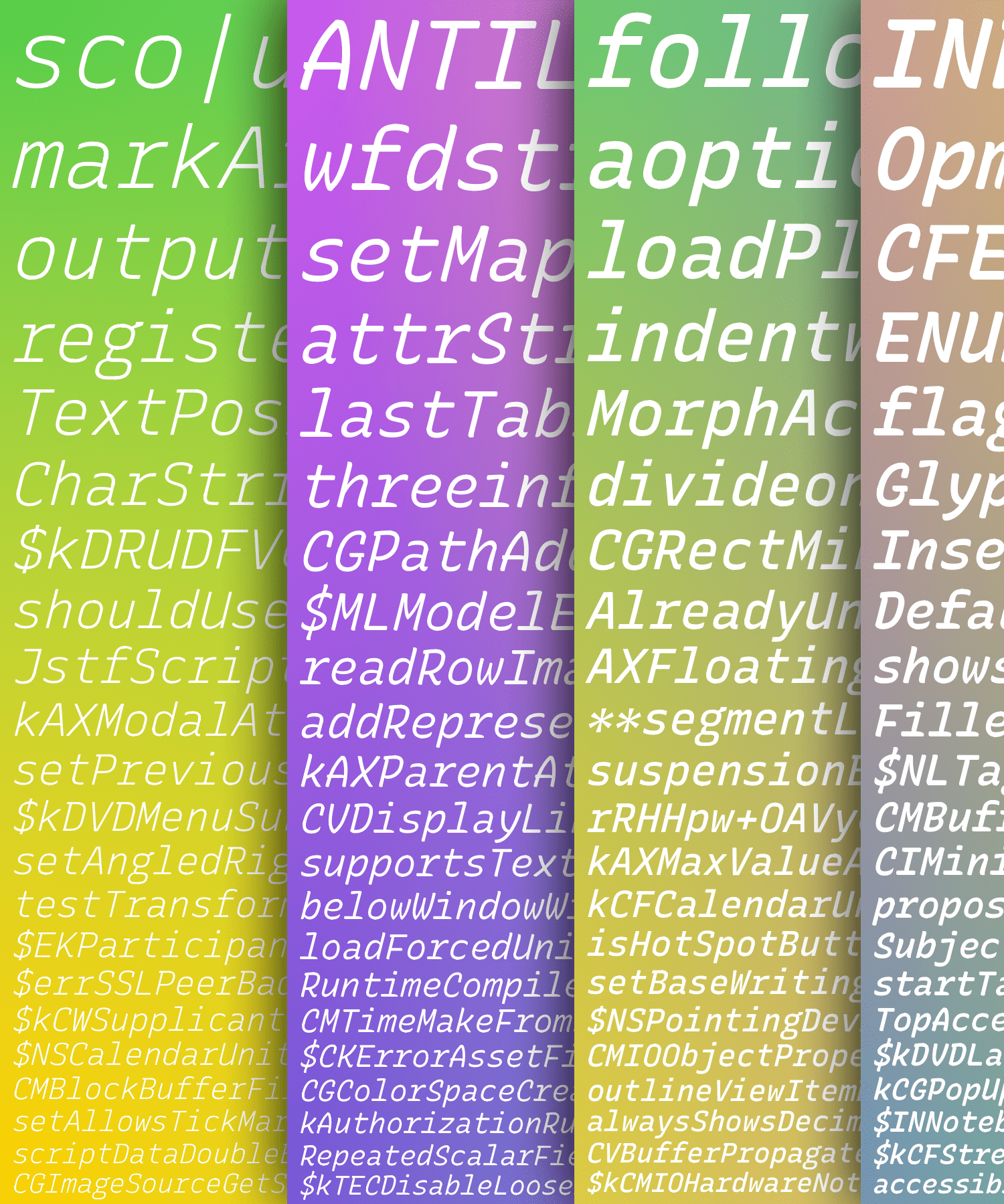
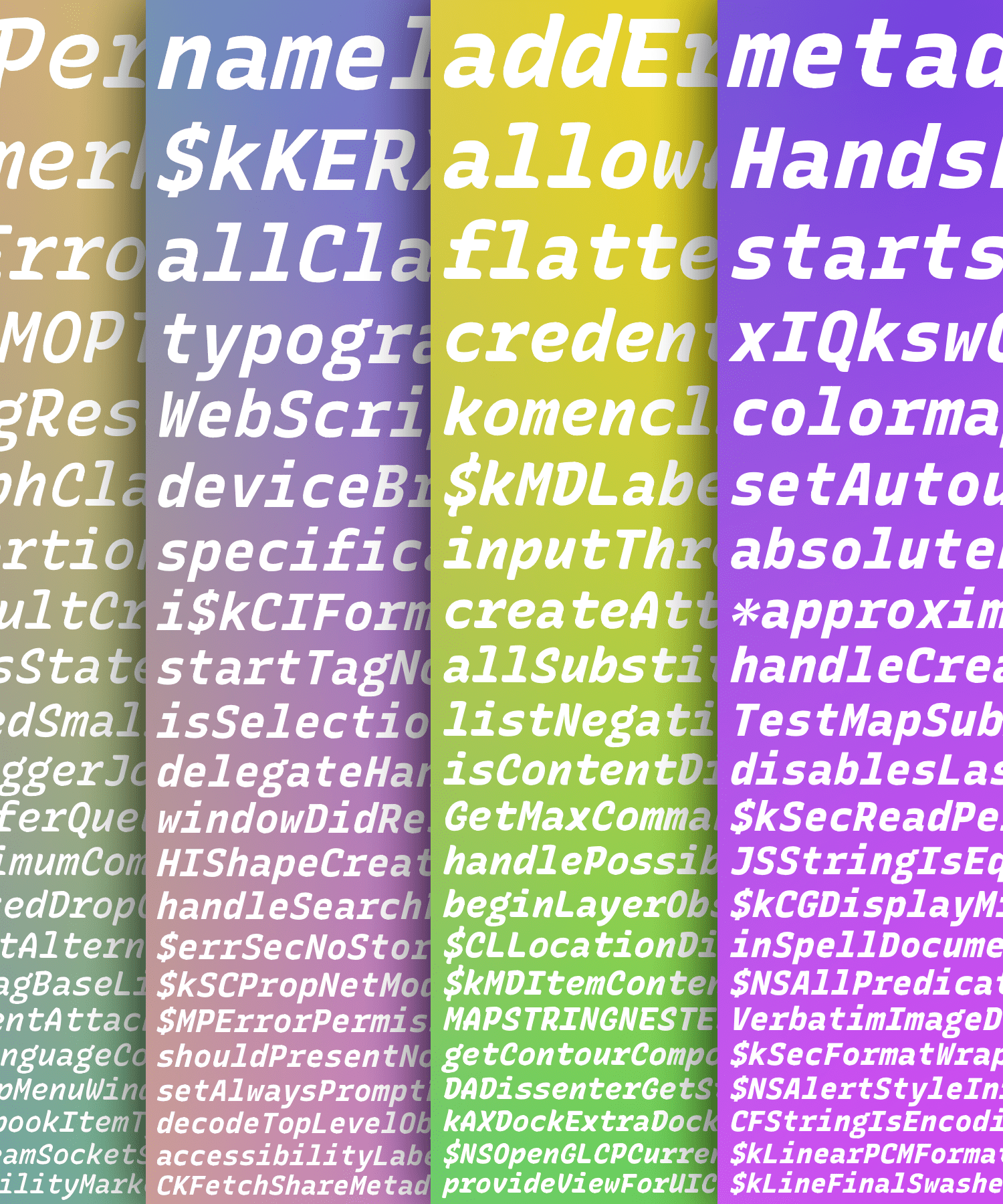
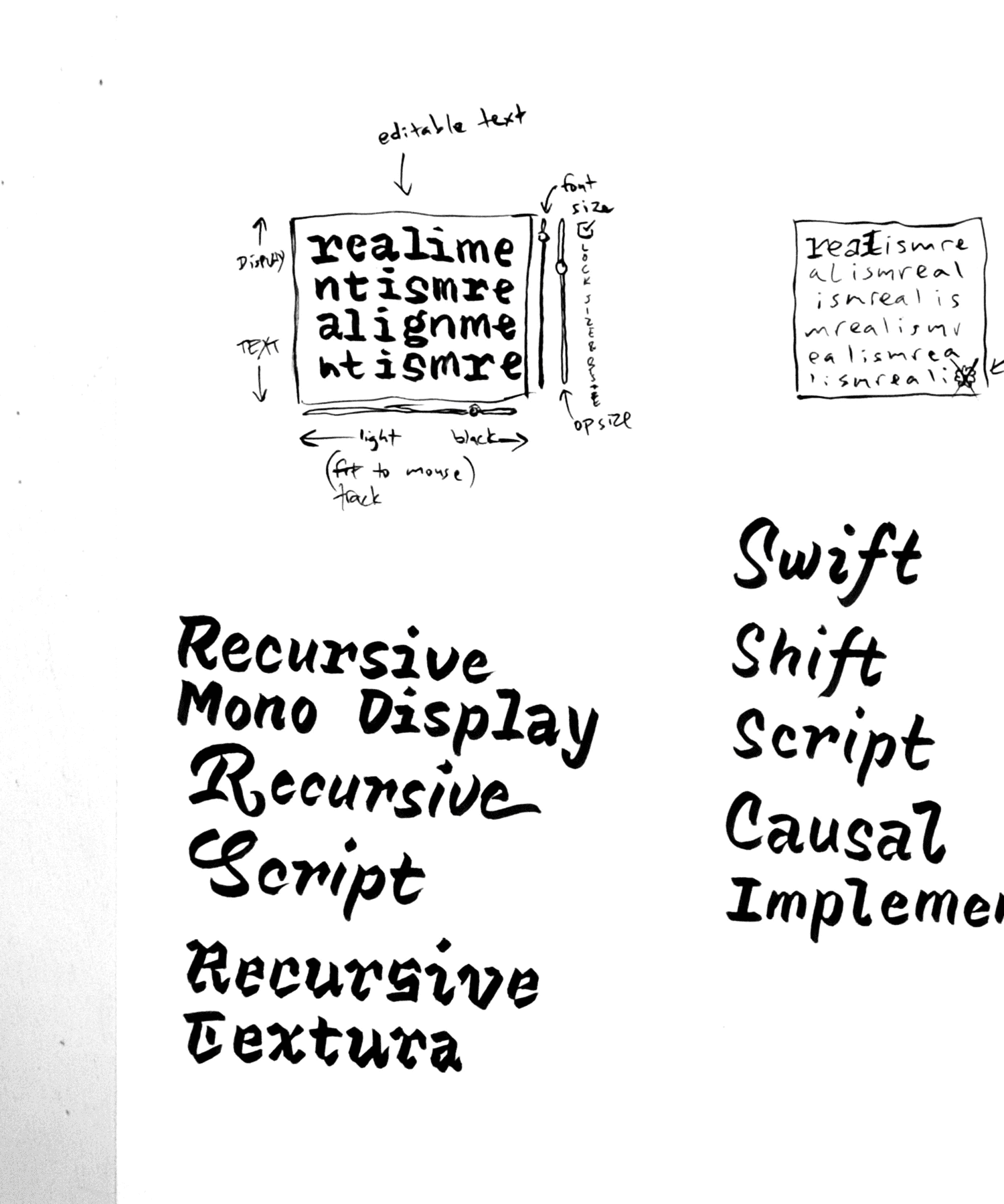
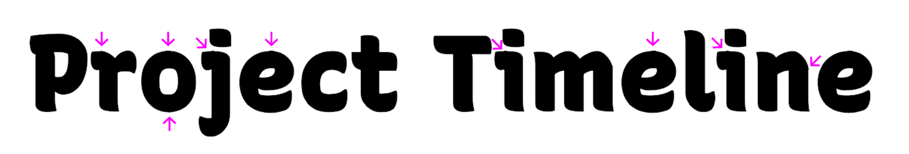
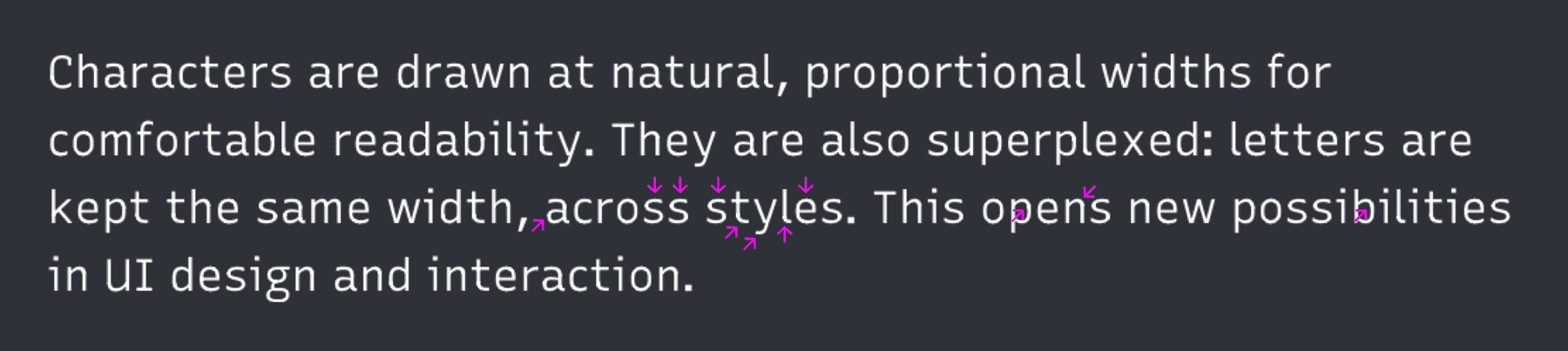
Recursive Mono & Sans is a variable type family inspired by casual script signpainting and designed for better code & UI. ¶ In programming, “recursion” is when a function calls itself, using its own output as an input. ¶ Recursive Mono was used as a tool to help build itself: it was used to write Python scripts to automate work and generate specimen images, and it was used in the HTML, CSS, and JS to create web-based proofs & prototypes. Through this active usage, Recursive Mono was refined to be not just warm, but also deeply useful for all-day work. ¶ Recursive Sans borrows characters from its parent mono but adjusts many key glyphs for comfortable readability in text. Its metrics are “superplexed” – glyphs take up the exact same horizontal space, across all styles. As a 3-axis variable font, this allows for fluid transitions between weight, slant, and “expression” (casual to strict letterforms), all without text or layout reflow. In turn, this enables new interactive possibilities in UI – and makes for a uniquely fun typesetting experience.
Stephen Nixon
USAStephen has a passion for type, technology, and the web. ¶ As an undergrad, he studied graphic design at the University of Minnesota in the Twin Cities. After that, he moved to New York City to work as a product designer at IBM. There, he focused on visual design & UX for software products, then moved into brand experience design within IBM Watson. ¶ Today, Stephen lives in Brooklyn, NY, where he operates Arrow Type, taking on freelance type design & development work while also nurturing font projects for future release.
![]()
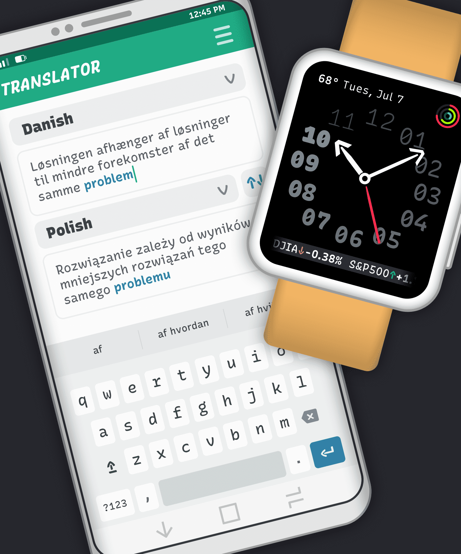
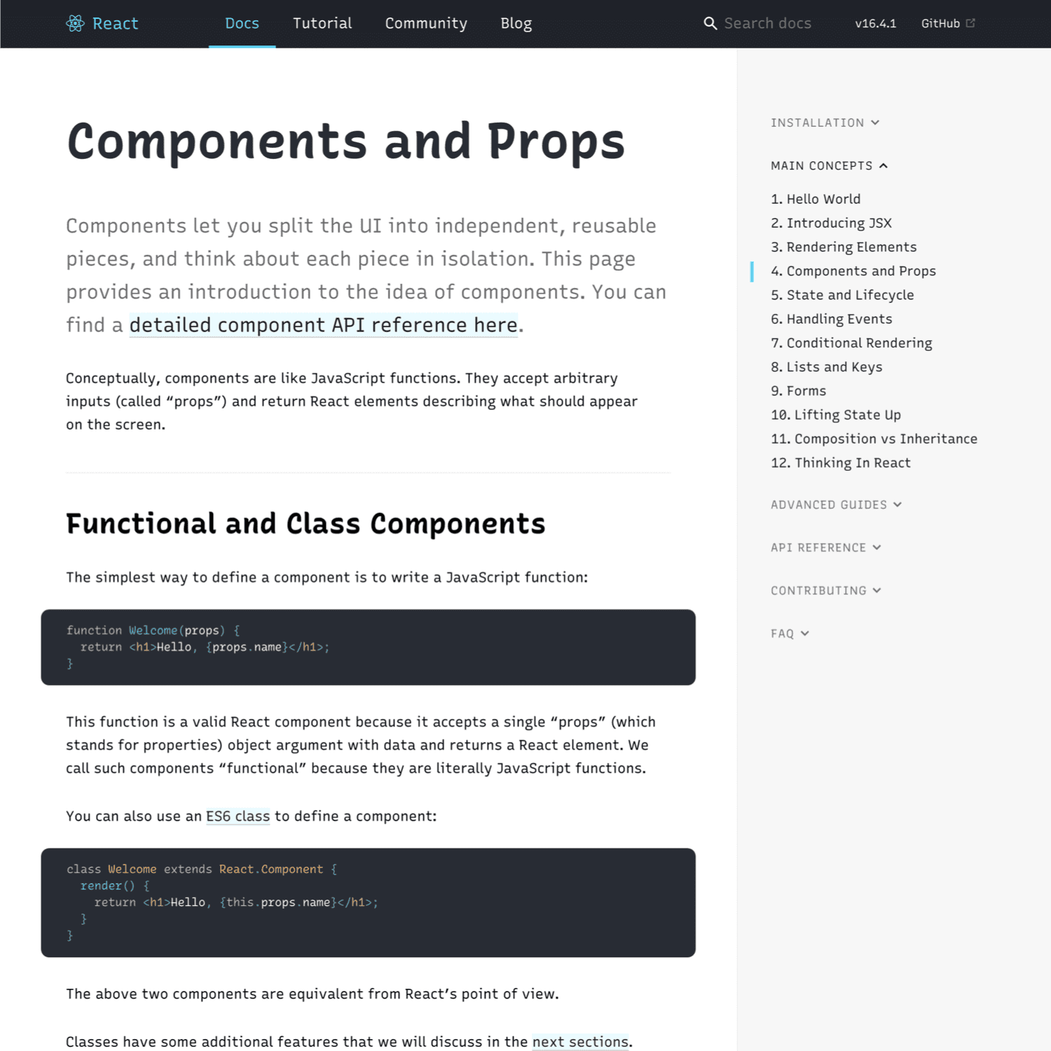
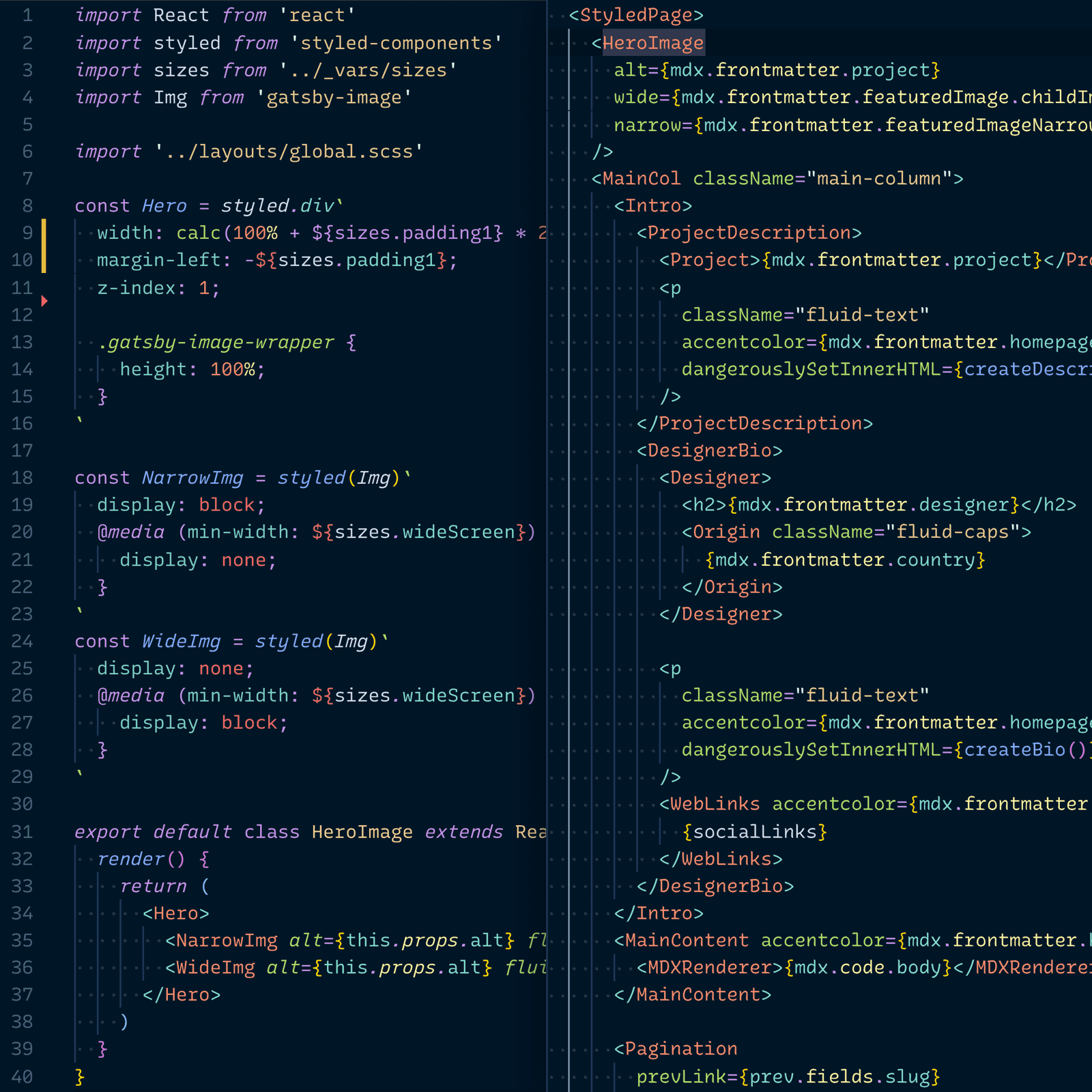
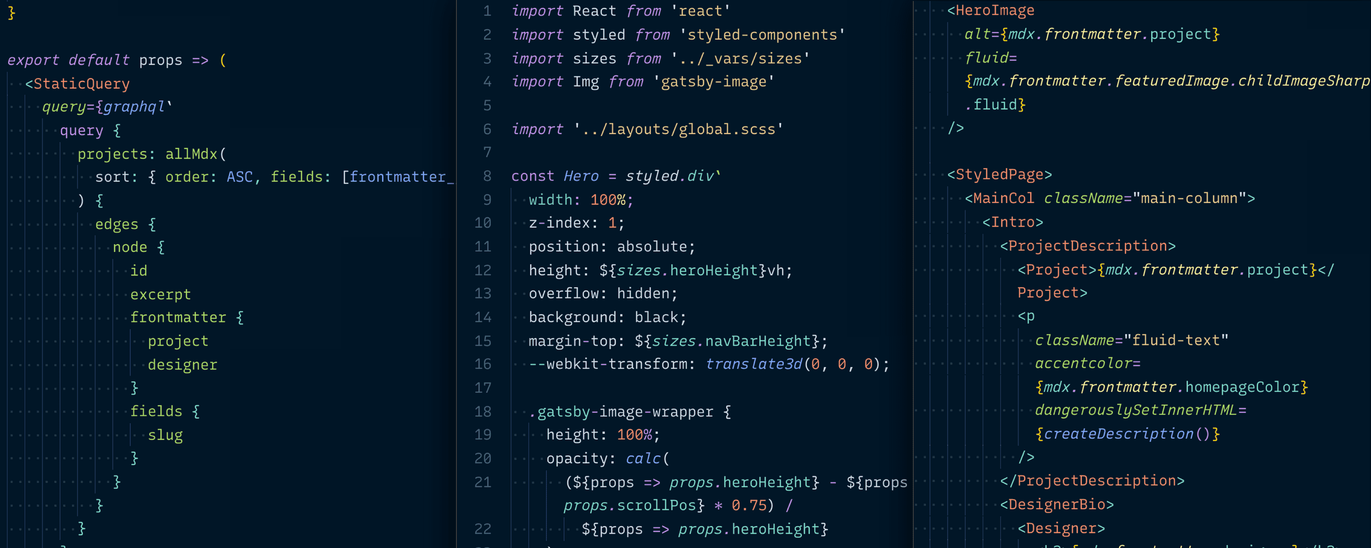
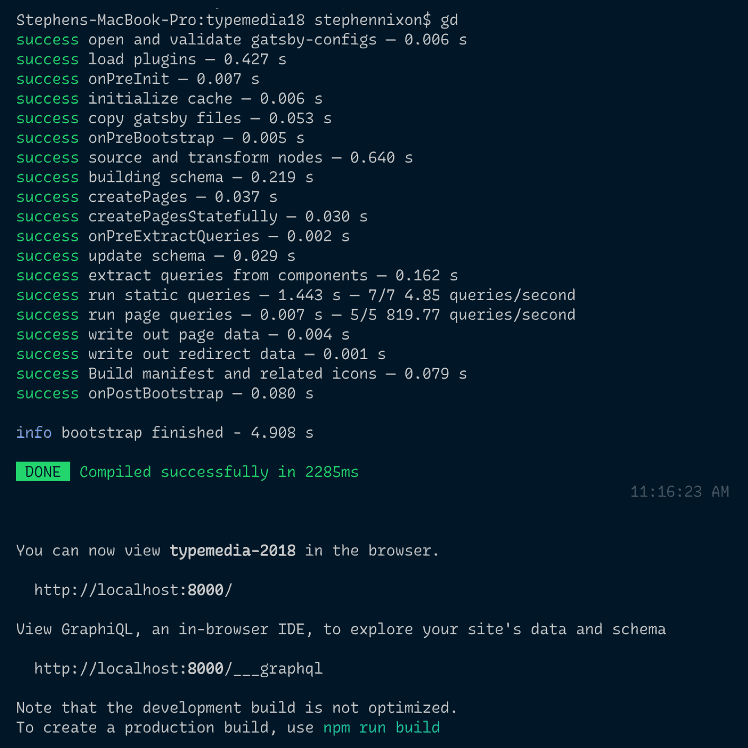
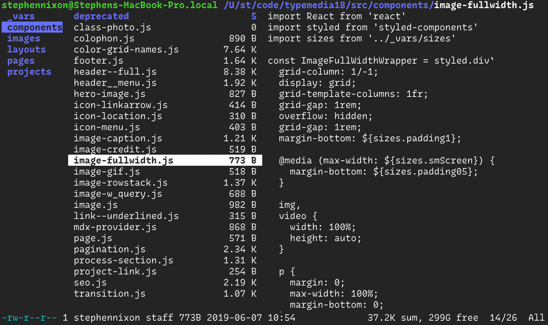
Layout from ReactJS
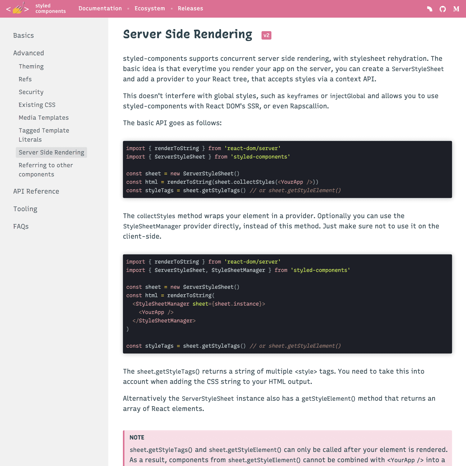
Layout from Styled Components
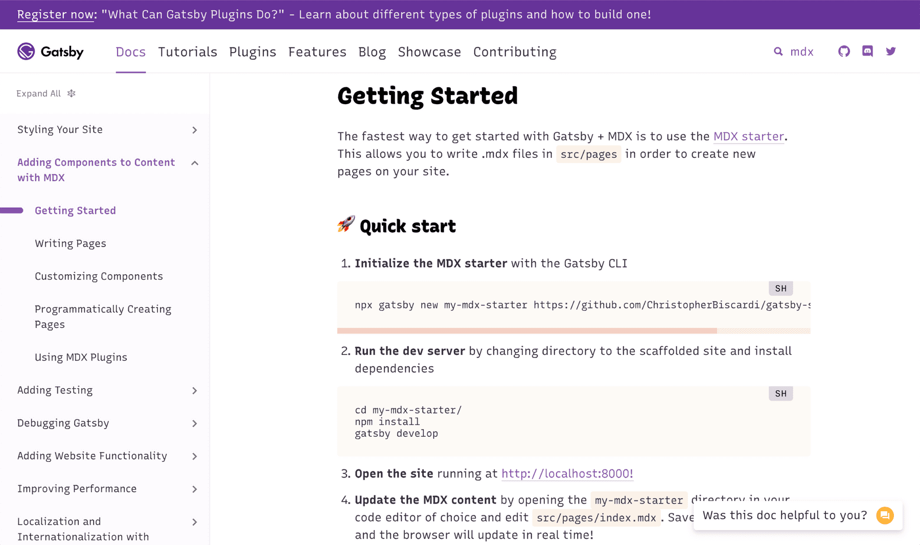
Layout from GatsbyJS
Process Notes
The Recursive project started as sketches in Fall 2017, but almost all the work shown here happened from February through June of 2018. There has subsequently been further work done to progress the typeface for release, but these updates have been intentionally excluded from here to leave this page as a documentation of the thesis project itself.
Finding the Right Project
During the first semester of TypeMedia, I sketched many type ideas, and I headed into the second semester with two primary ideas that felt promising. One was a sans serif that seemed to have “commercial potential,” while the other was an eclectic family of casual script-inspired monospace fonts. Two things pushed me towards the latter: advice from former TypeMedia students to embrace something wild and experimental in my short time there, plus the excited reaction of two graphic designer friends upon seeing my early sketches for a casual script.
I have had a long-time passion for learning web development, starting by coding my own portfolios as an undergrad, and later creating prototypes as a visual designer for software. Through this, I had learned so much and gotten so much joy from web dev education blogs like CSS Tricks, podcasts like ShopTalkShow and Toolsday, and teachers like Wes Bos and Treehouse. In the Recursive project, I hoped to create a typeface for code that could match the sense of fun, energy, and approachability that my favorite code resources have.
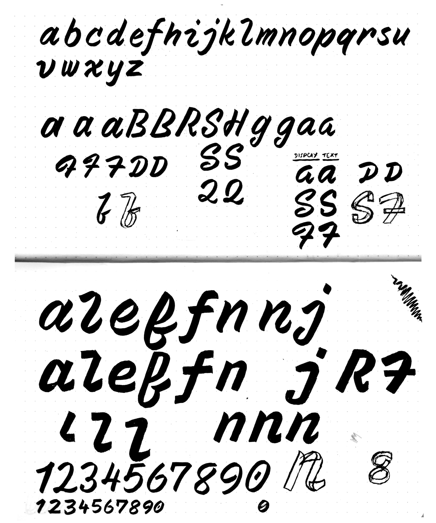
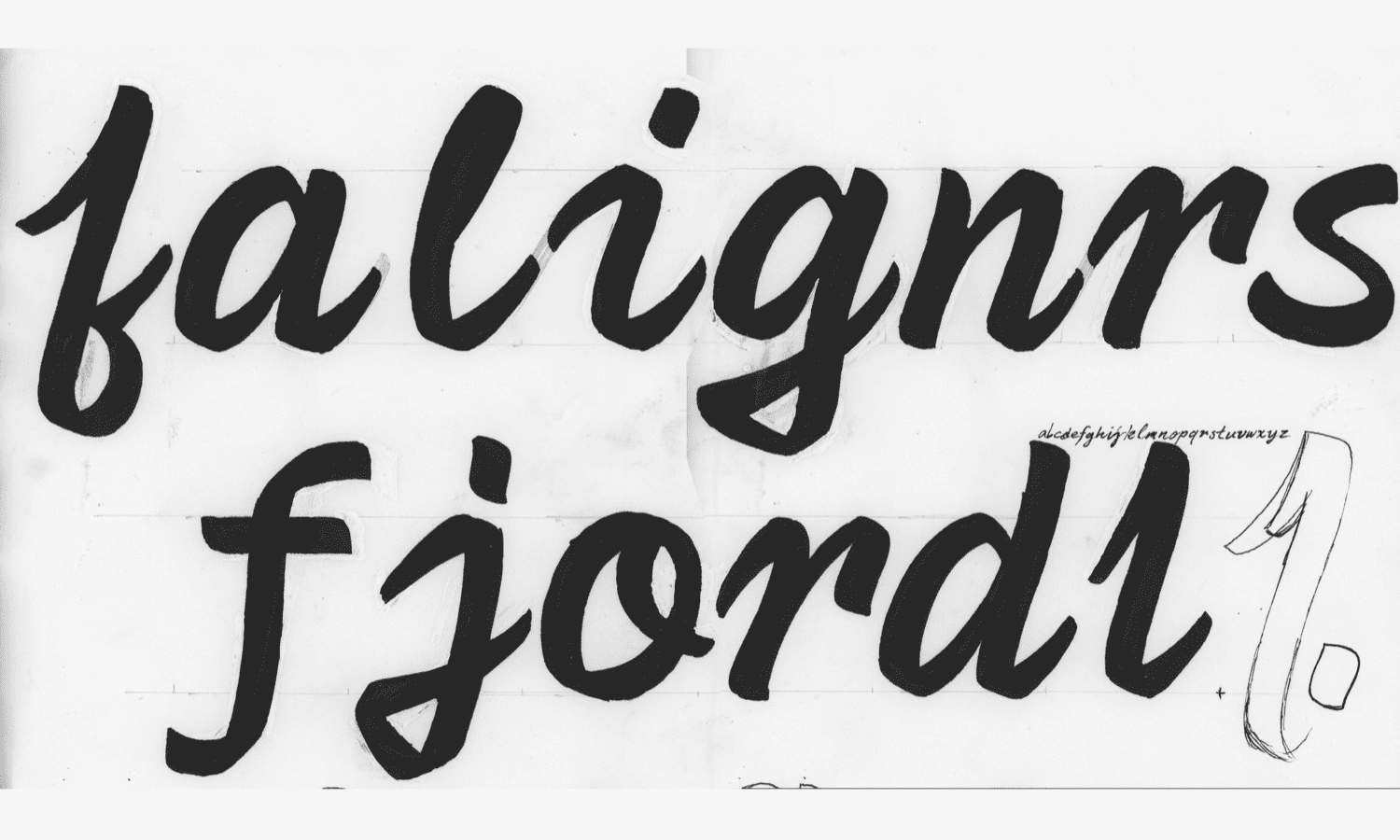
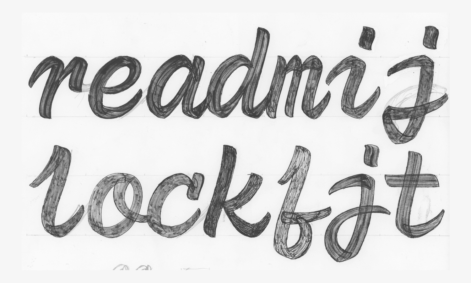
Gaining an understanding of paint strokes
I was very lucky to have two classmates (Gen & Seán) who are really skillful signpainters. They taught the rest of us useful lessons in basic letter painting. Without their instruction, I don’t know where I would have started in this project. With their help, I learned to practice brush painting with acrylic paint on windows and paper. With this approach, I interspersed painting throughout the semester, to keep my ideas rooted in the source material, even while I did much of the sketching with a simpler-to-control brush pen.
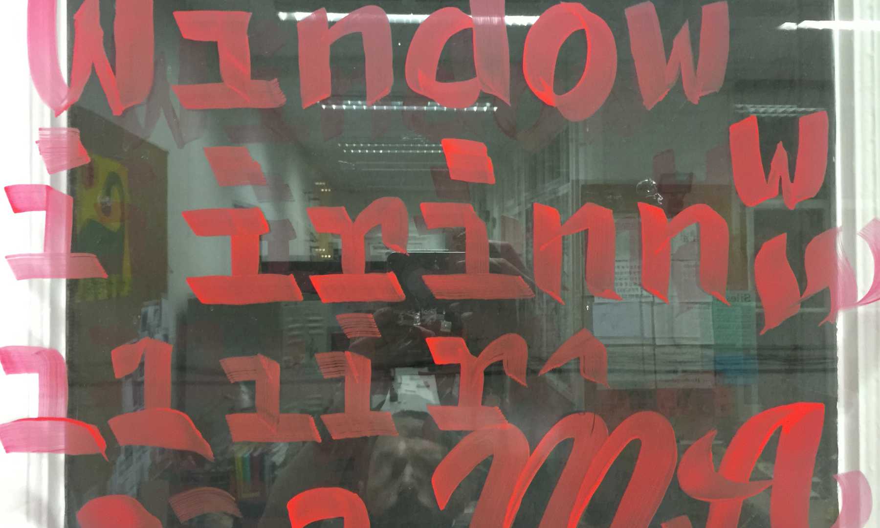
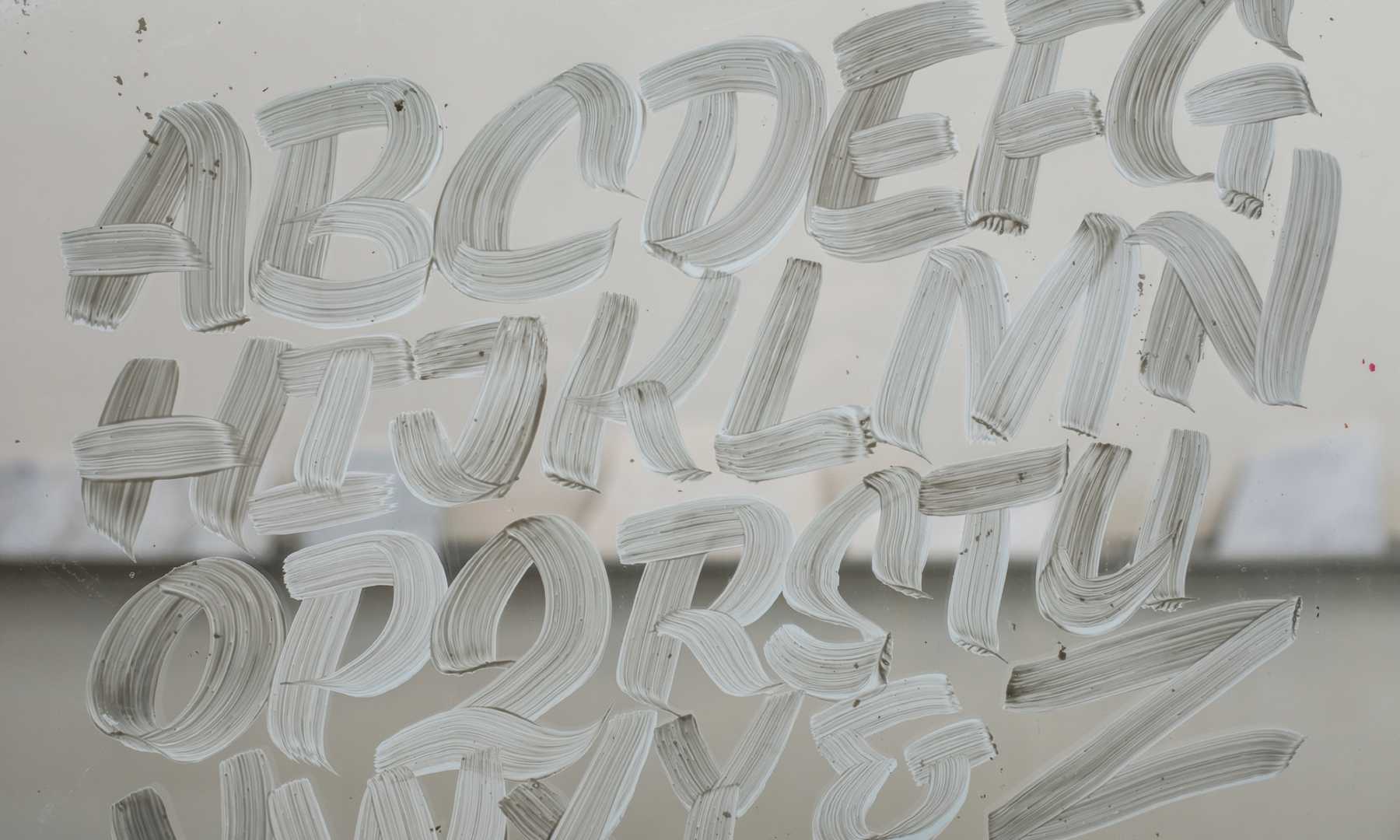
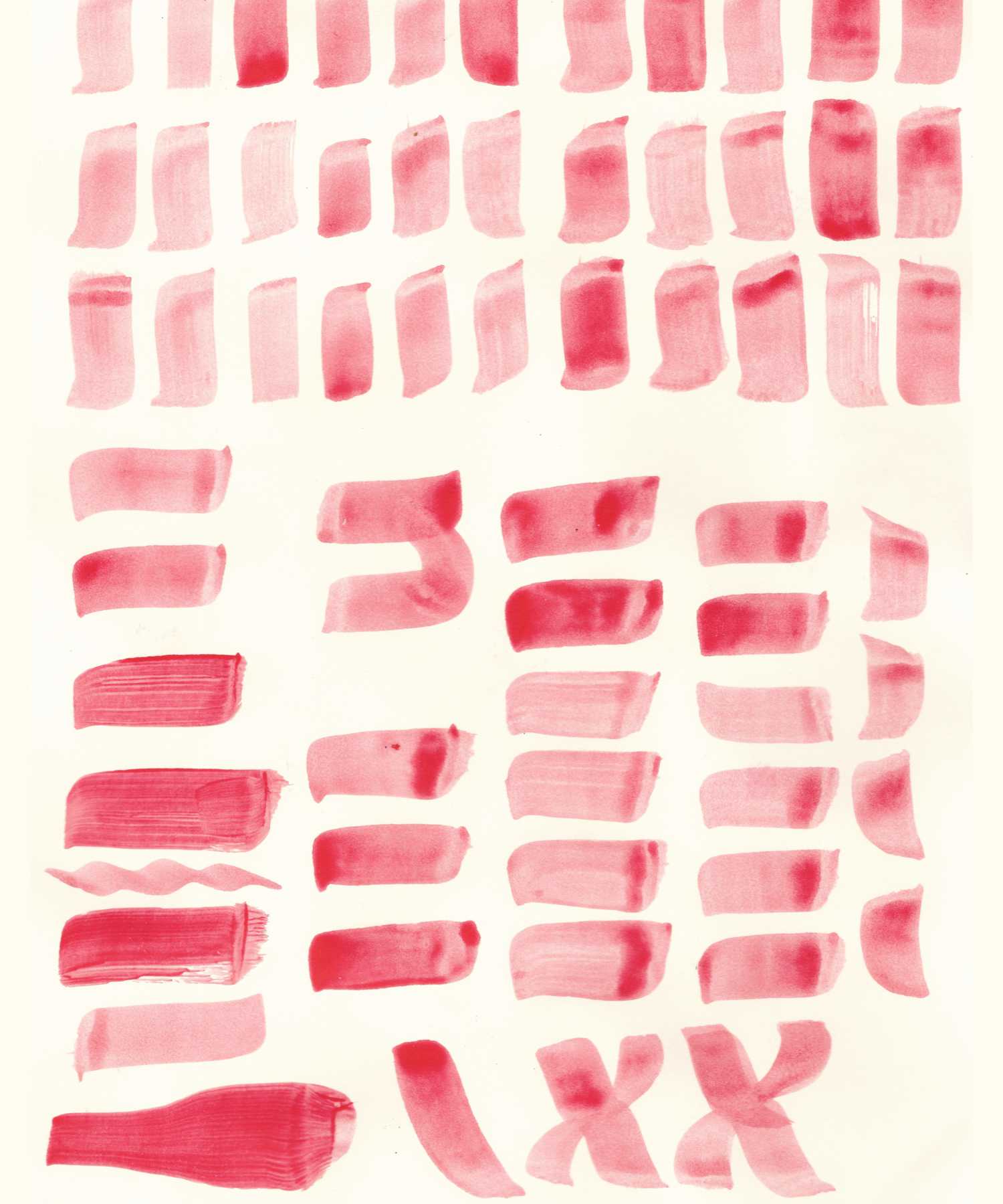
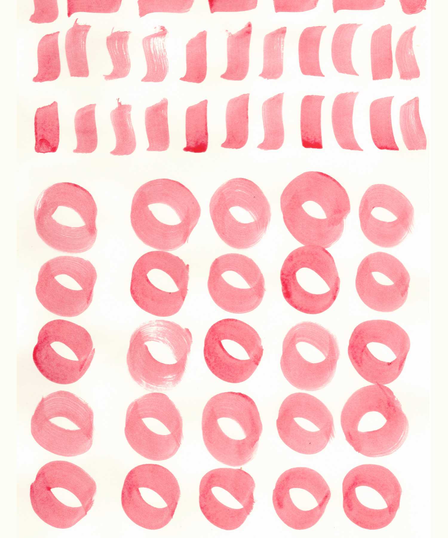
I haven’t (yet) become a good letterpainter myself, but practice with different brushes gave me valuable lessons in how pressure, rotation, and speed will affect brushed letterforms. It also provided a useful means of quickly prototyping ideas, and many of my messy paintings informed the final glyph shapes in Recursive.
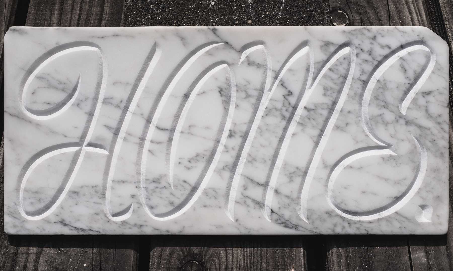
A unique aspect of TypeMedia is that it teaches many methods of letter design, with the philosophy that learning to create letters in many different ways and materials (or media) leads a designer to better understand the intricacies of making letters well. Quality type comes from more than just intellectual understanding, but also a multidimensional connection to type through working in code, on screen, in print, and even in stone. For Recursive, I spent time carving a casual brushscipt into marble, which helped me become more attuned to what curves would yield graceful and striking results in the typeface.
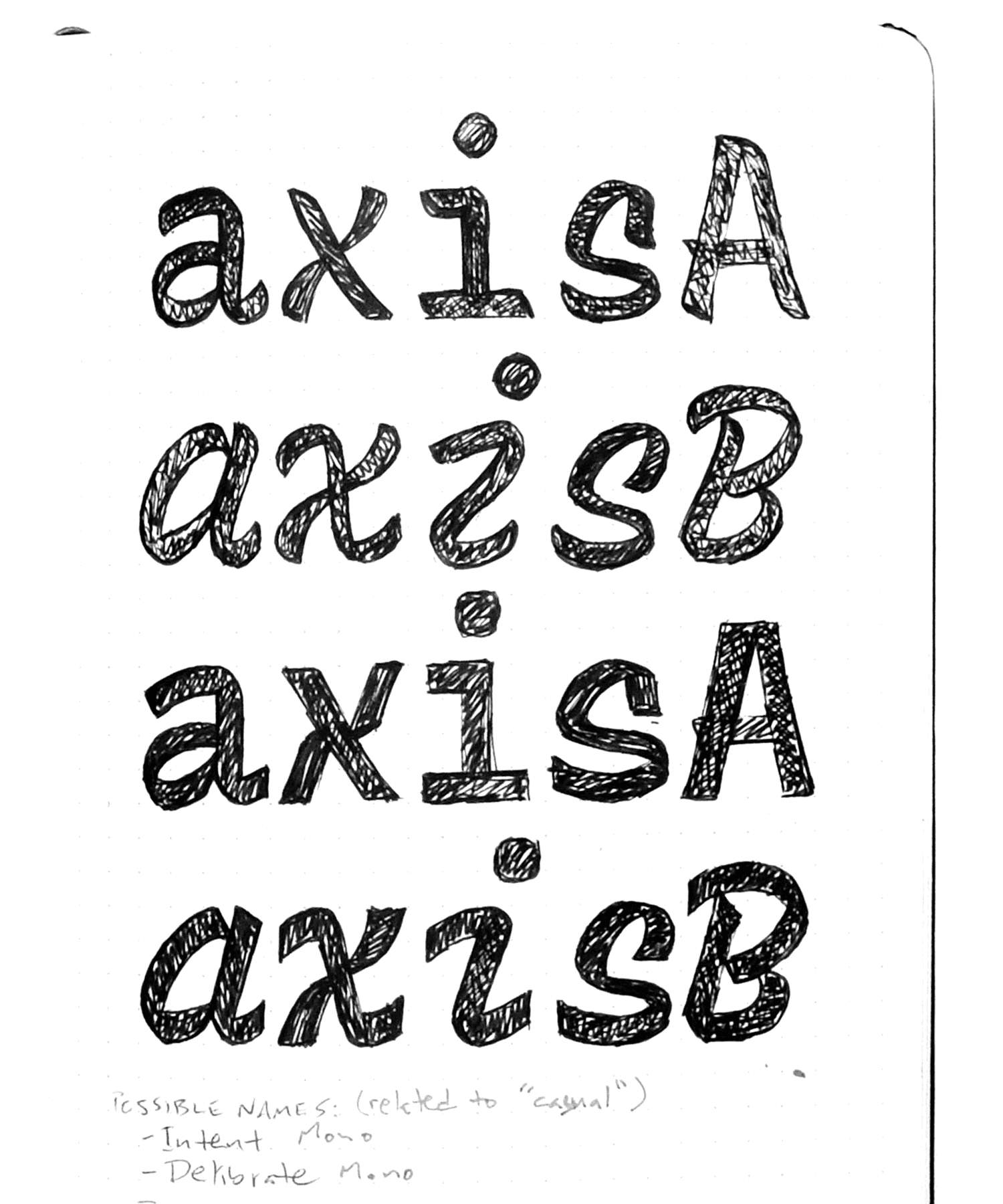
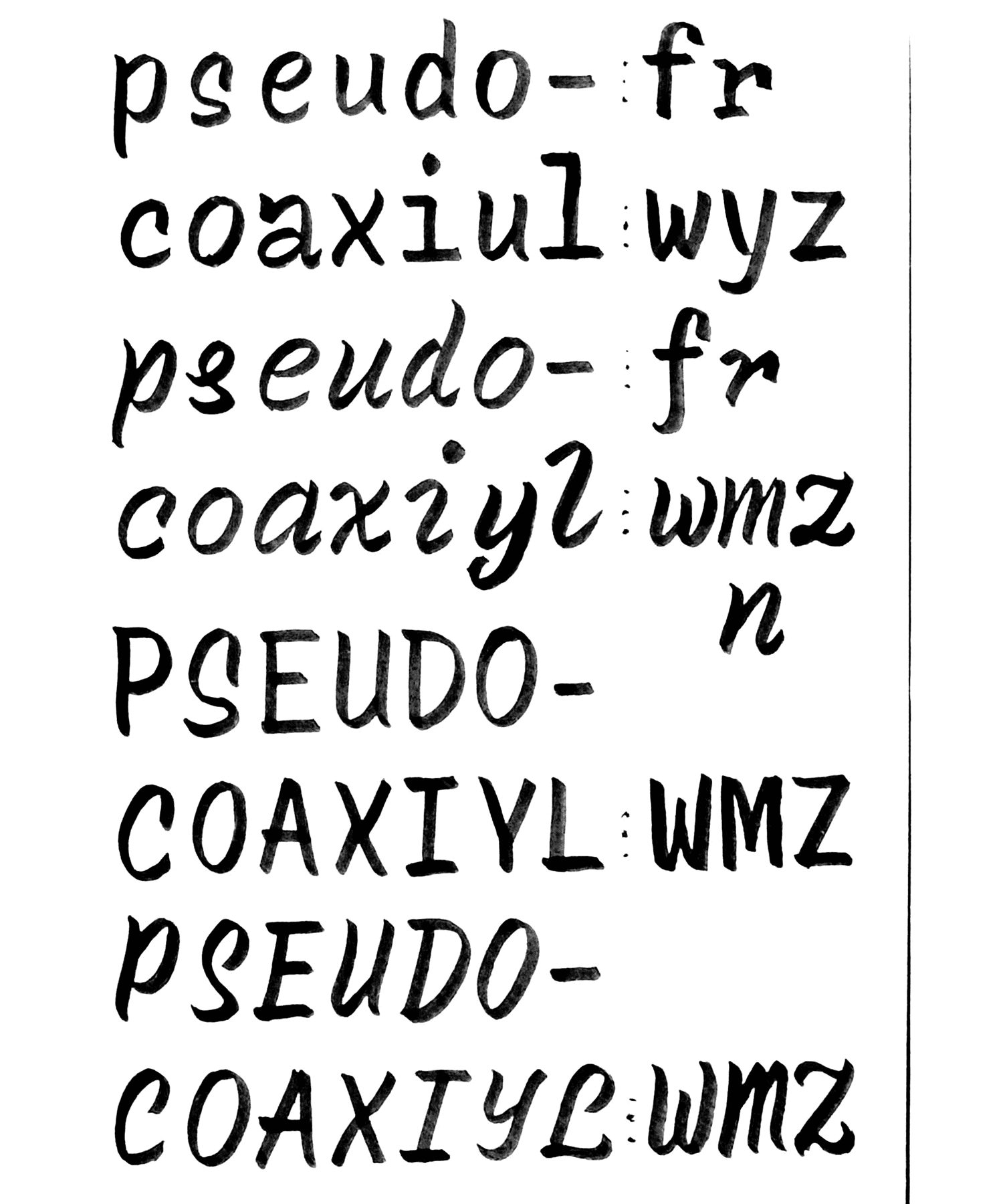
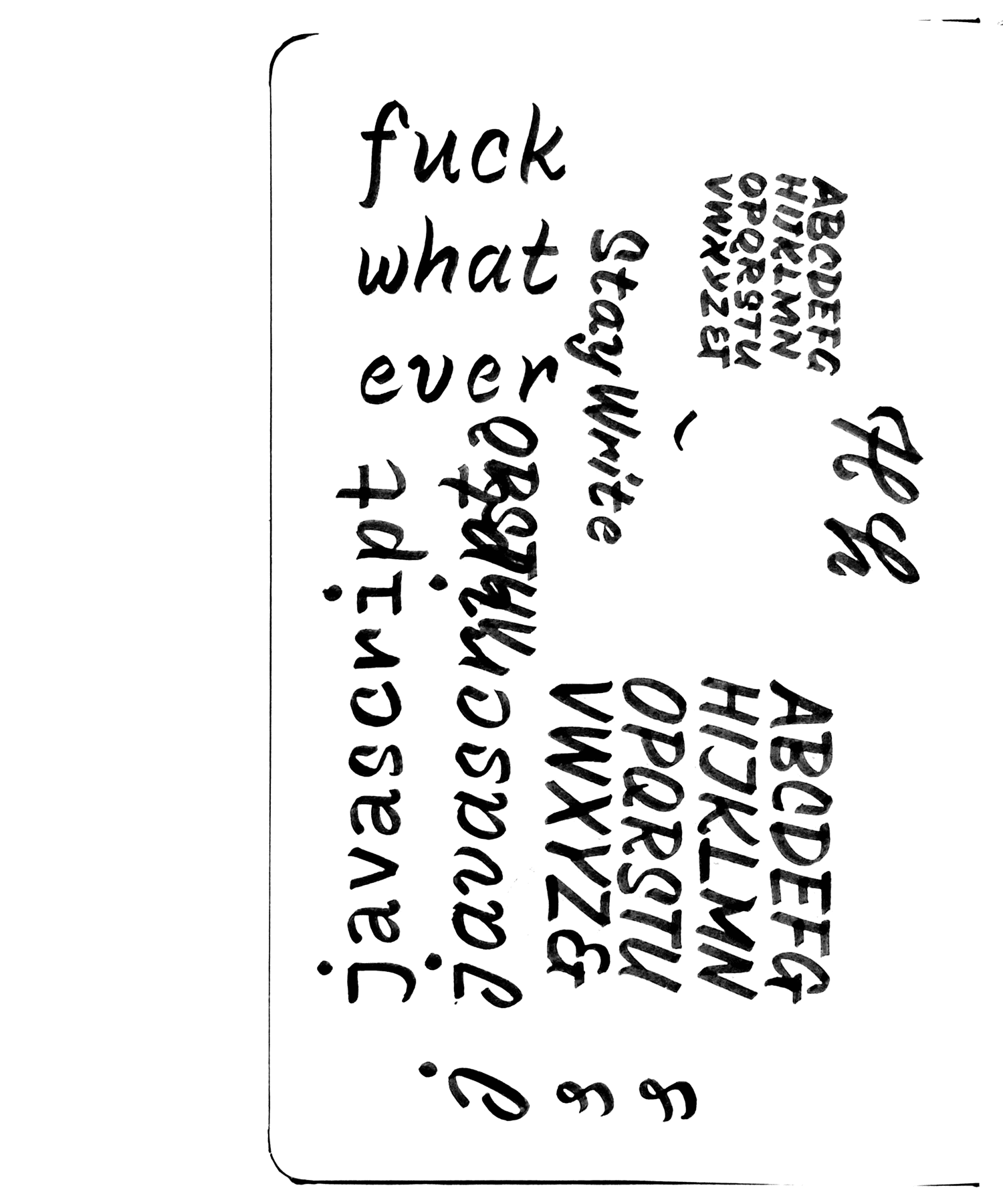
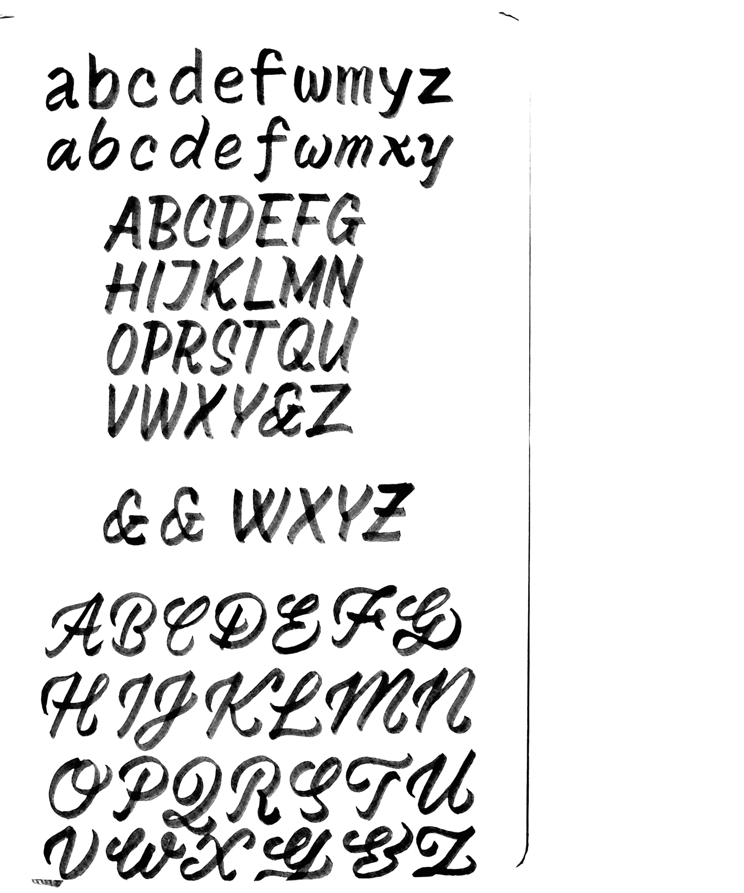
Exploring the possibilities
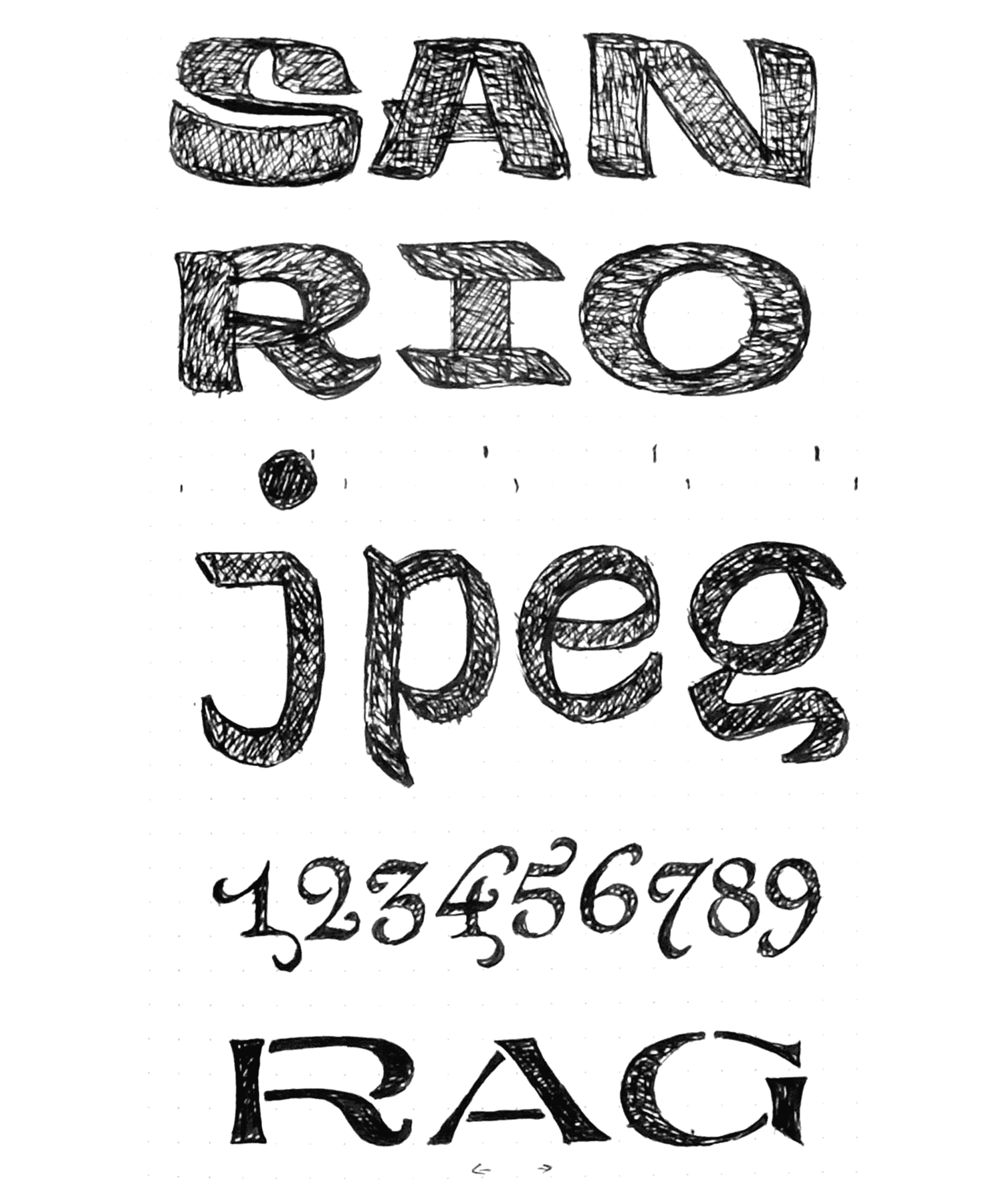
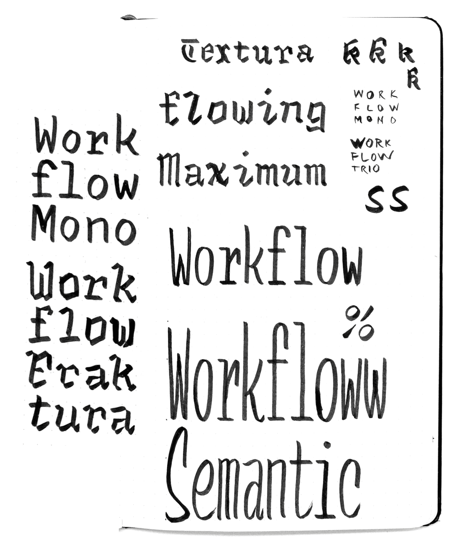
Early on in the semester, I explored many directions. I tried a connected-script monospace. I really wanted to make a casual-script blackletter subfamily. I sketched many other ideas that ultimately went unused, but still contributed to the final output. Time is the biggest constraint in any creative project, and I eventually found that (at least for my thesis) I had to narrow my focus to accomplish a cohesive typeface. Blackletter and connected script didn’t make it through to the end, but they did help me to explore shapes and ideas that did make it into the family. Who knows? Maybe these far-flung siblings will make their way back into the project, someday.
Workflows & Approach
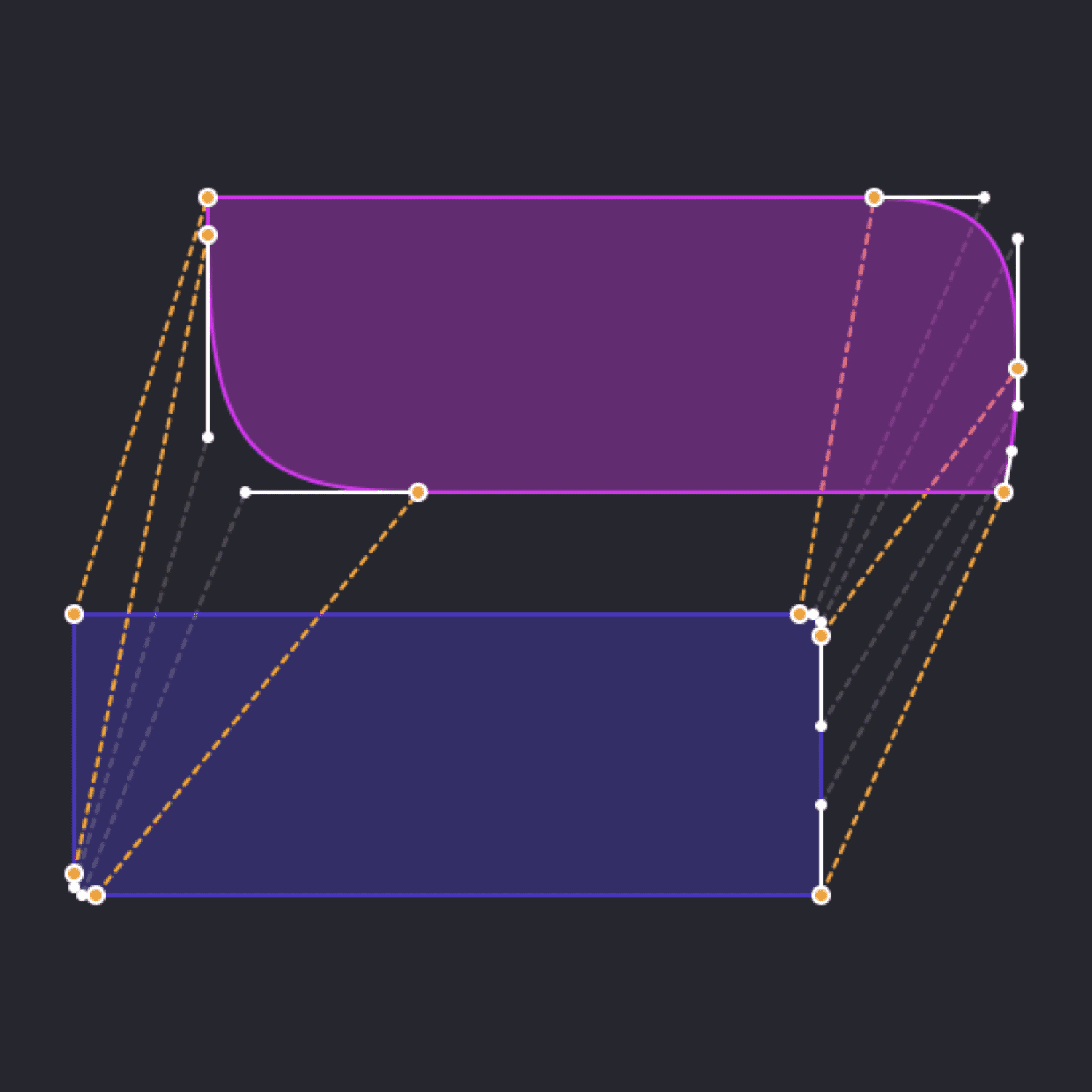
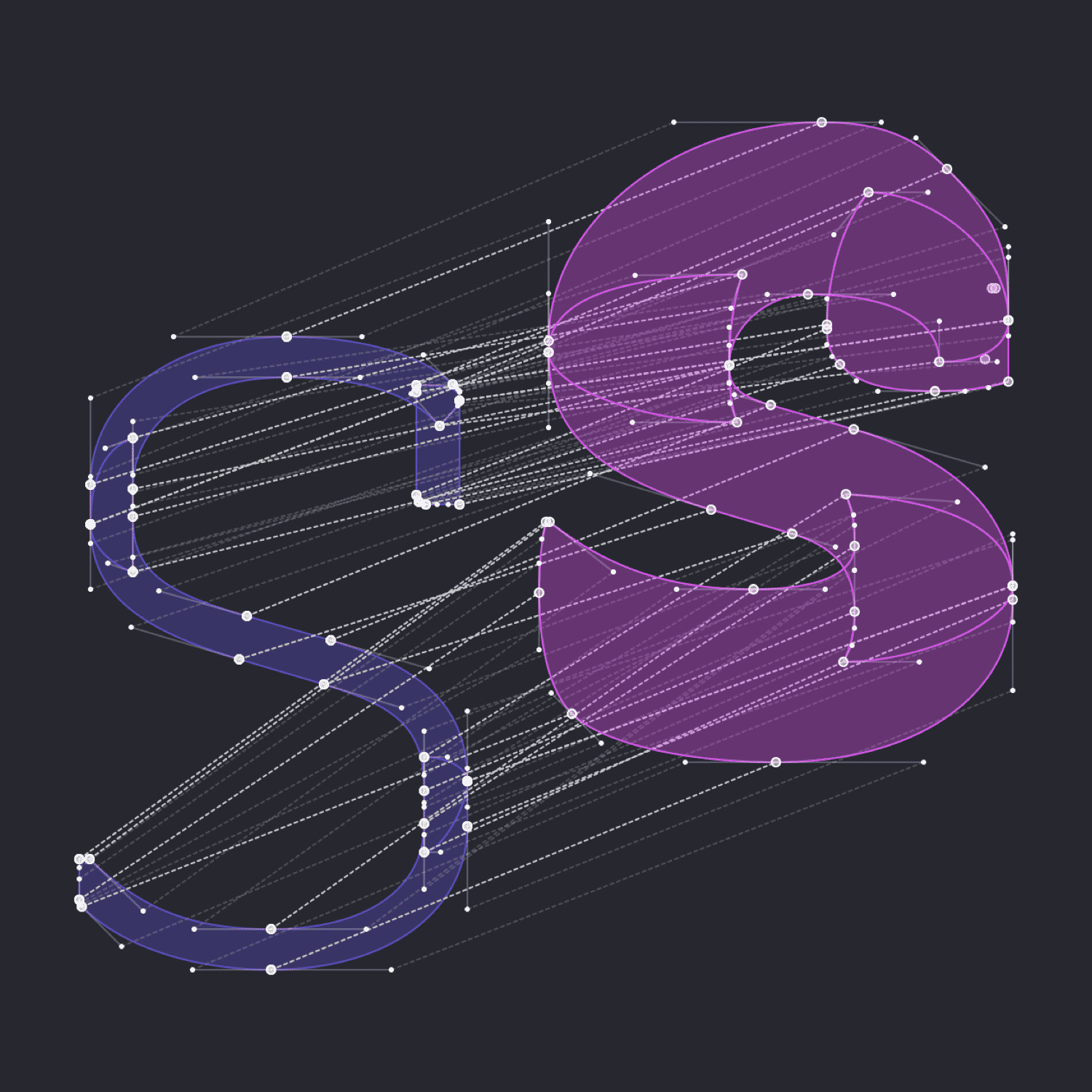
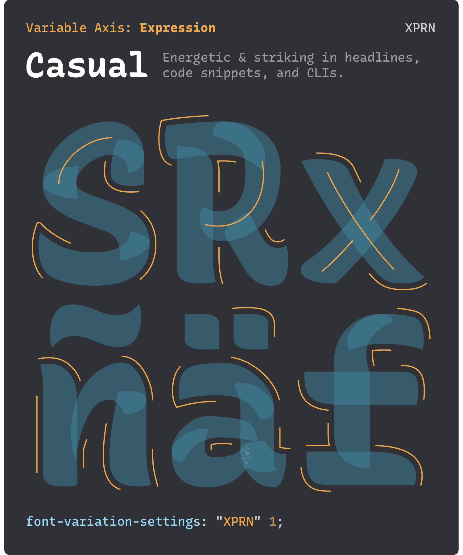
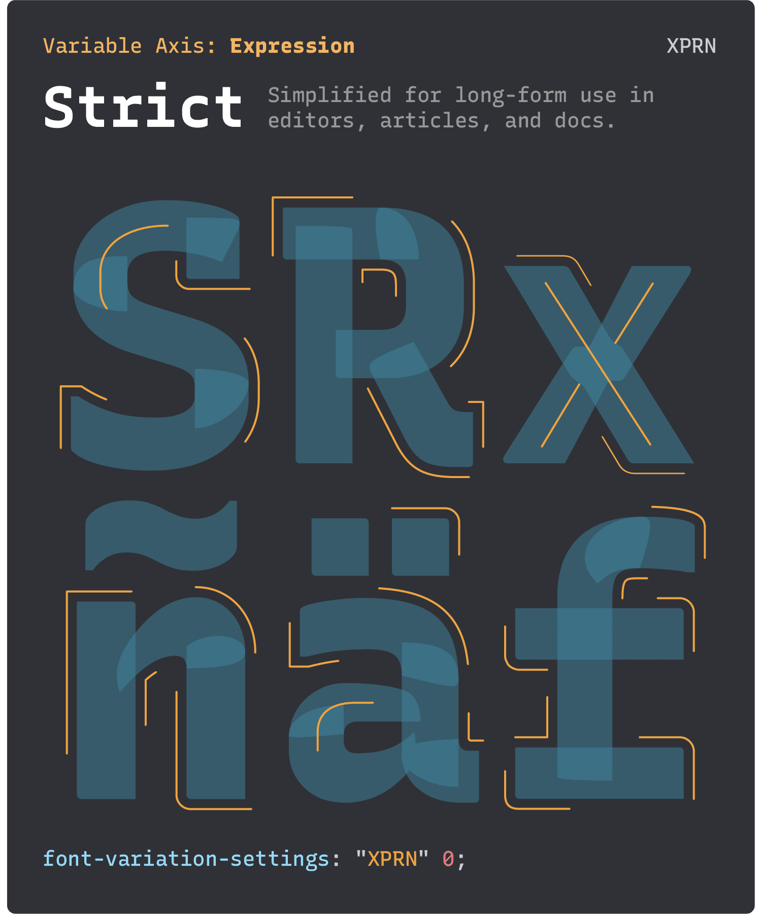
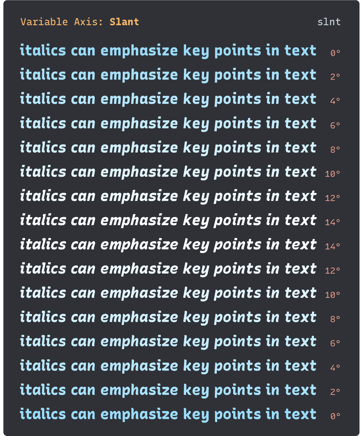
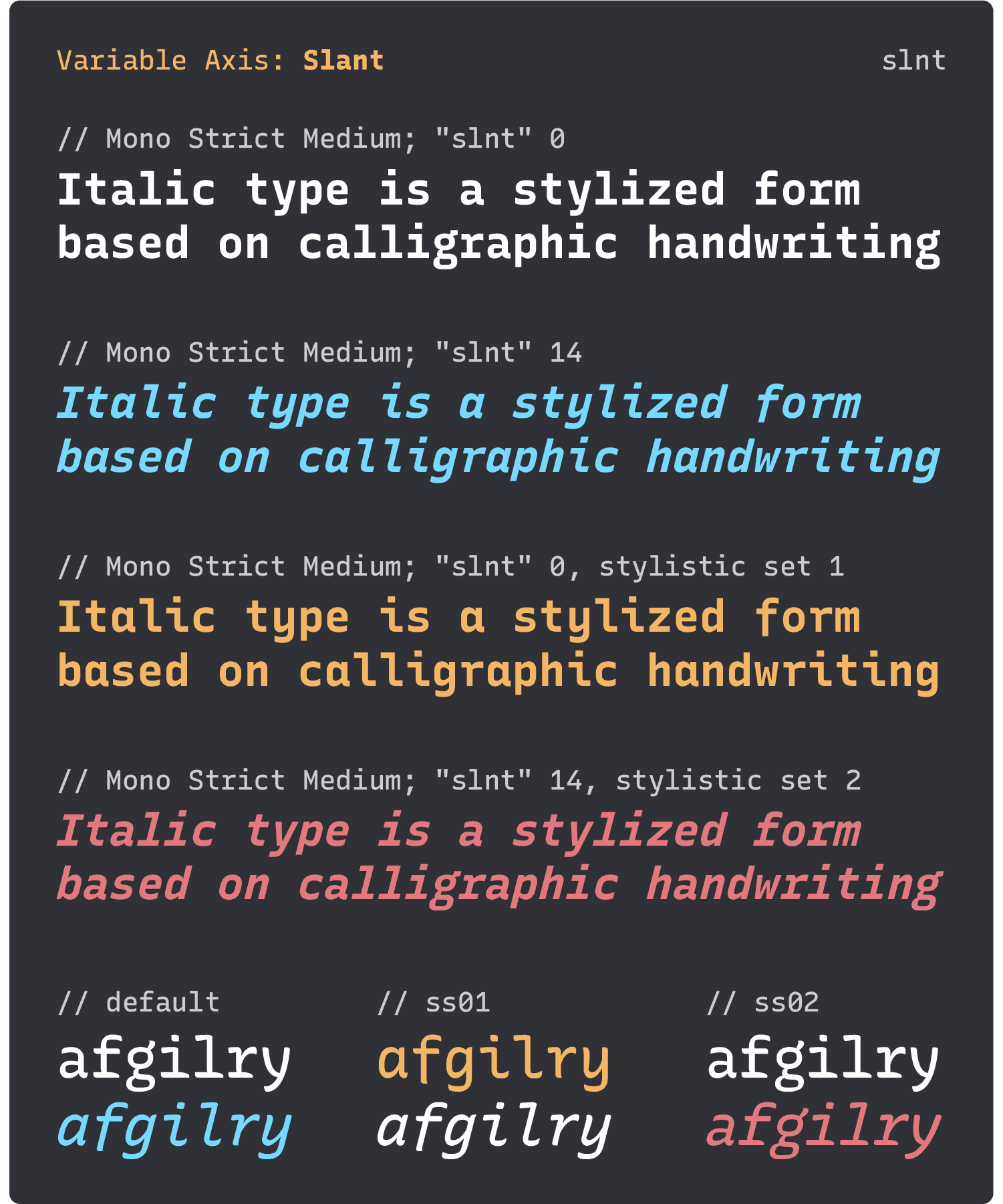
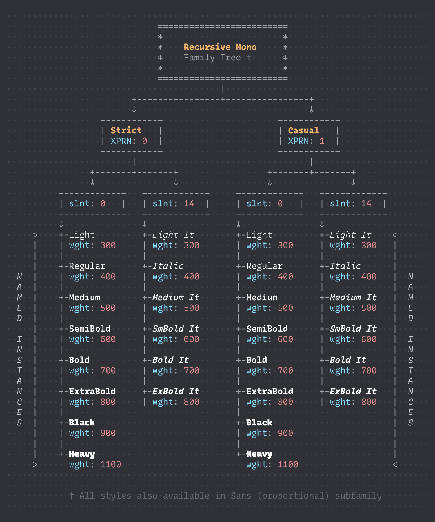
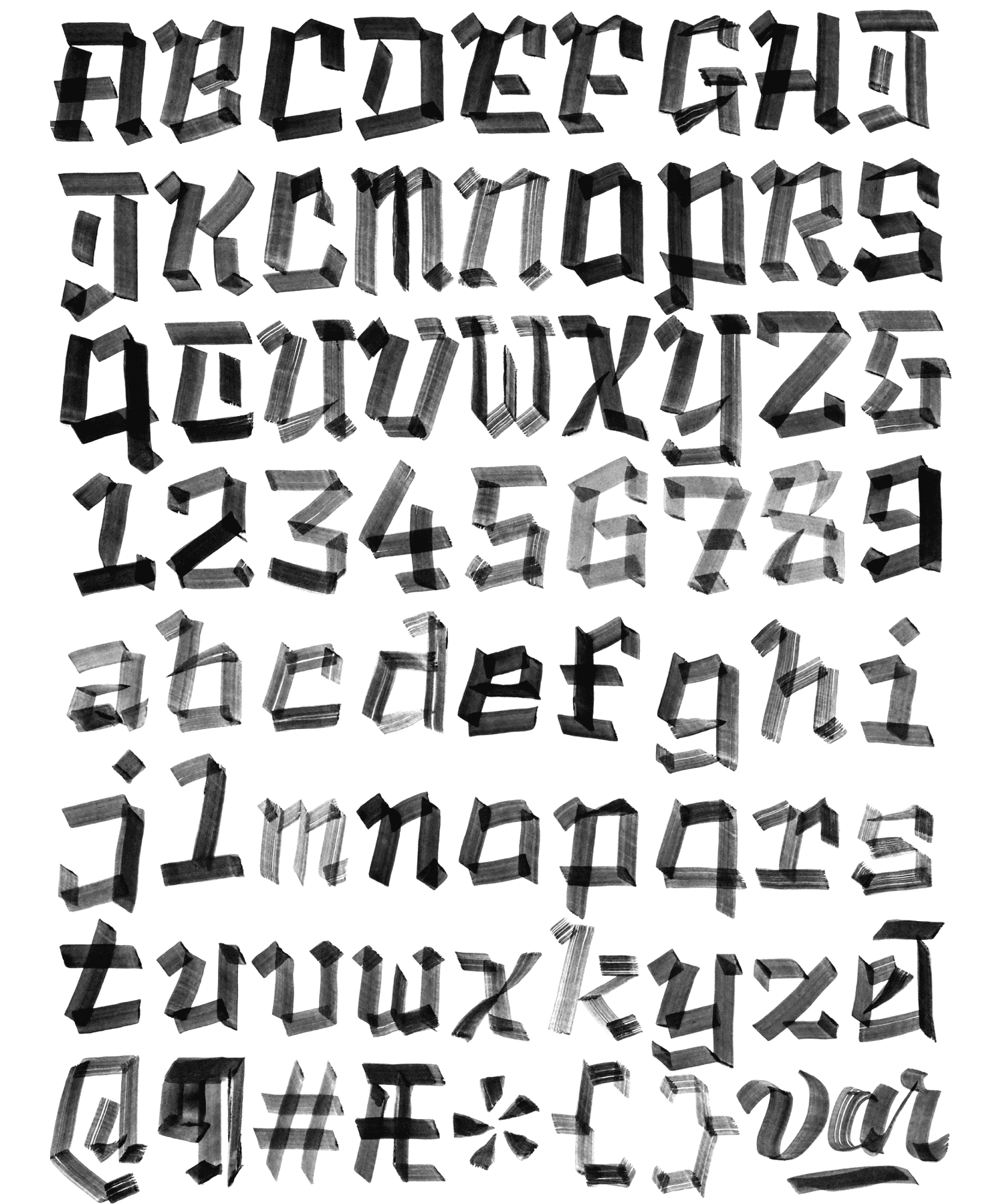
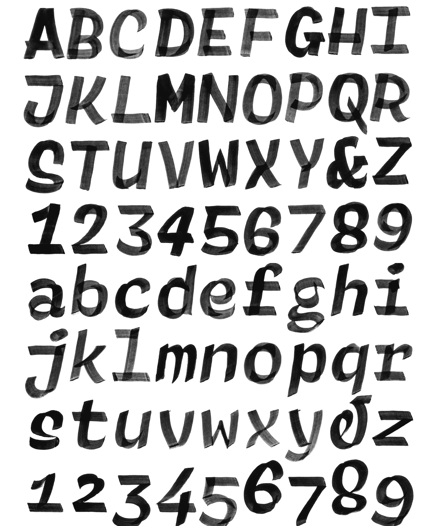
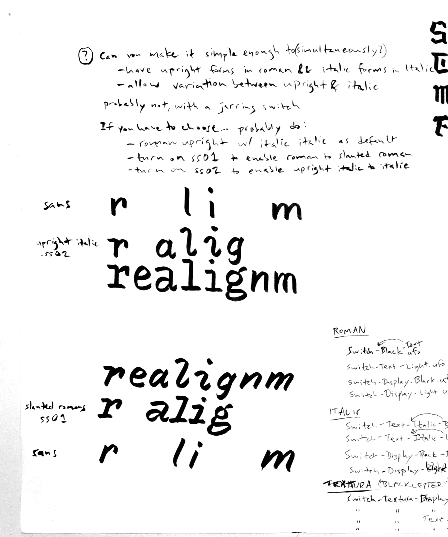
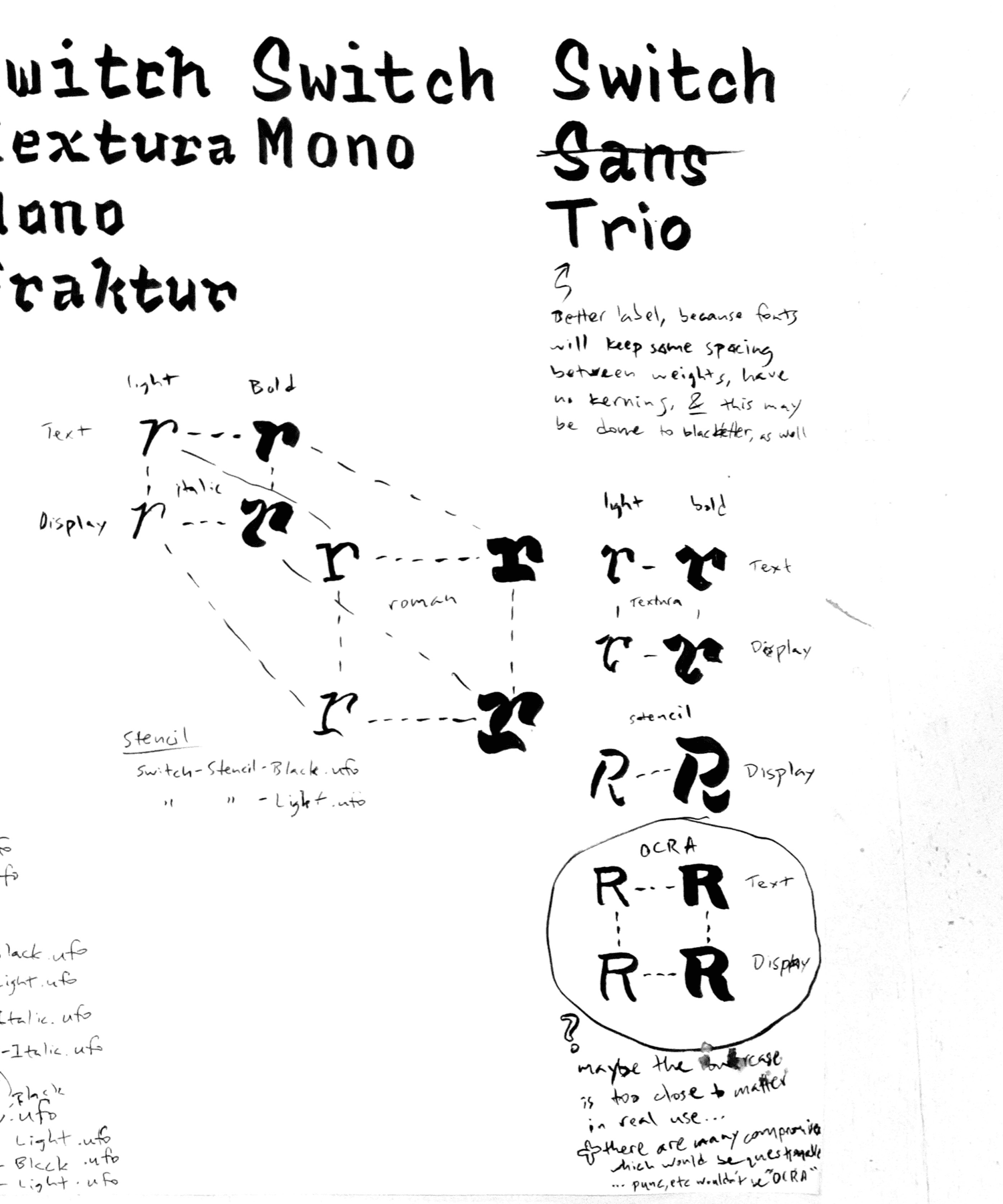
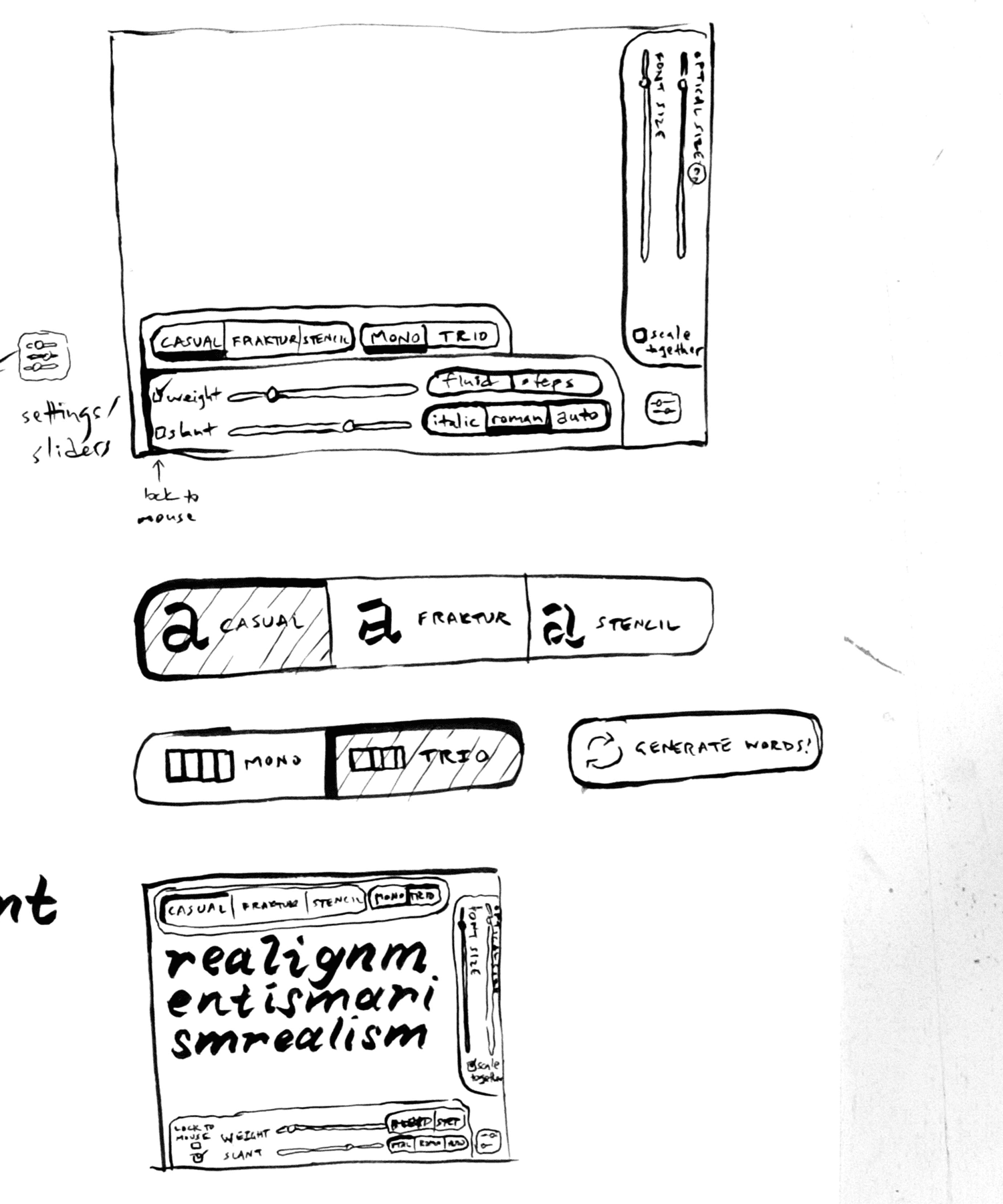
Interpolation between two contours requires very similar point structure. However, within this constraint, shapes can change quite a lot. The core idea of Recursive’s Expression axis is that letters can be built either from casual “brush strokes” or strict rectangular paths.
This atypical interpolation allows two sides of an “Expression” axis in the family, useful in slightly different contexts. The “Casual” side is more energetic and is better for short-form use in short scripts and in the command line. Meanwhile, the “Strict” side which is more subdued and is optimized for long-form coding and deep focus.
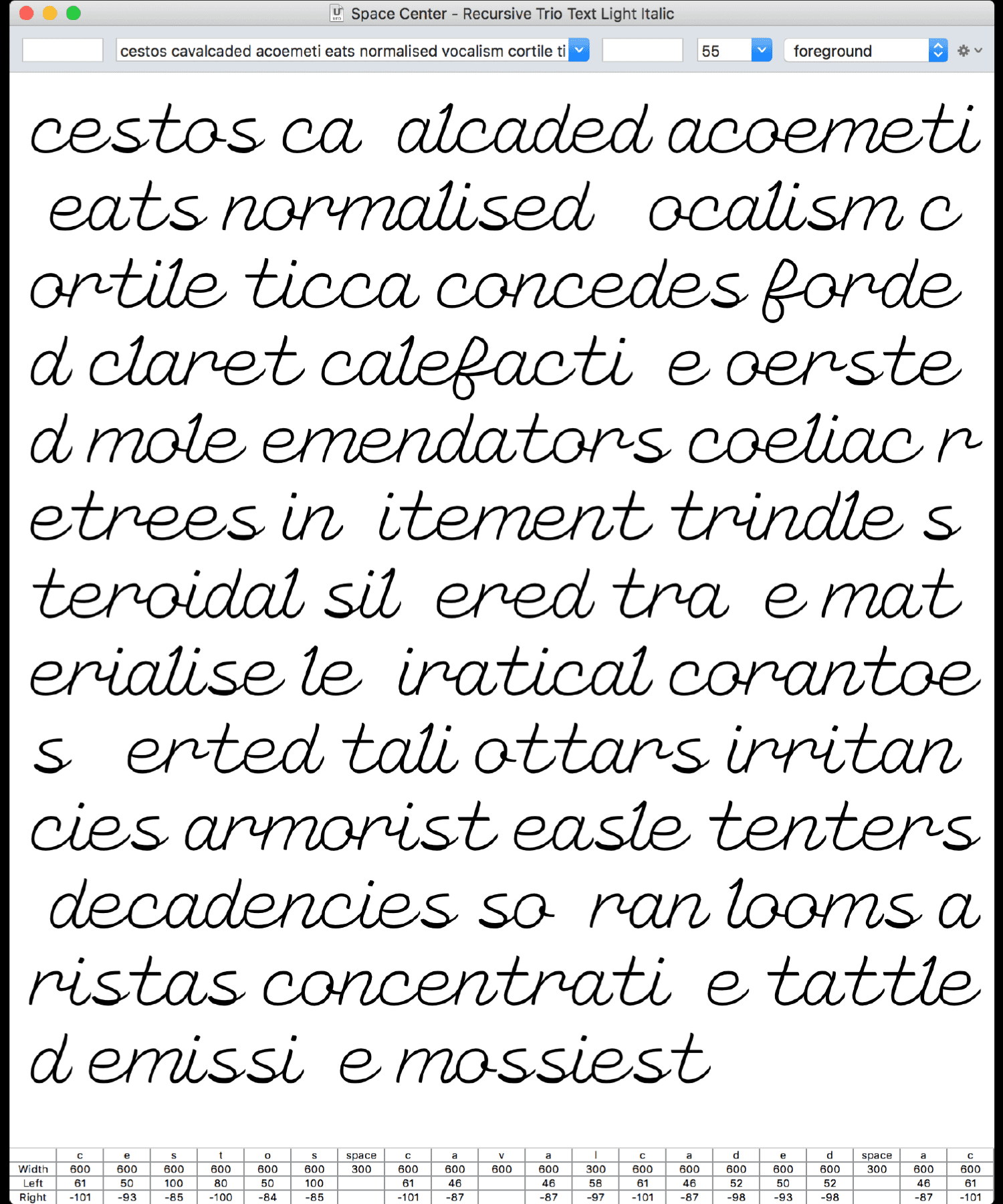
The Casual styles are my interpretation of single-stroke casual script as practiced by signpainters like John Downer, Gary Martin, Glen Weisgerber, and Sthlm Signs. The capitals get a little more flavor than most casuals, while the lowercase are disconnected Romans rather than script.
The Strict styles take the same basic skeleton, but bring the shaping towards forms inspired by screen-first code and UI fonts like Verdana, Bitstream Vera, Input, Covik, Apple SF, and IBM Plex. Open apertures and humanist strokes keep legibility intact to small sizes, while letterforms are optimized for even rhythm, clear spacing, and recognizability.
Drawing Recursive with “brush strokes” helped keep the central idea alive in a way that worked well for interpolation. Every letter is composed of brush strokes that could be morph from straight to curvy, thin to thick, and upright to slanted (I don’t actually recommend this drawing method to others, however, for reasons explained below).
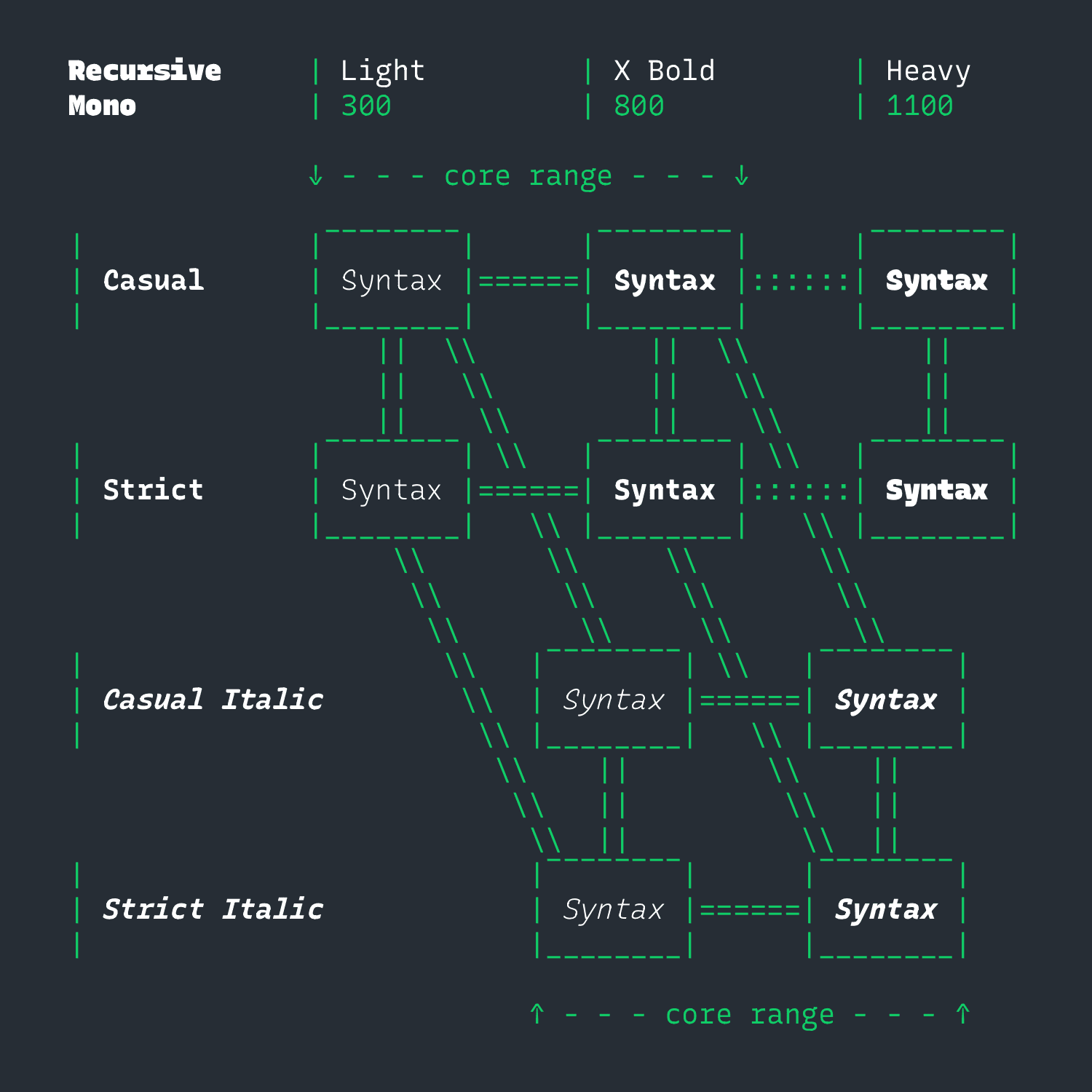
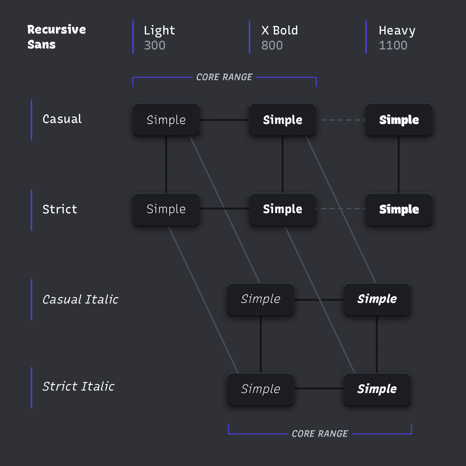
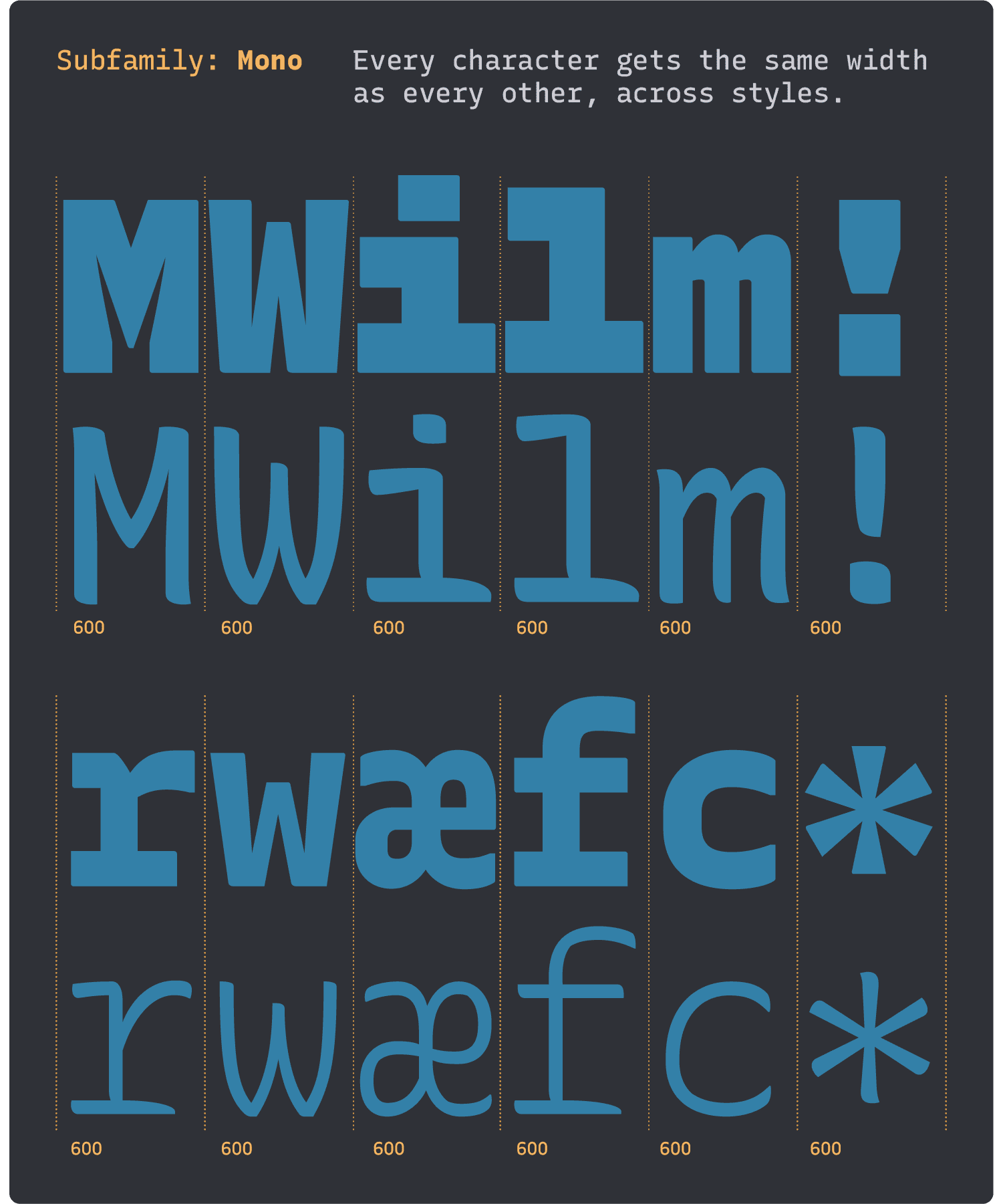
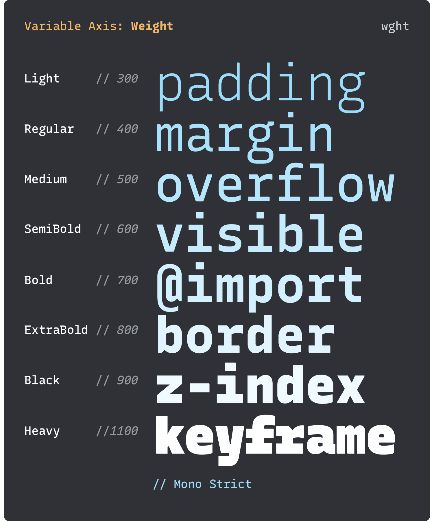
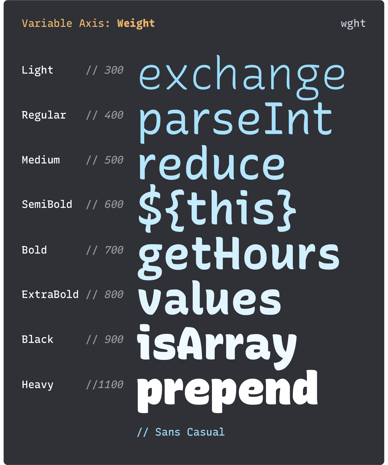
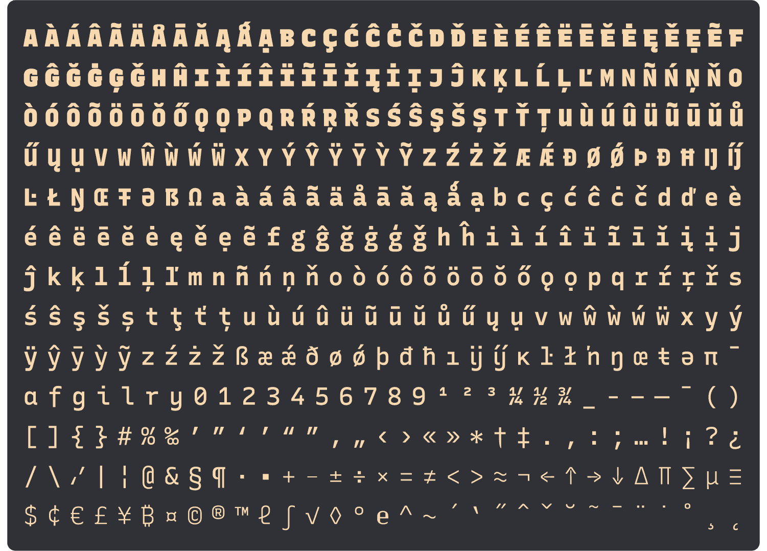
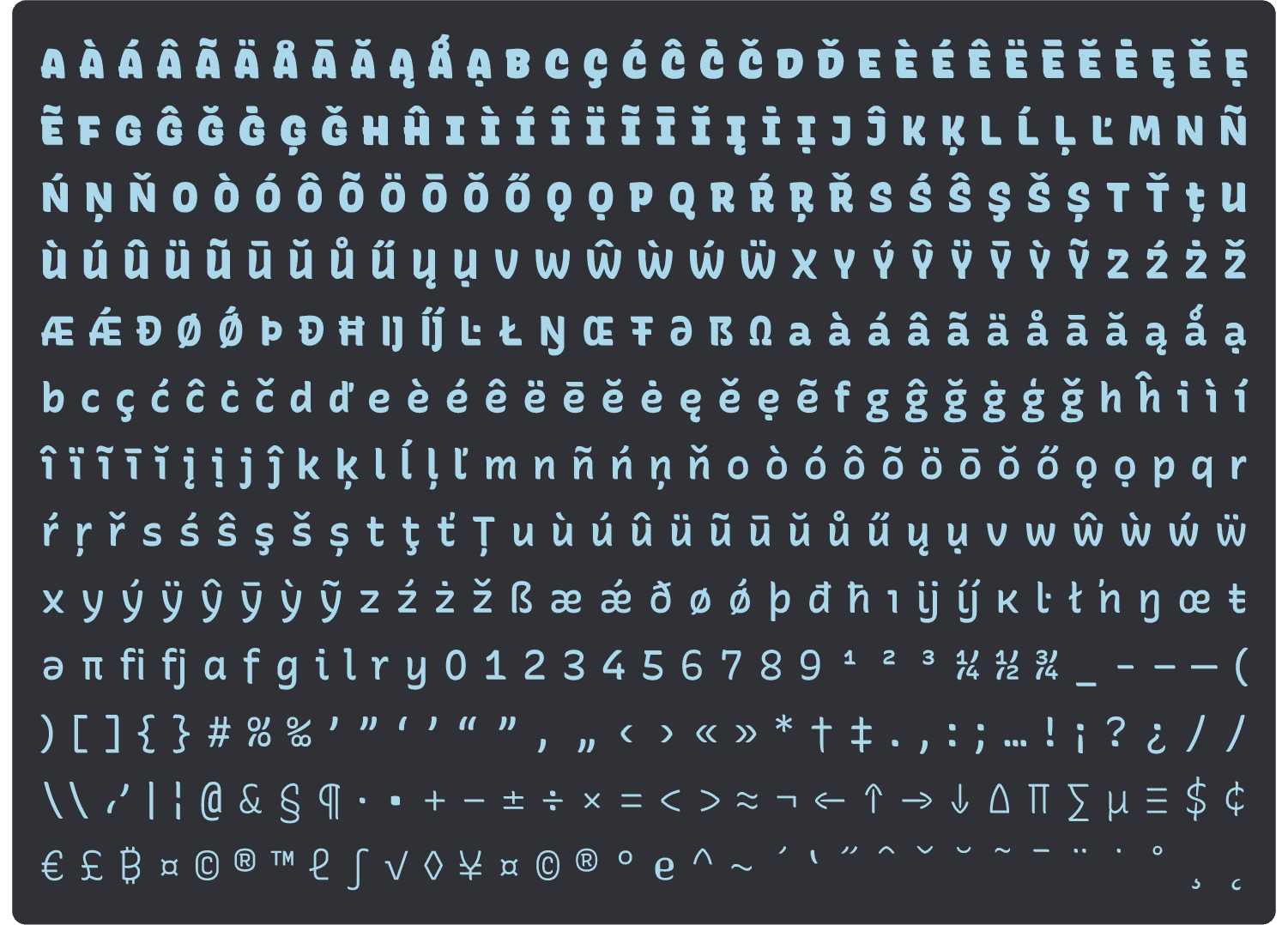
The designspace of Recursive is based on a 10-master system: a core weight range of Light to ExtraBold with Expression and Slant axes, plus two Heavy masters with an Expression axis only. These masters were created as monospace fonts, then duplicated and adjusted into (semi-)proportional Sans masters. In the tight timeline of the semester, this approach allowed me to create a large system, exporting working variable fonts by the end with an extended Latin character set.
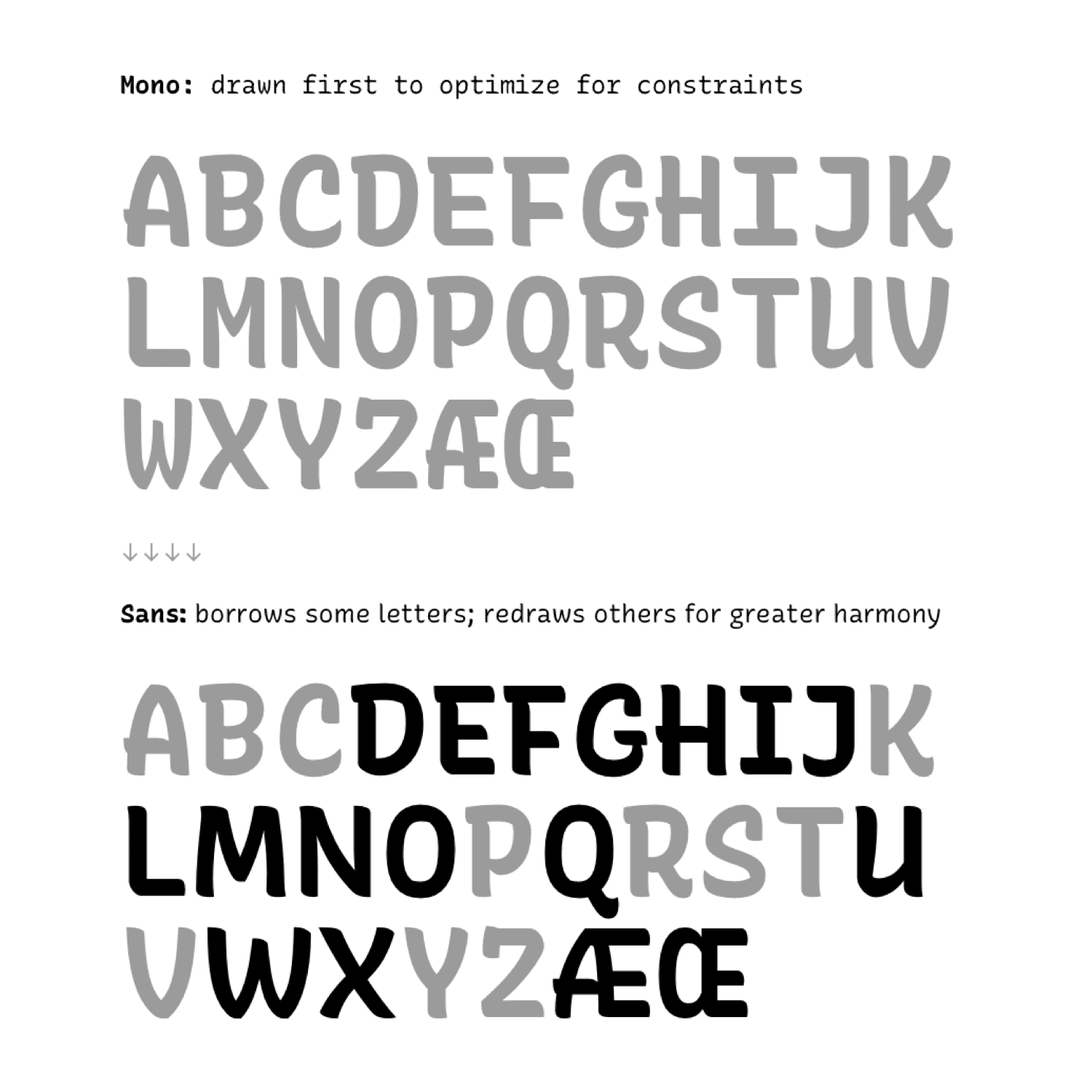
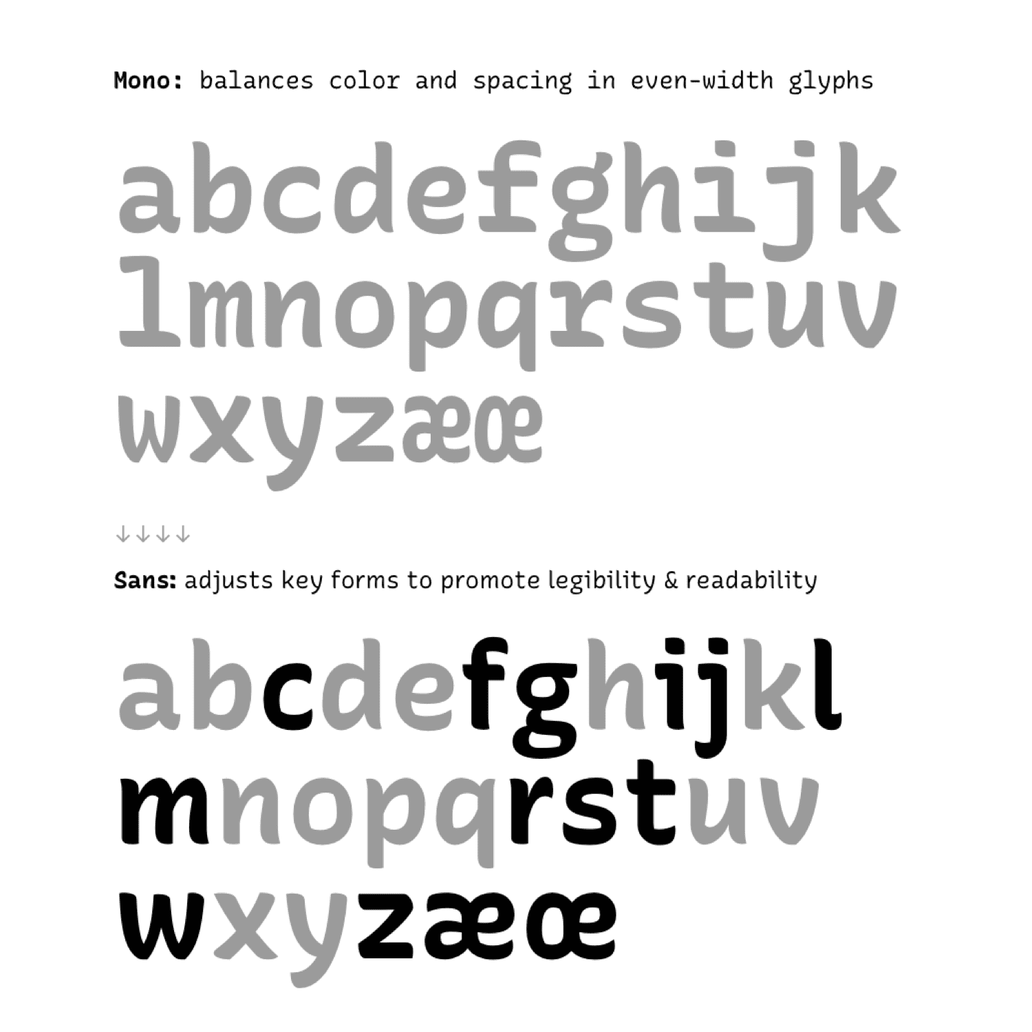
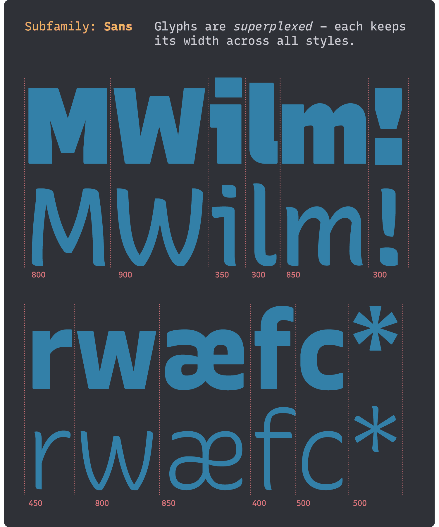
Much of the Mono character set was duplicated to make the Sans, but about half of the main Latin alphabet was adjusted to natural widths for better readability. Some adjustments were obviously needed, for letters such as /W, /M, /i, and /l. However, many letters needed to be adjusted just a little bit. Instead of taking the extreme of only adjusting these few obvious letters or the traditional approach of adjust all letters, Recursive Sans uses a grid system of 50 units for glyph widths (out of a coordinate system of 1000 UPM). That is, rather than being arbitrary widths, letters are 300, 350, 400, 450, 500, 550, 600, 650, etc. Inspired by grid layout approaches from software design, this approach allowed for an efficient design process and an outcome that has (mostly) natural proportions and a steady horizontal rhythm.
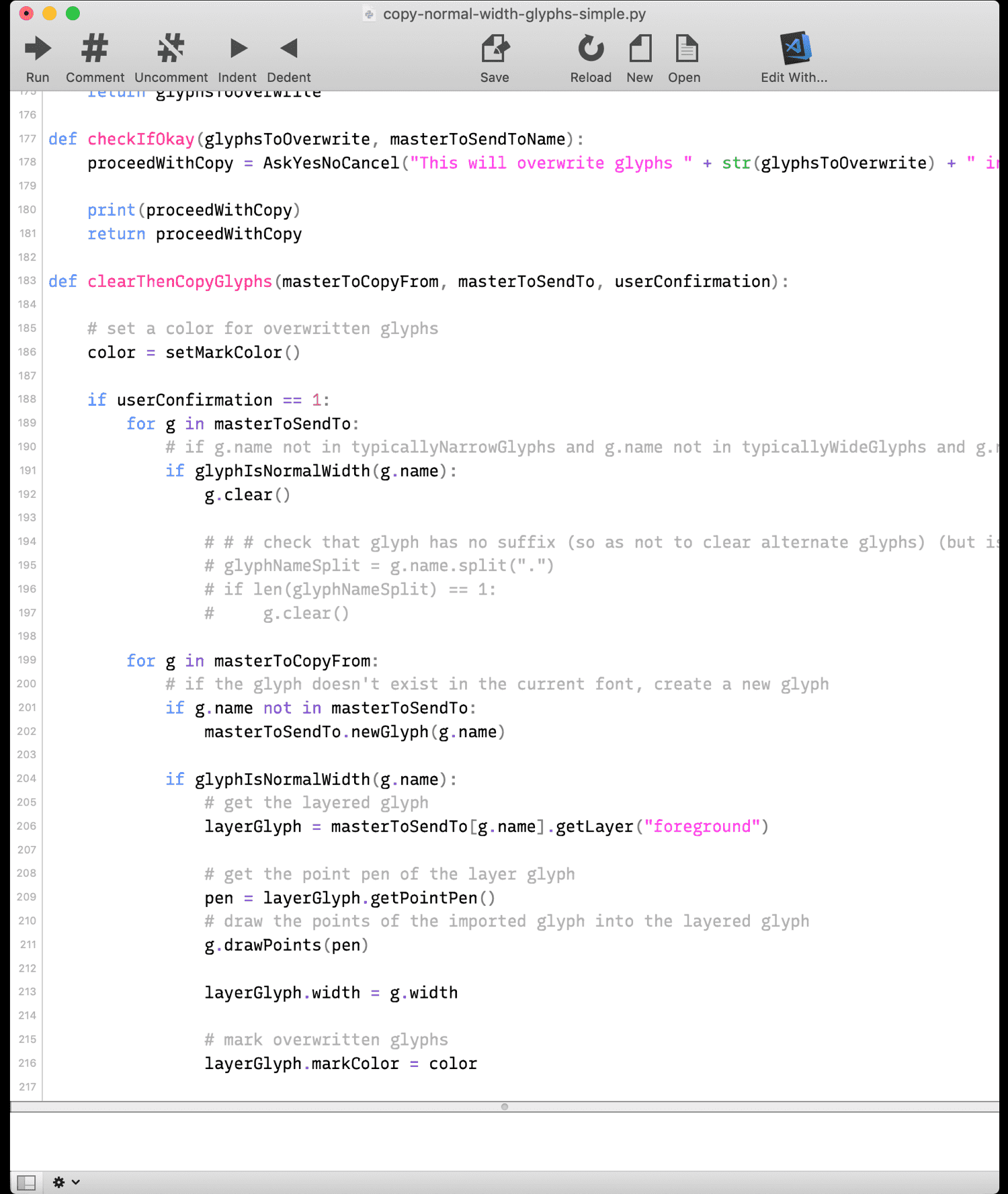
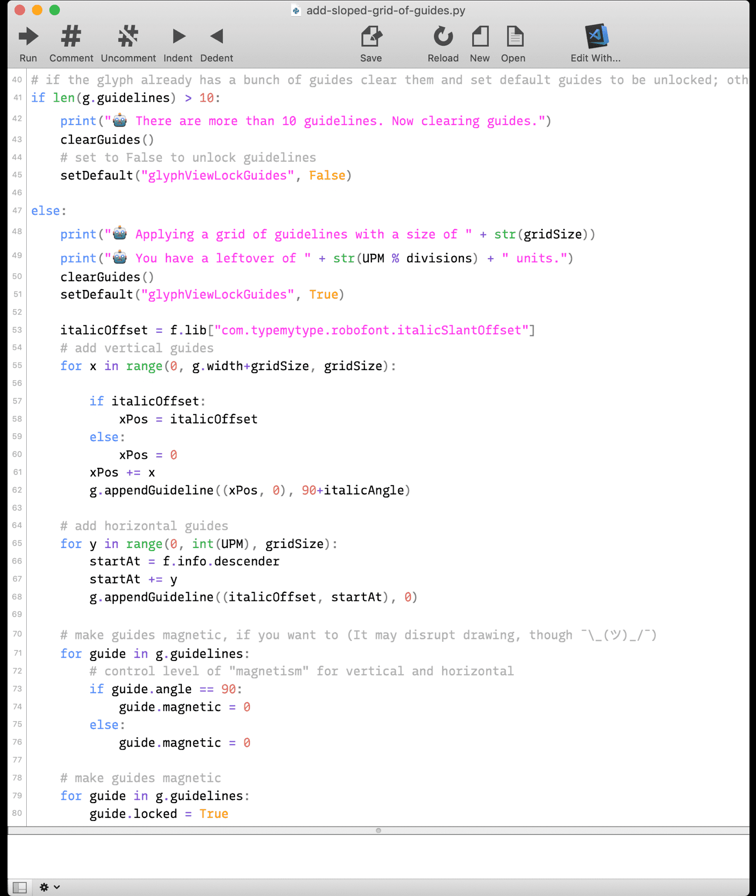
Throughout the semester, I wrote a number of Python scripts to improve my workflow in RoboFont. Some did a lot of work: one script orchestrated the duplication of “normal width” glyphs from Mono to Sans masters. Some were tiny but useful: my most frequently-used were scripts to create a grid of guides and to make suffixed copies of glyphs for experimentation. Of course, all were coded in the then-current versions of Recursive, helping me to find and fix issues. True to its name, Recursive was used to make itself.
Testing & Refining
I made the early decision to set the monospace character width to 600 units (out of 1000 UPM) to match what is a somewhat standard dimension for monospace fonts. This dimension was started by “10 pitch” typewriter fonts that would fit 10 letters-per-inch, and became a standard for computers thanks to fonts like Courier. Using this common metric allowed me to test Recursive in browsers and text editors even at its earliest (partially-drawn) versions, by using compatible monospace fonts as fallbacks to missing glyphs.
The very first iteration of Recursive was made merely to test whether the idea of a casual-script monospace could be a viable typeface. To make it this first prototype quickly as possible, I drew a simple character set over the top of IBM Plex Mono. This let me focus on creating the fastest possible test of the idea without initially worrying about deeper questions around proportions and glyph margins. Immediately after deciding that this was indeed the right project, I scrapped these early designs in order to root the drawing in my own visual judgements.
Some of the earliest “Strict” and “Casual” versions of Recursive were … rough. A proud moment was independently showing these explorations to two type designers I really admire – and seeing both of them grimace immediately, in a very similar way, at how chaotic and ugly it was. Luckily, they each went on to give feedback that was extremely helpful to the project! TypeMedia is a constant flow of critique and response, which is a big reason that students are able to learn so much in such a short time.
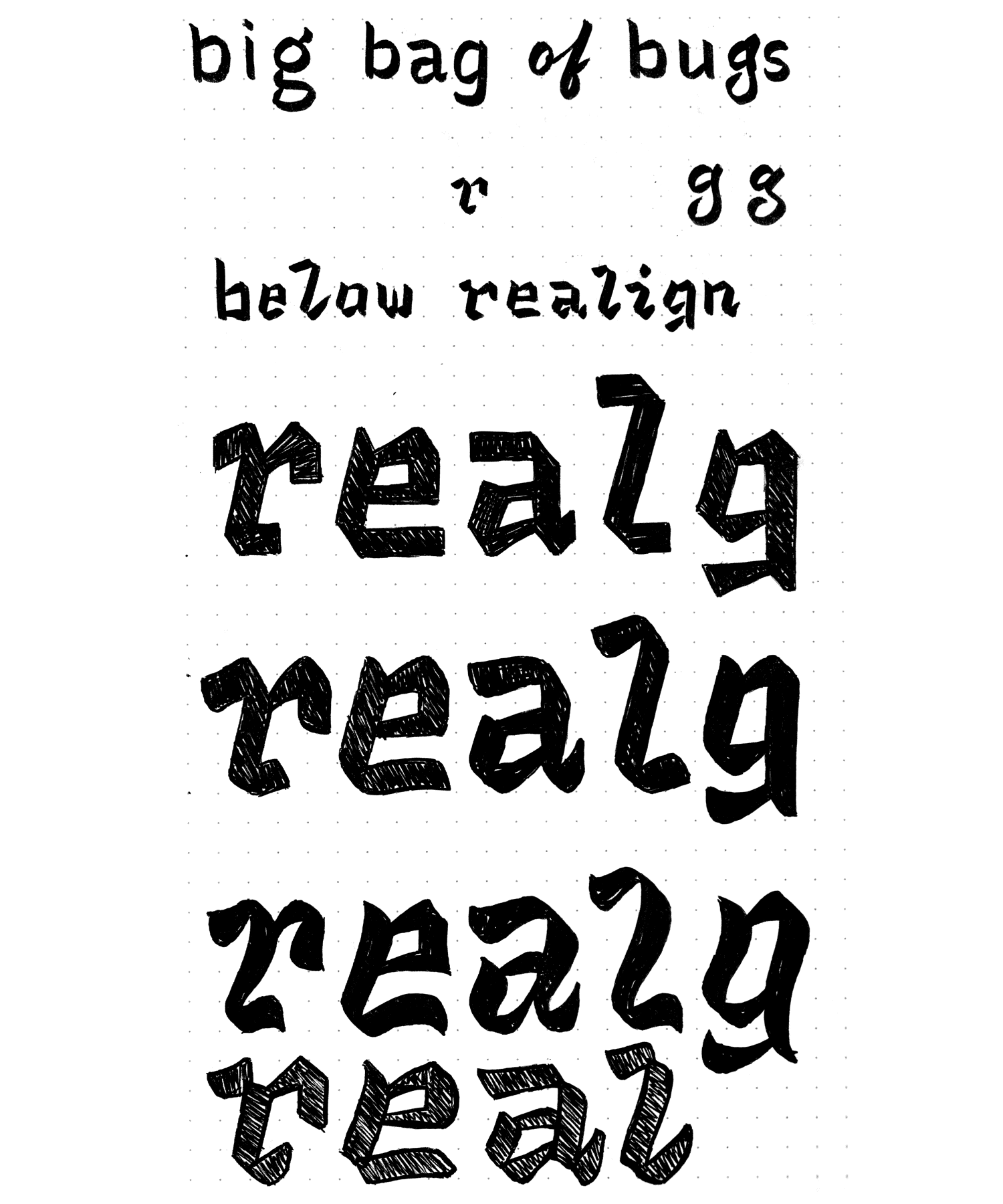
Towards the beginning of the project, I experimented with making a connected-script italic – partly motivated by a desire to live up to the name I found for the project (emphasizing the “cursive” in Recursive), and partly movtivated by a desire to do something fun and weird. I even wanted to create a casual-script blackletter, to have a style that was neither Roman nor Italic, for a third level of emphasis. However, I started to scale back from such experimental directions after seeing them in sample texts & code. Even with partial character sets, it was clear that connected scripts and casual blackletters would not provide a pleasant coding experience, and may not even work so well as display faces. For the semester, I made Italics that were mostly sloped-Romans, but with a few key lowercase glyphs that would substitute with true Italic forms above 7° of slant.
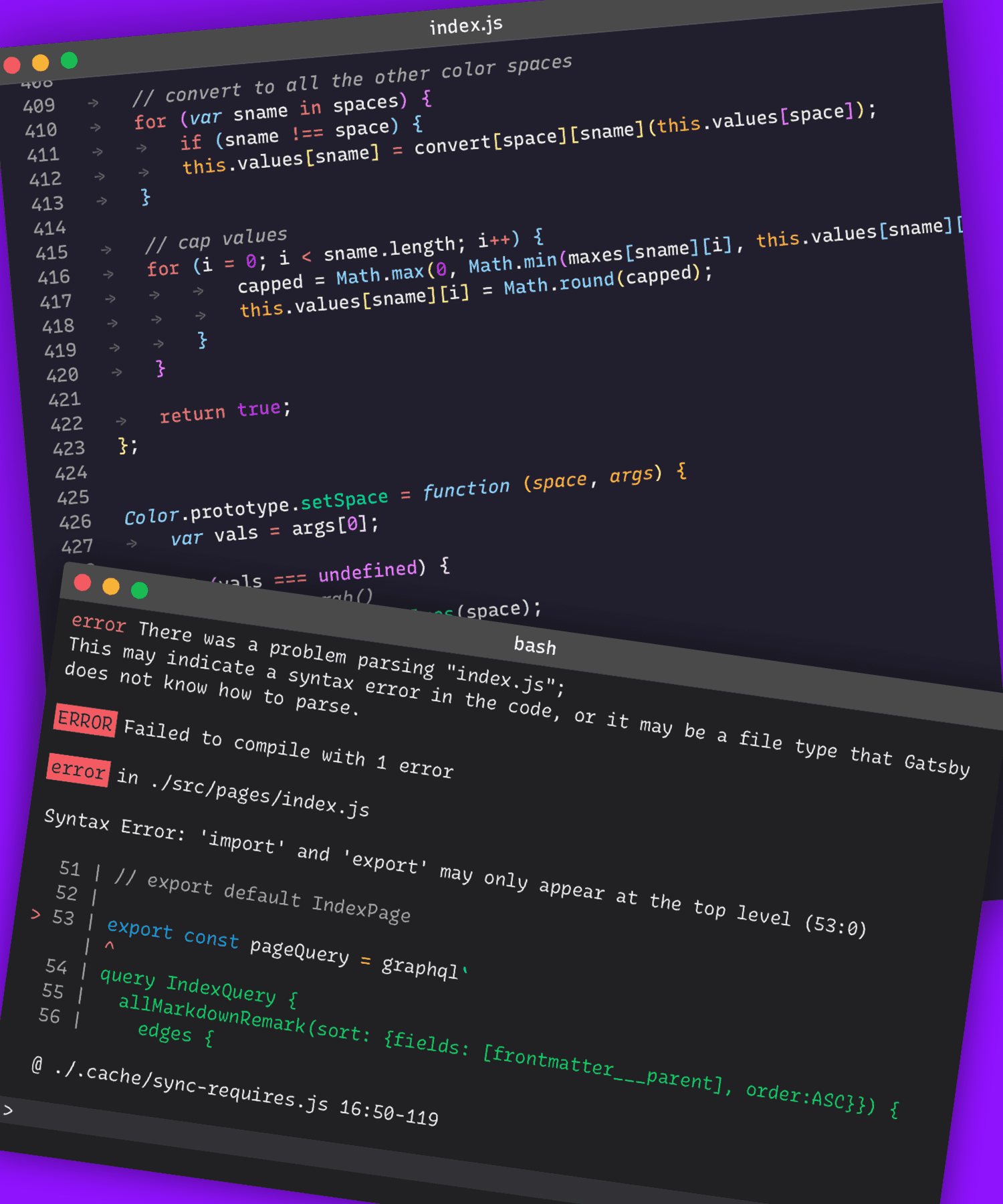
I spent much of the semester avoiding making type proofs in traditional desktop design tools, instead opting to build templated, browser-based proofs. This was fun and (somewhat) useful, but had its limits. Even though web code can make some types of updates very efficient, it can also require debugging at unexpected and inopportune times – in the case of the semester, sometimes just before critique. For some kinds of quick tests and immediate questions, traditional desktop design software can be extremely efficient tools for making proofs.
At the start of the project, I wanted to do everything in code, including the print specimen and process book. However, in prototypes, I discovered how poorly CSS print specs are supported by major browsers, which meant that this route was not viable. While tools like PageBot promise to bridge the gap between code and print, I found that for now, InDesign still has its place.
A fun (and useful!) diversion was developing a Chrome extension that allowed me to override any web page with Recursive. This extension was surprisingly useful in helping me to find and correct aspects of the design such as weight relationships and clarity in long-form text.
I created a type tester to go along with my exhibition poster, and evolved this into a preview site at https://recursive.design. Check it out if you’d like to learn more about Recursive!
A project takeaway: test early, test everywhere
After TypeMedia, I continued to use Recursive Mono & Sans in coding and in design work. Through this, I found many more issues, big and small. The biggest problem: my approach of drawing contours as separate “brush strokes” resulted in terrible rendering on non-HD screens. Specifically, areas of overlap that occurred on the exterior of shapes often yields little black “blobs” where the antialiasing of two contours overlaps. In large text, this can be ugly, and in body copy, it can be downright distracting. Humorously, I was the only student in my year who ended up with a 4K monitor (because the previous monitor at my desk stopped working), and aside from my Retina laptop screen, the only other place I saw my type was in printouts. Therefore, I didn’t see this rendering issue until after graduation, when I finally hooked up to a normal screen again. I do hope that this rendering issue may someday be a solved by better text renderers, because it affects all kinds of overlapped type. However, for the foreseeable future, it is a big flaw that won’t be solved overnight, so I am removing most of the overlap from Recursive, to better handle this constraint.
My novel drawing method did help shape the design of Recursive in positive ways, but I definitely would not recommend it to anyone starting a new typeface. Beyond that, my failure to see the issue until far into the project is a cautionary tale: anyone making digital products must test them in as many contexts as possible, as early as possible.
What’s next?
I am currently working to improve Recursive for eventual release! It will retain the same spirit and warmth but will recieve many improvements, big and small – fewer contour overlaps, a bit more contrast, smoother curves, some stylish inktraps, a more-cursive italic, and a Heavy Italics for a fuller designspace.
I am extremely thankful to my teachers, visiting designers, and classmates for helping me to learn and grow so much in a whirlwind of a year. Not only did they help shape Recursive as a project, but they helped shape me as a designer.
Photo by Peter Biľak