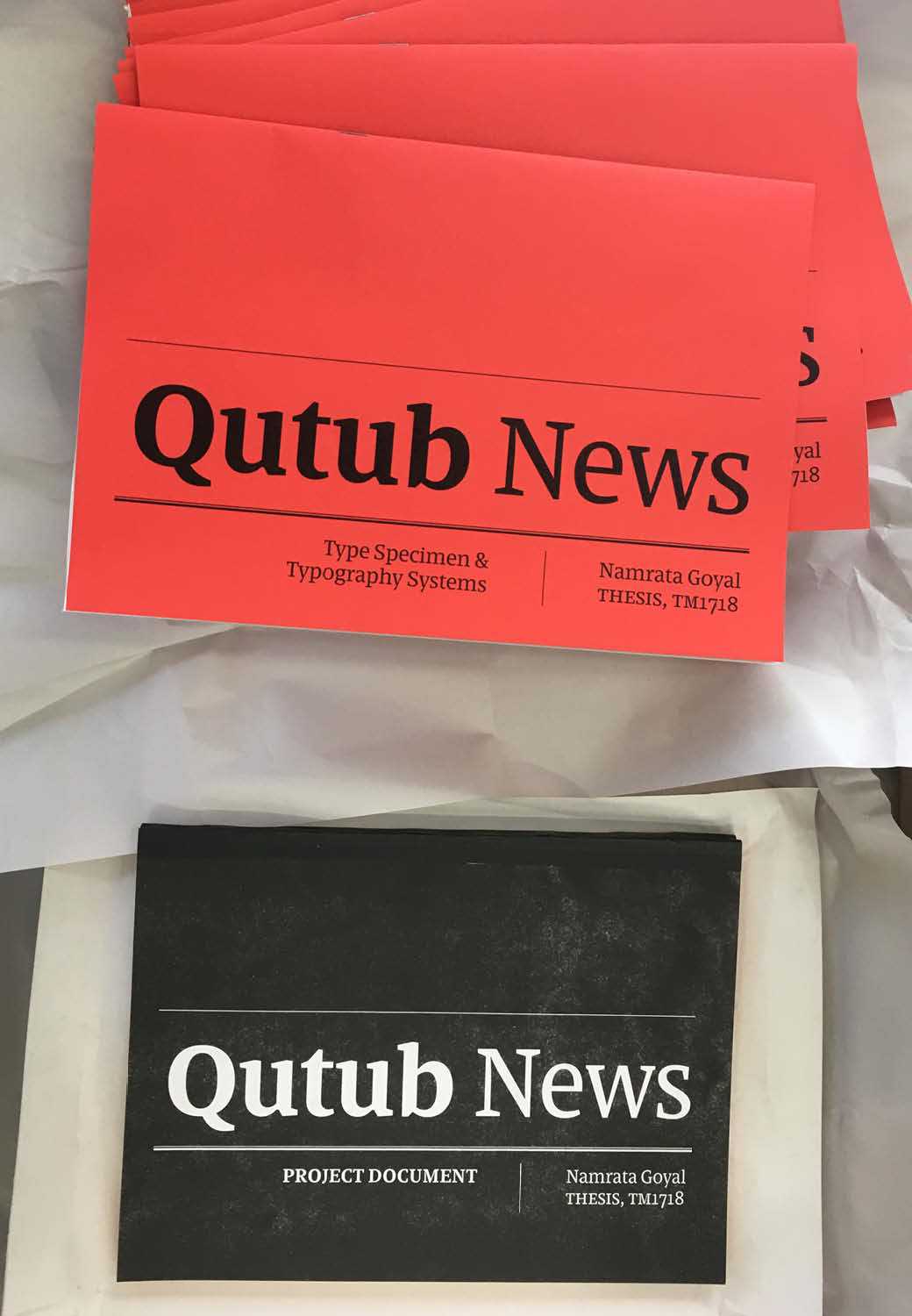
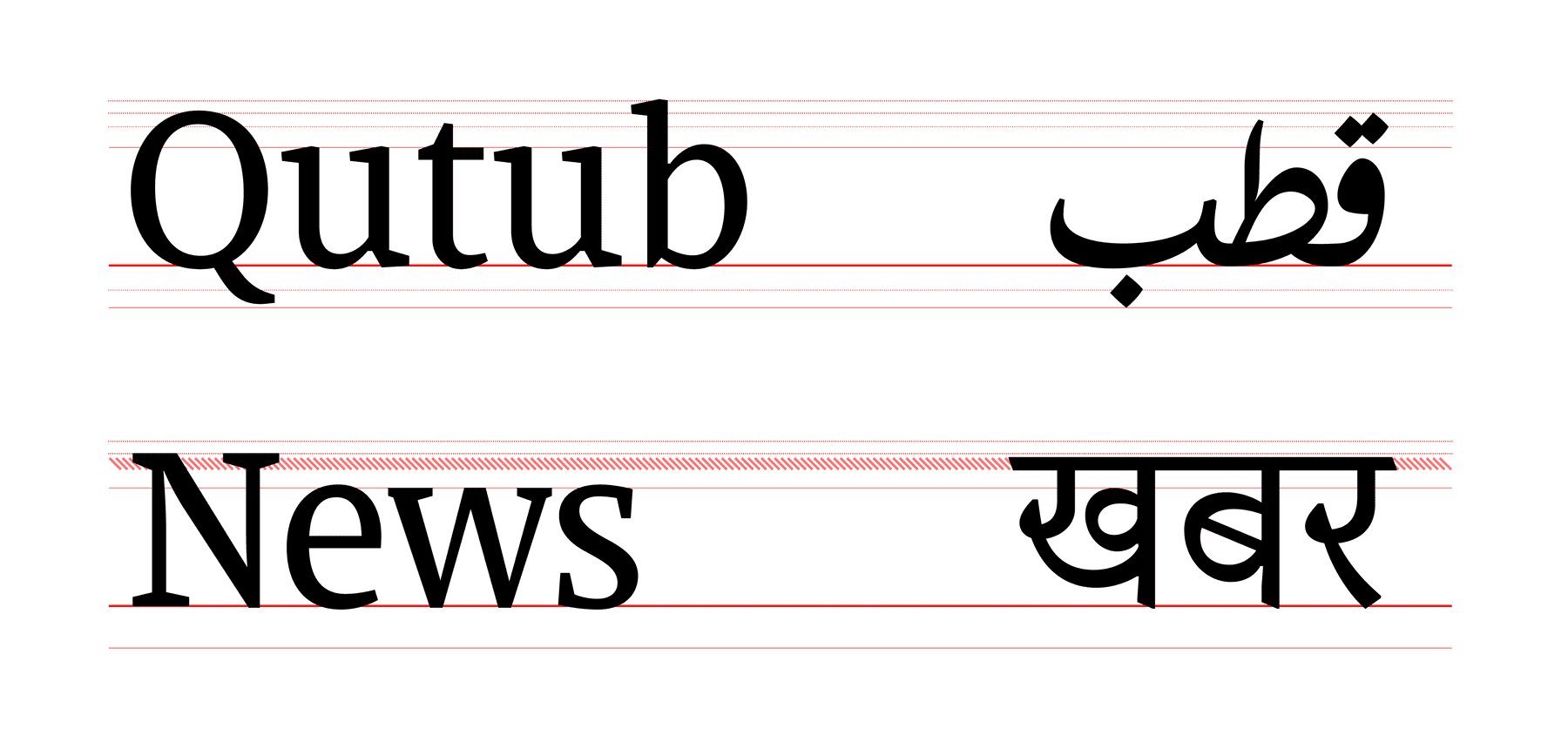
Qutub News
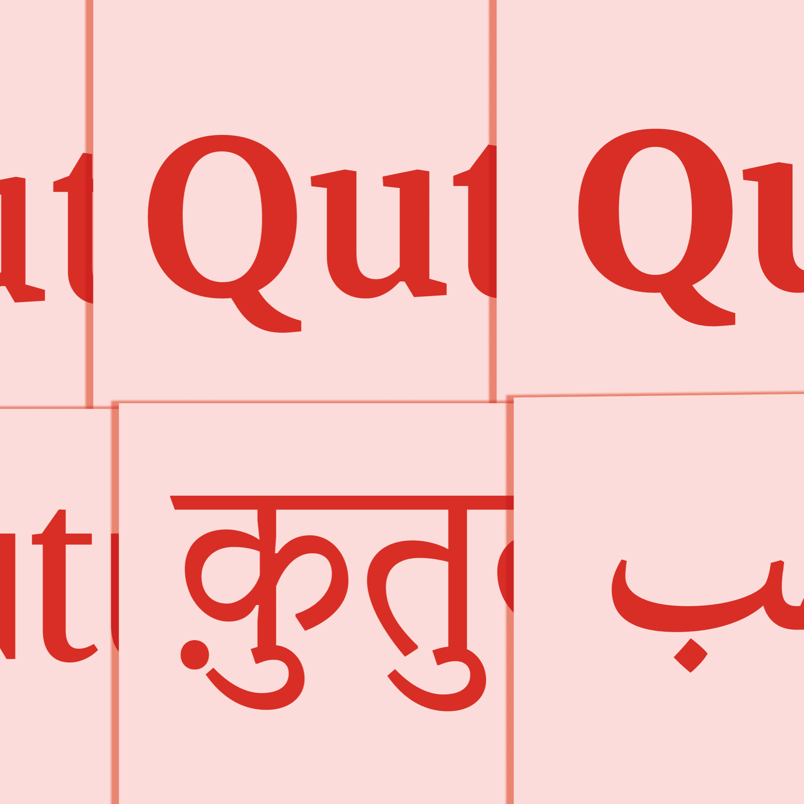
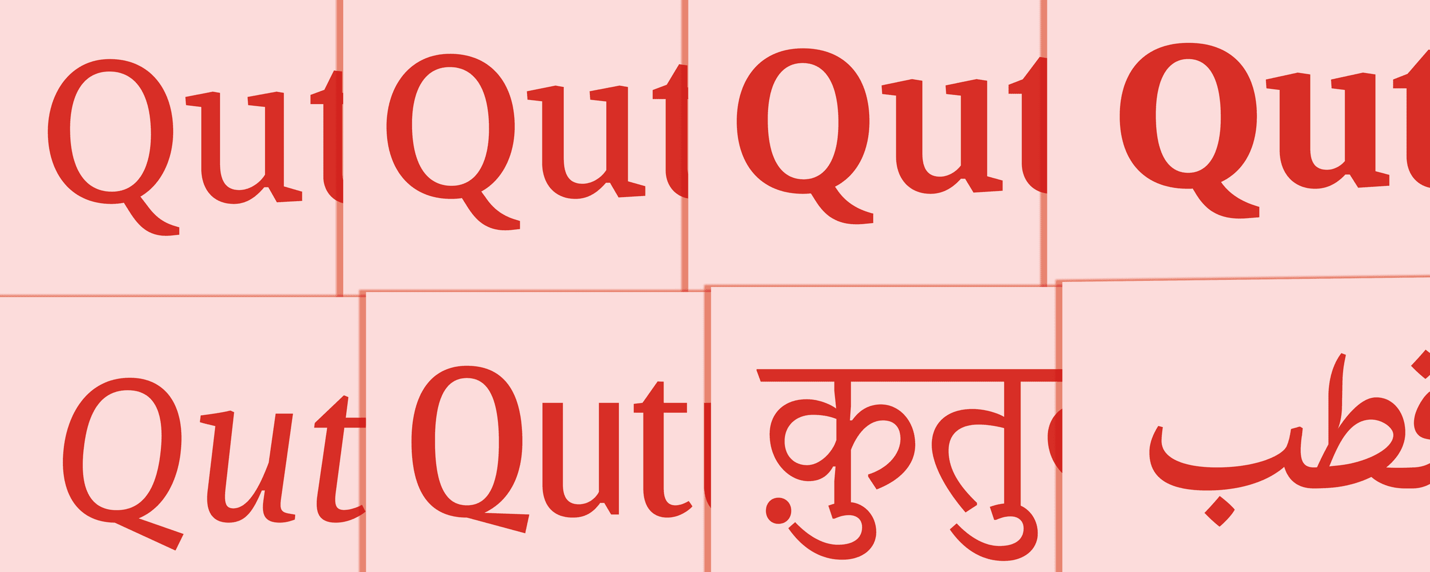
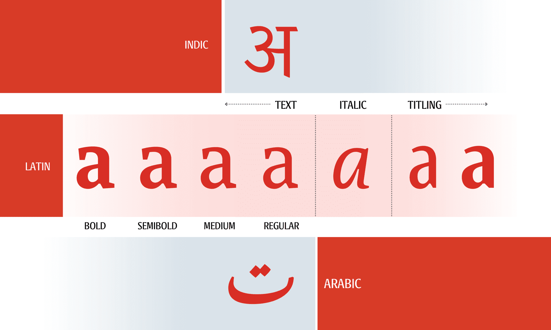
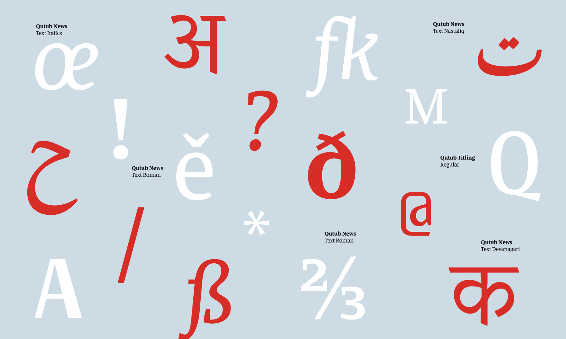
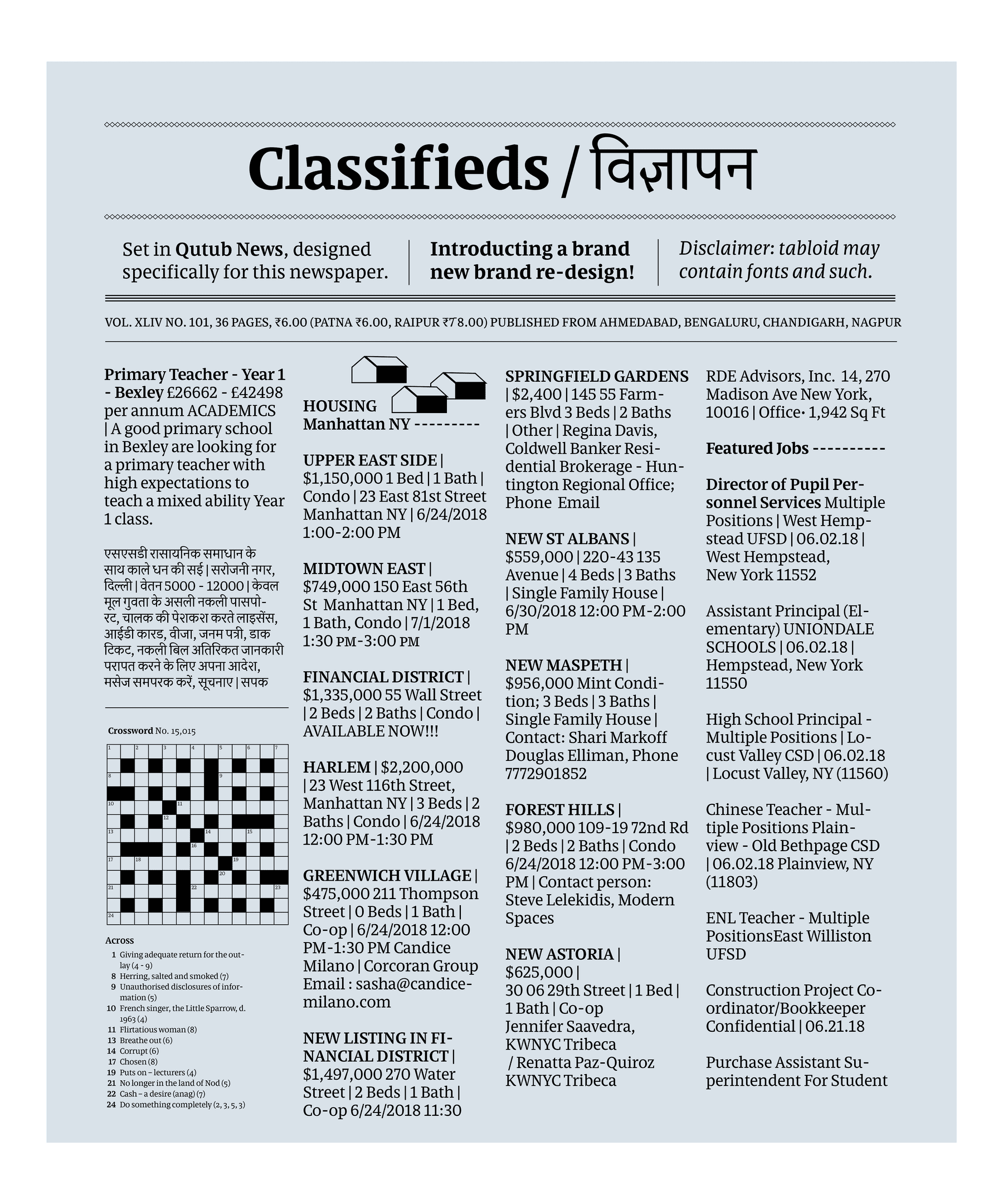
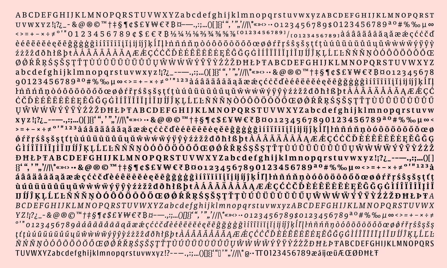
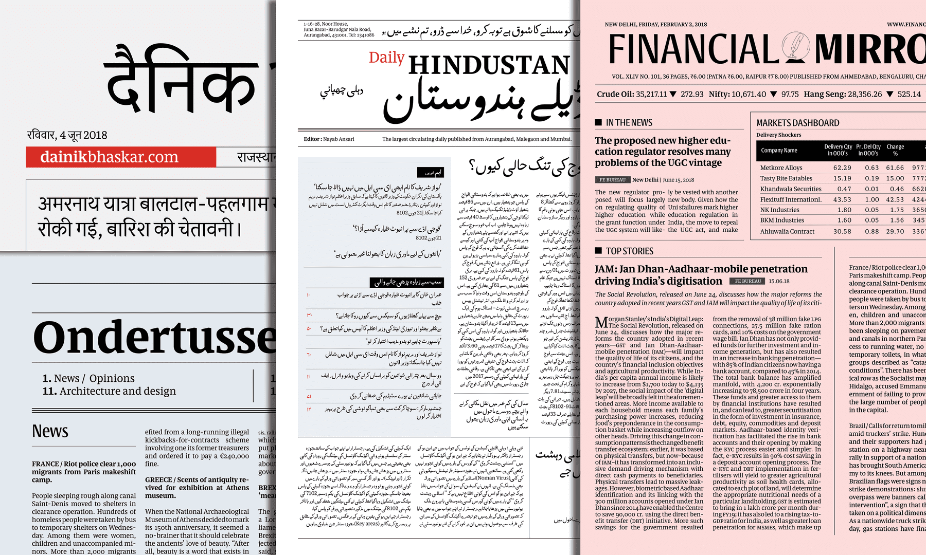
Designed for the needs of local newspapers in India, the type design balances functionality and tradition. It encompasses the three main styles for setting news in Headlines, Text and Italics. Also explored in the project are proposals to extend the type family to other scripts, beginning with Arabic and Devanagari. ¶ The type family is intended for a news-house that publishes tabloids in major languages from India including English, Hindi and Urdu.
Namrata Goyal
IndiaNamrata graduated as a visual communication designer from Srishti School of Art, Design and Technology in Bangalore, India. After a couple of years of drawing type at Indian Type Foundry, she went on to pursue the discipline further at Cooper Union in New York and received her Masters in Type and Media at KABK Den Haag, in 2018. She is currently working as an independent type designer, though equally enjoys working with a team and collaborating. She has drawn type for Latin, Devanagari and Gurmukhi scripts. Namrata is based in India.'
Process Notes
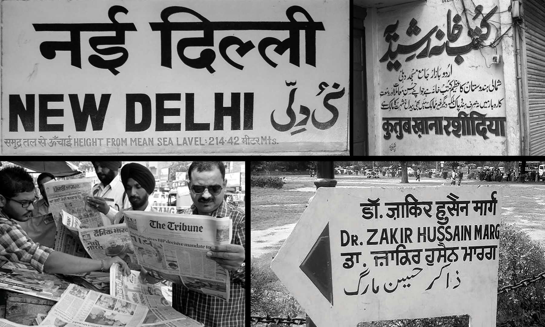
In November 2017, the idea of Qutub first germinated. It started with the goal of making a typeface for New Delhi, to represent the city. Though soon due to certain factors, and being unable to create concrete rules as a brief, making a newsface was the best way to do so in my opinion. I made the typeface to illustrate the basic nature of the city as well as achieve what newspaper typefaces must: be highly readable, effective at small sizes, and space efficient to pack words into the available (usually limited) space.
Delhi is one of the most populated cities in the world and there are certain parallels in the nature of a big city that can be drawn with a newspaper– which is populated with diverse subjects and affairs. The two are extremely messy if you get into the details, but at the end bring together alot of people/ words, subjects/ behaviours under one umbrella.
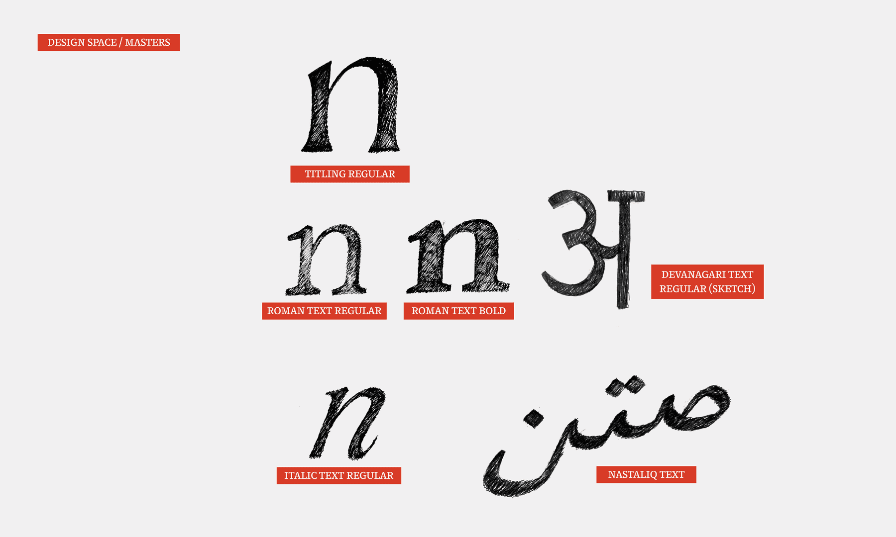
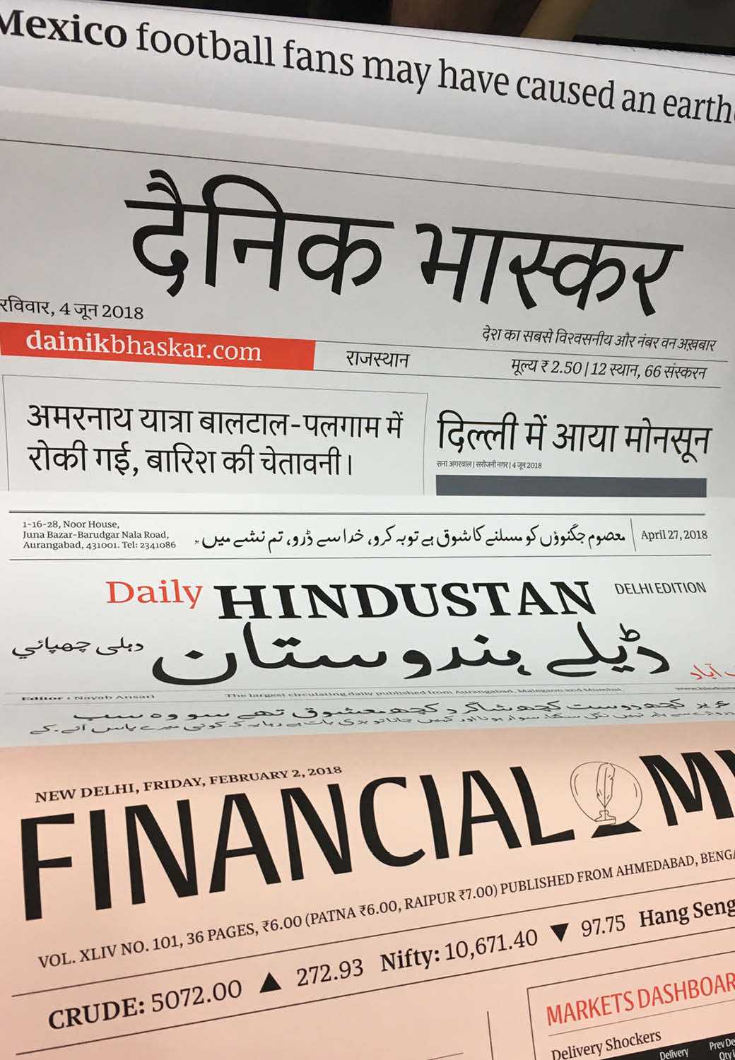
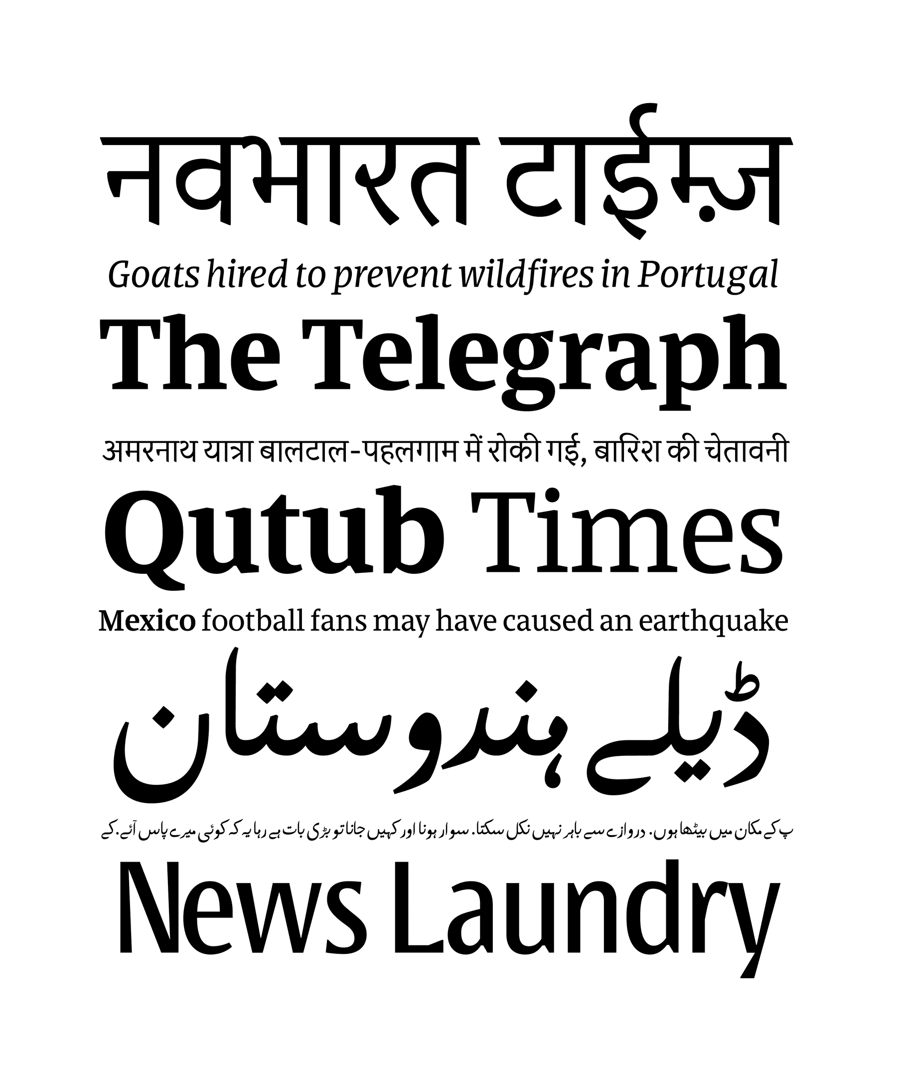
To achieve the cosmopolitan-ness of Delhi in a typeface, it had to be a multiscript project. The three scripts covering most of the population of the city are Latin, Devanagari and Arabic Nastaliq, which is used for Urdu.
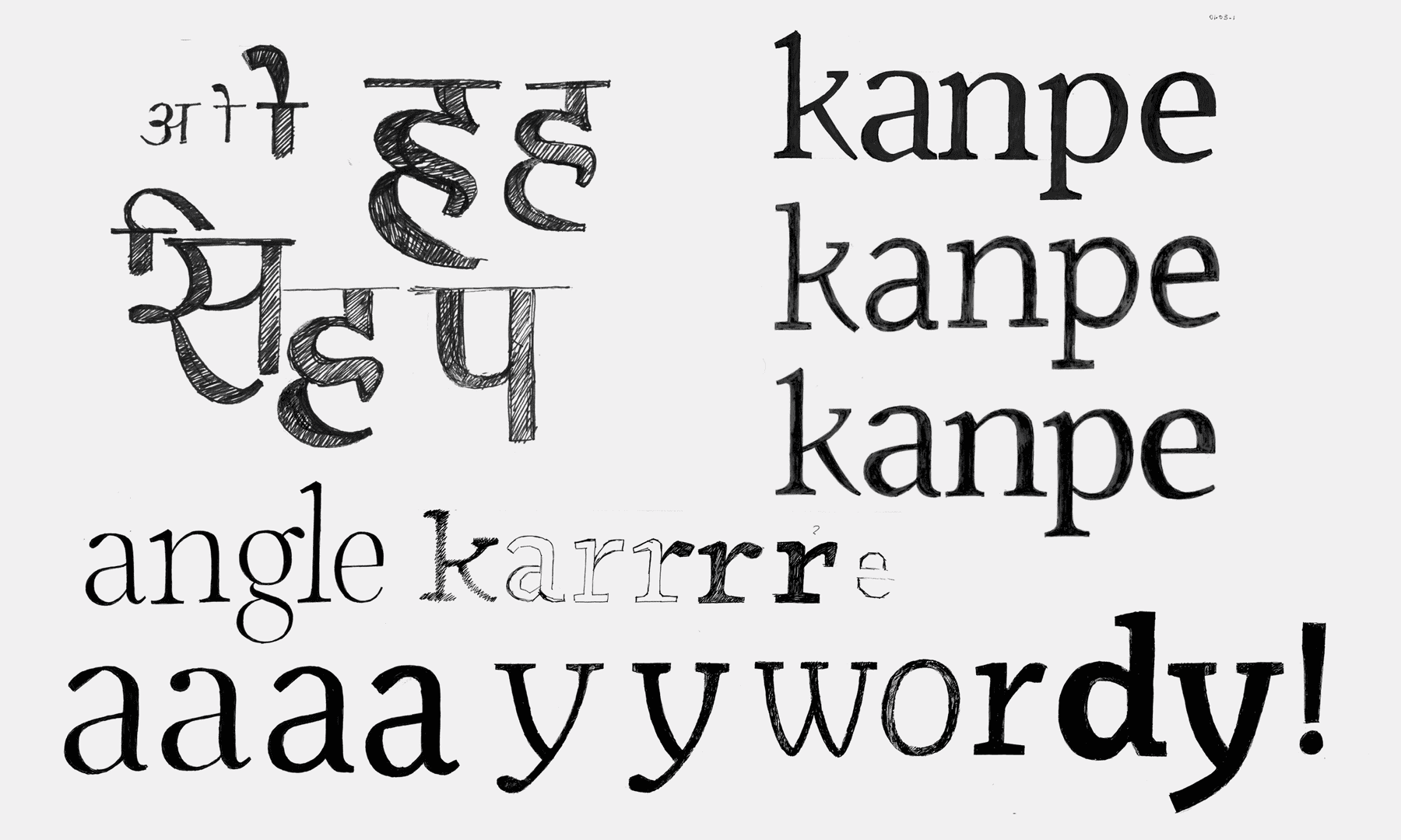
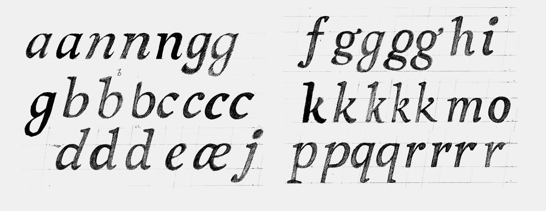
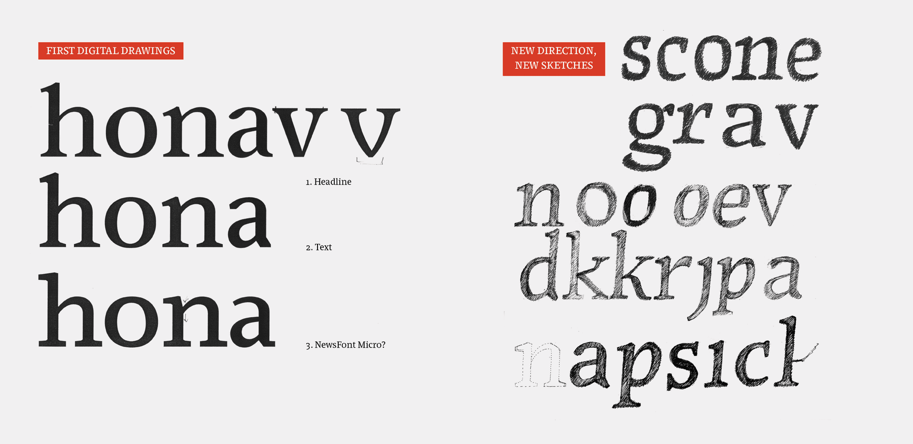
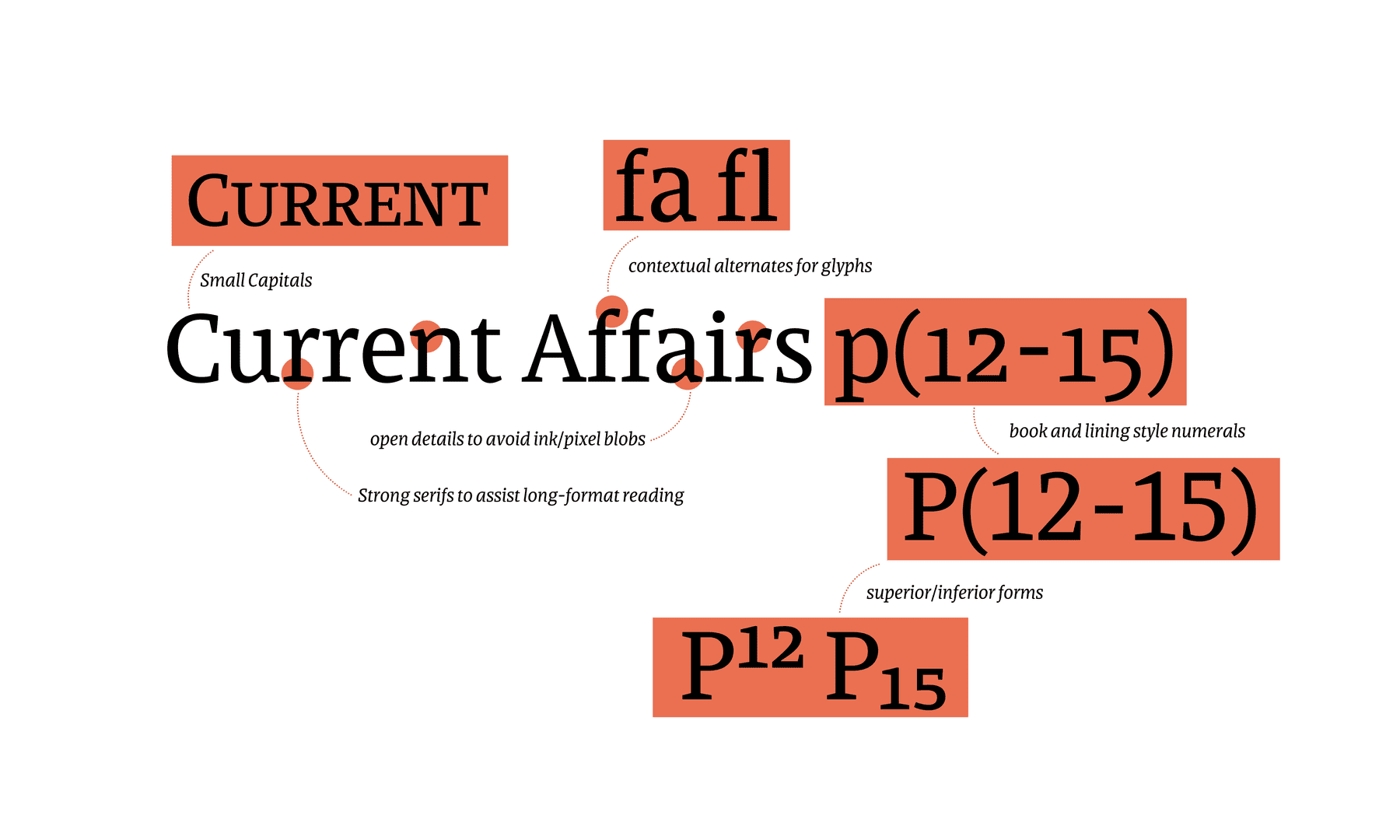
After the first explorations and a quick digital sketch of the initial drawings, it became clearer which details worked best at the intended sizes and which did not matter. For example– shape of the serif was less important than the weight of the serif. This new direction lead to a new set of explorations, which gave a small insight into where it the project was going – but far from what it was eventually going to become by the end of June 2018.
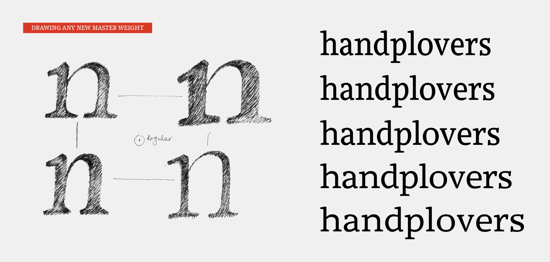
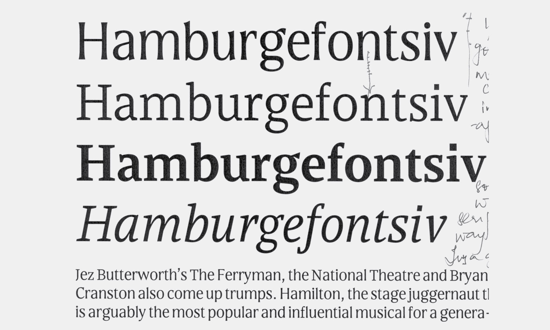
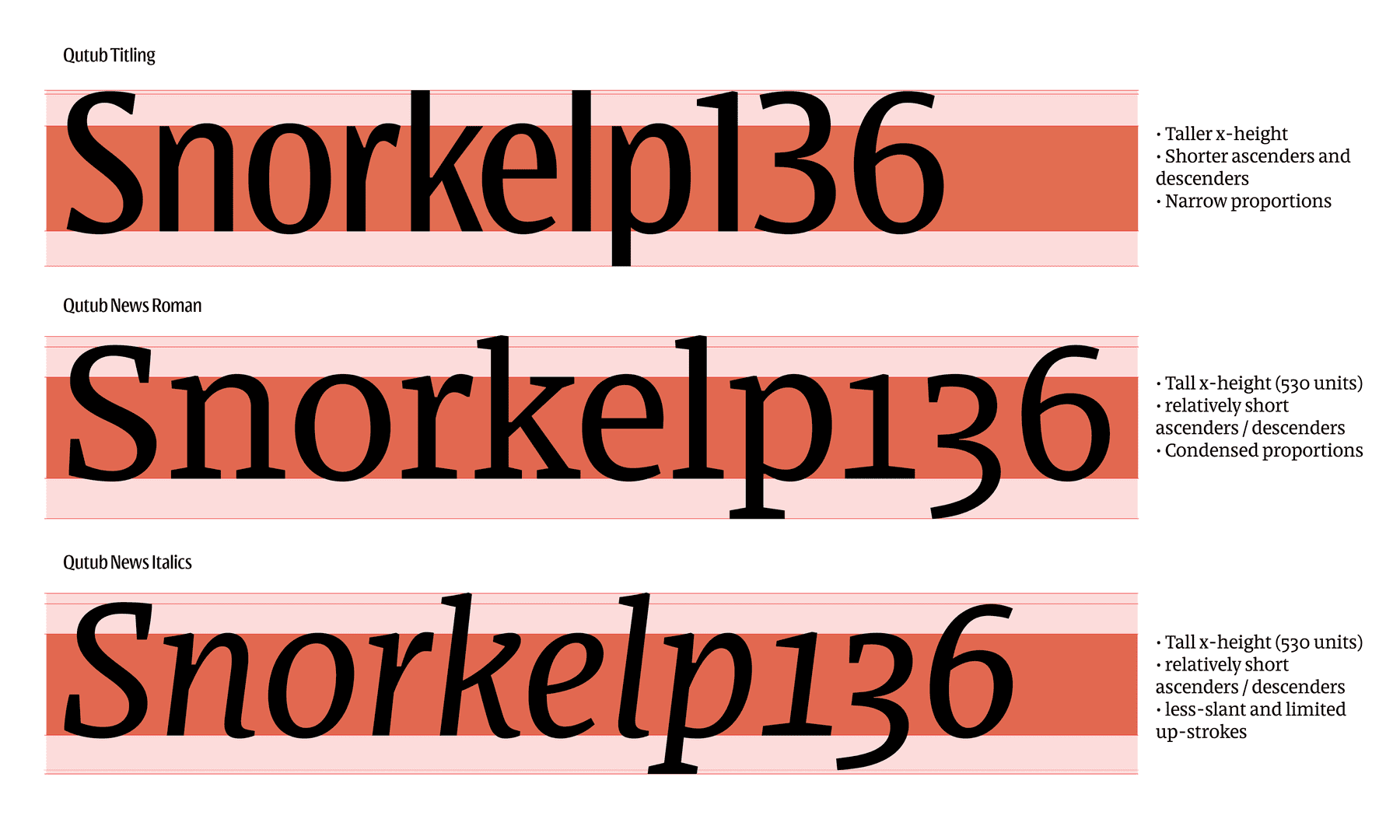
The titling style does the same thing as the text styles, but better. The environment of the ‘titles’ or headings are even more limiting in their vertical space, therefore this style is more compact and condensed.
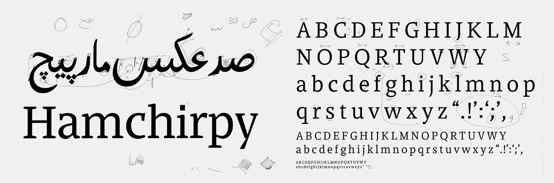
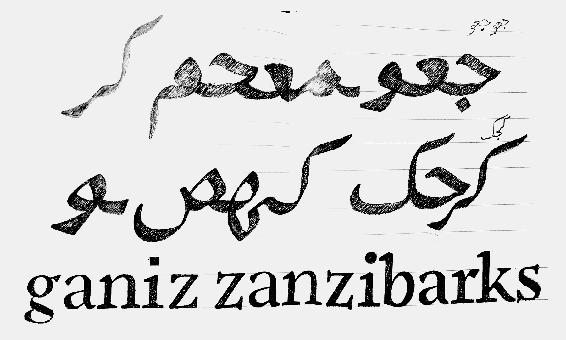
Chalking out the other scripts, only began after achieving a basic level of clarity on the Latin. Since the work on that was the most extensive in terms of filling out charactersets and proofing, it was important to base the other scripts on a stable foundation of features – provided by the Latin in this case. I tried to bring in the ‘flowy-ness’ of the Nastaliq into the Qutub Arabic – which still sits on a horizontal line. Due to time (and coding capability) constraints, at this point I was unable to develop it in the cascading– Nastaliq fashion, which involves vertical conjuncts and a bit of coding knowledge. I came this far with tremendous patience from Bahman Eslami, who gave me constant feedback and corrections. That being said, I will definitely want to pick this up again in the future, and work along side someone with the available knowledge, and bring this to completion.
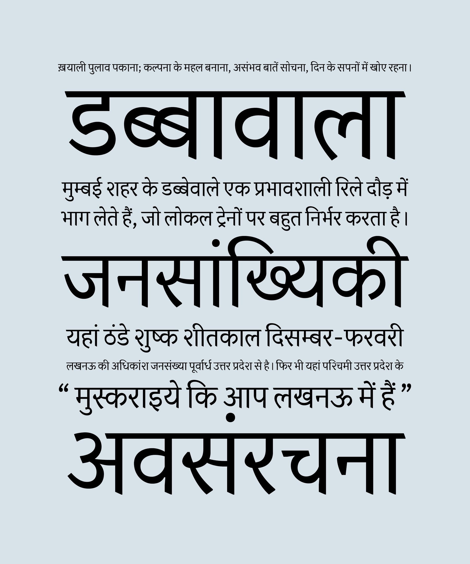
It was similar with Devanagari. Although, it was just me– drawing the possibilities and unifying features across these three, very distinct scripts. Qutub Deva is much in it’s infancy and this was a proposal/draft.
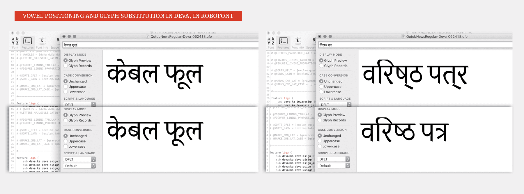
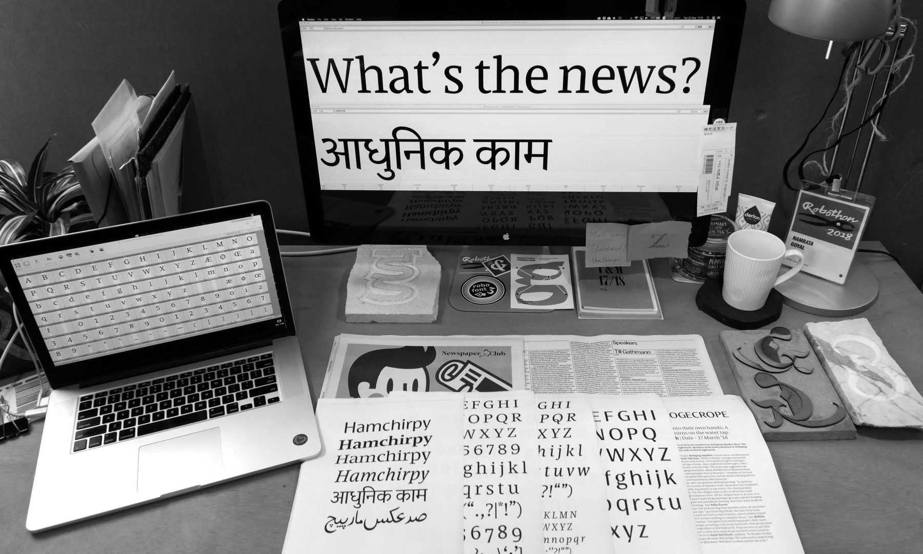
Drawing and producing Devanagari with a new software (which I hadn’t used for the purpose of making Devanagari fonts before) was a huge learning experience for me, and I will definitely continue doing the same.