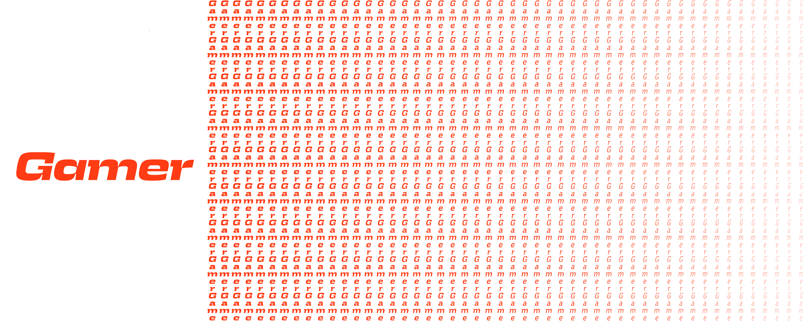
Gamer
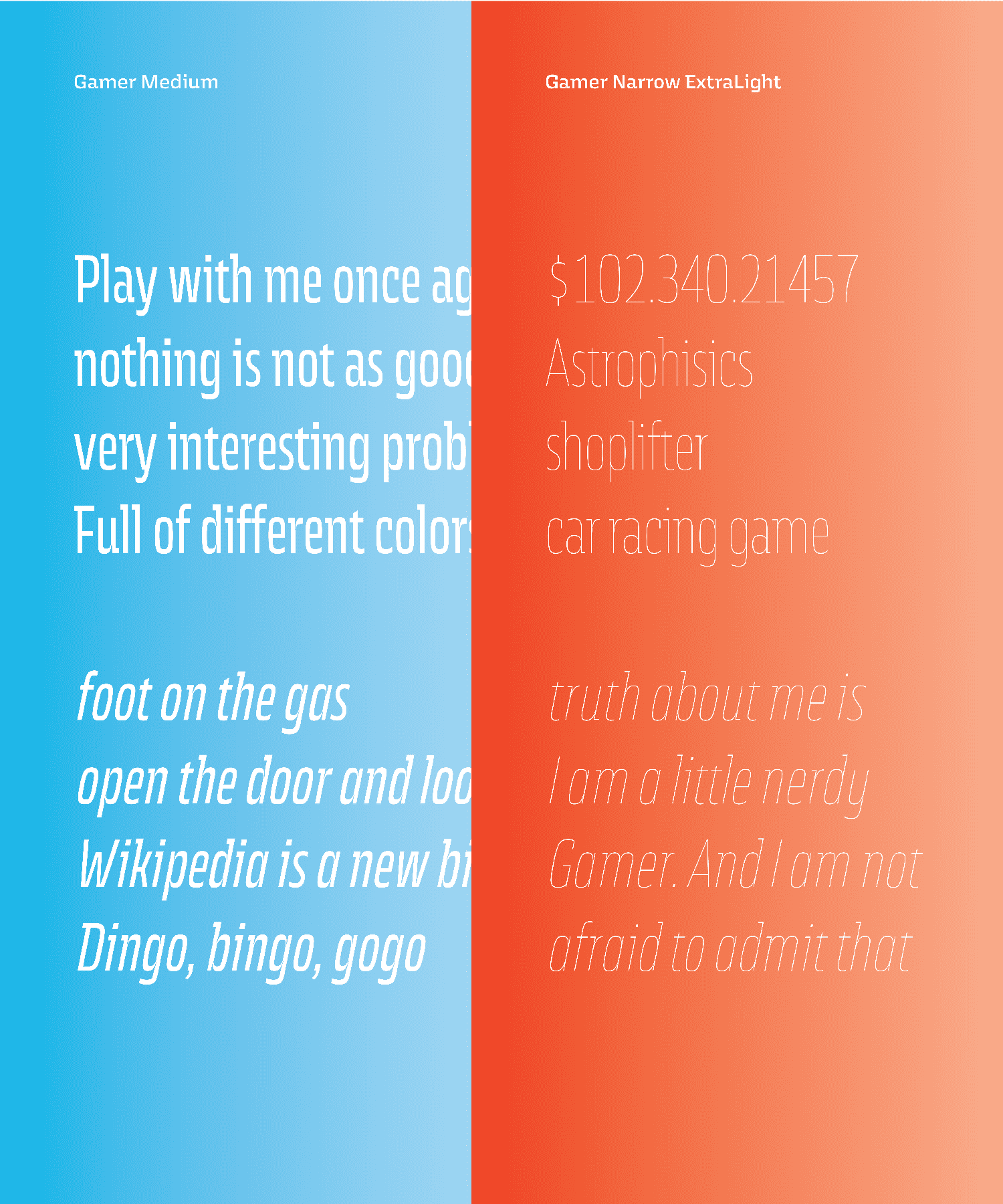
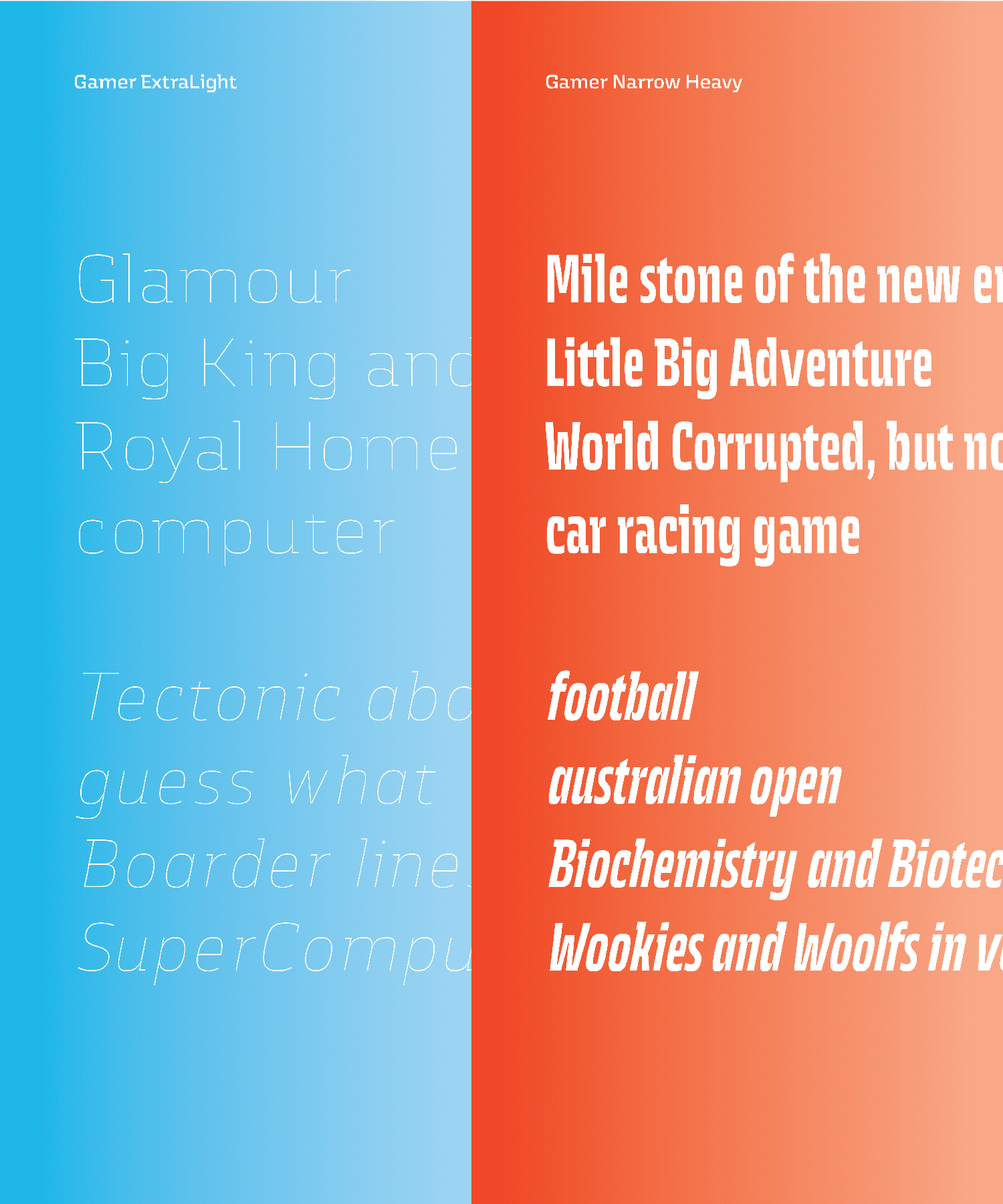
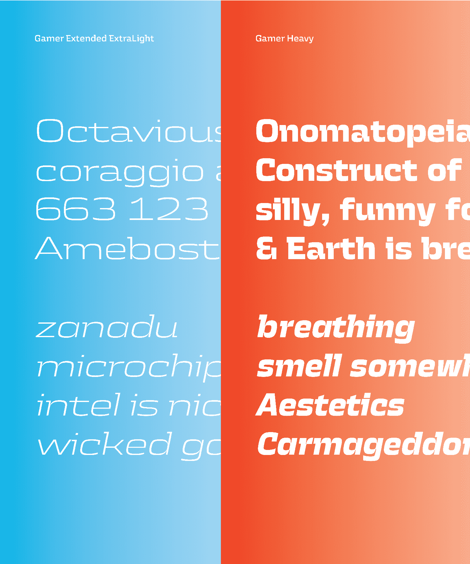
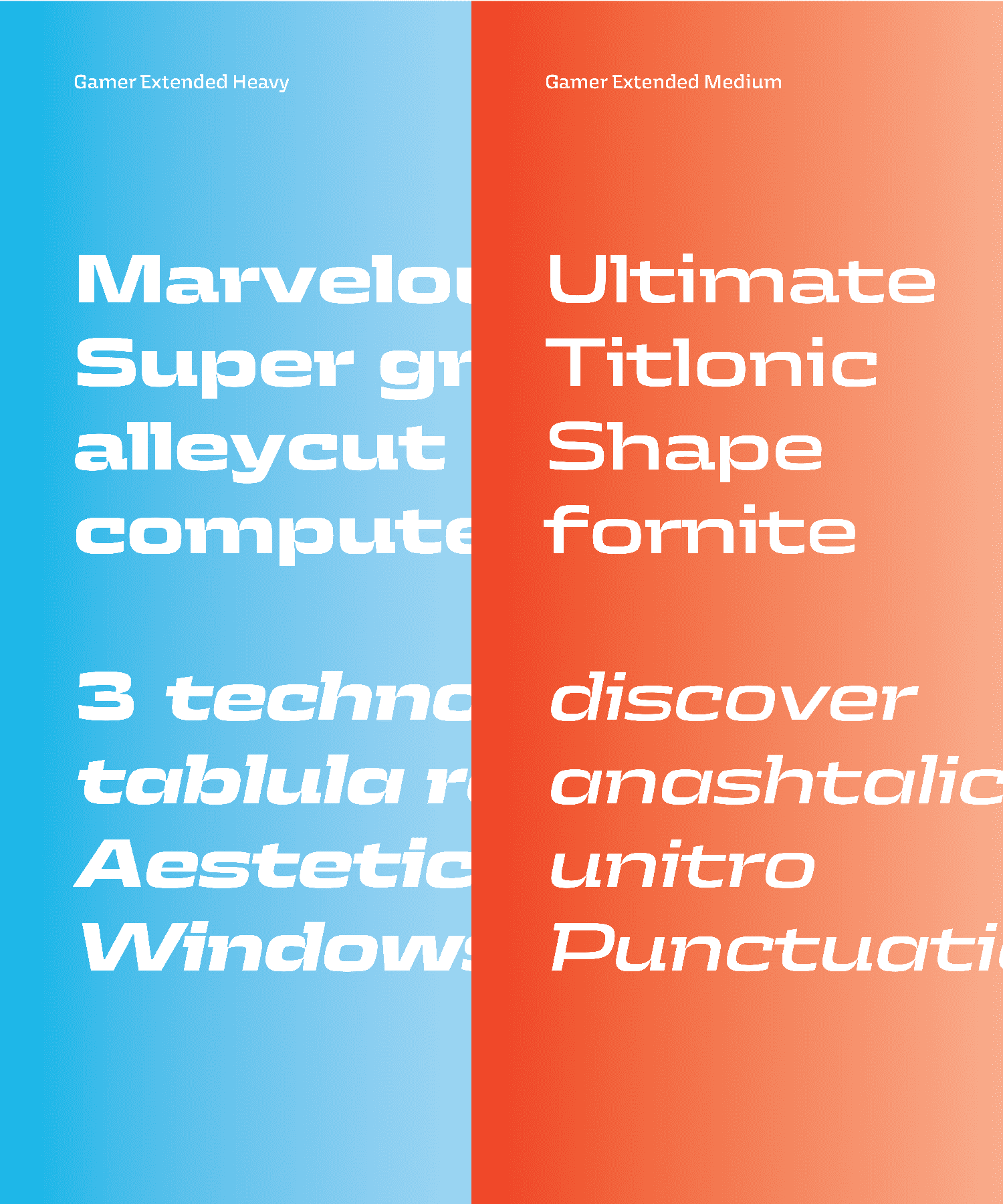
Gamer is a typeface which originates from nostalgia for the games, films, and technology I grew up with. The main aim of the project is to make letterforms that work well both on low and high-resolution screens. To accomplish this, the core shapes of the typeface are drawn on top of pixelated letters. The wider-than-usual proportions are informed by the logos of technology companies. The squarish letterforms are inspired by fonts that commonly appear in sci-fi movies.
Rafał Buchner
PolandBorn in Warsaw, Poland, where he lives and works as a freelance type designer and coder. Graduated from Type and Media Master course at Academy of Arts in the Hague (KABK). Before that, he studied at Academy of Fine Arts in Warsaw, which he finished with Master Degree in Graphic Design. He is a type nerd, teacher and dog owner.¶ Rafał’s design practice is focused on exploring the influence of tools in the final product. Because of that he practices simultaneously both, drawing and coding skills which for him are equally important.
Process Notes
When I started to think about the final project, I was looking for the application, that could be an exciting environment for my typeface. In the beginning, I was thinking of creating the family that initially would be designed for some made up vintage game’s interface. That would involve me in dealing with the rough conditions of old-school screens like low resolution.
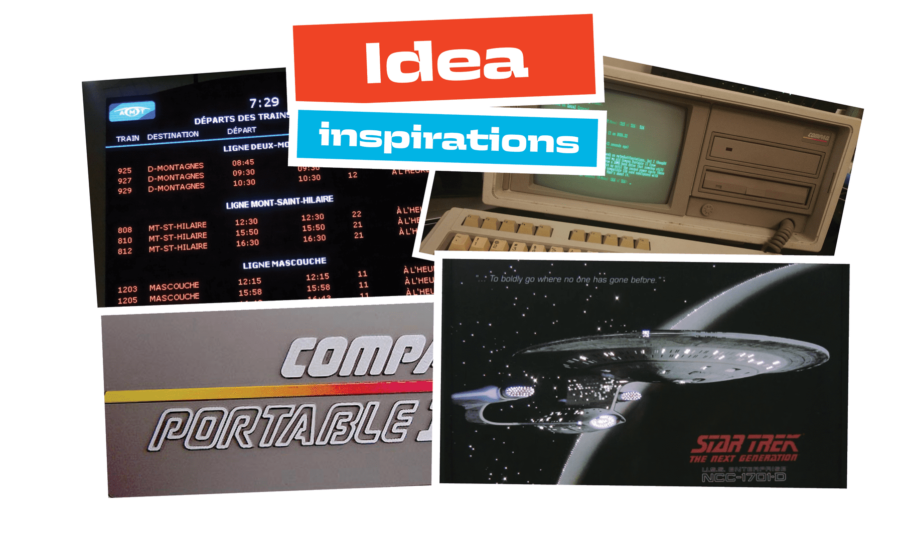
I partially abandoned this idea: vintage games started to be only one of my main inspirations, along with sci-fi movies, oldchool computers and old tech company brand identities.¶¶I’ve chosen to focus on the problem of really low resolution screen. In my opinion this is current problem. Since LED screens are everywhere in public.
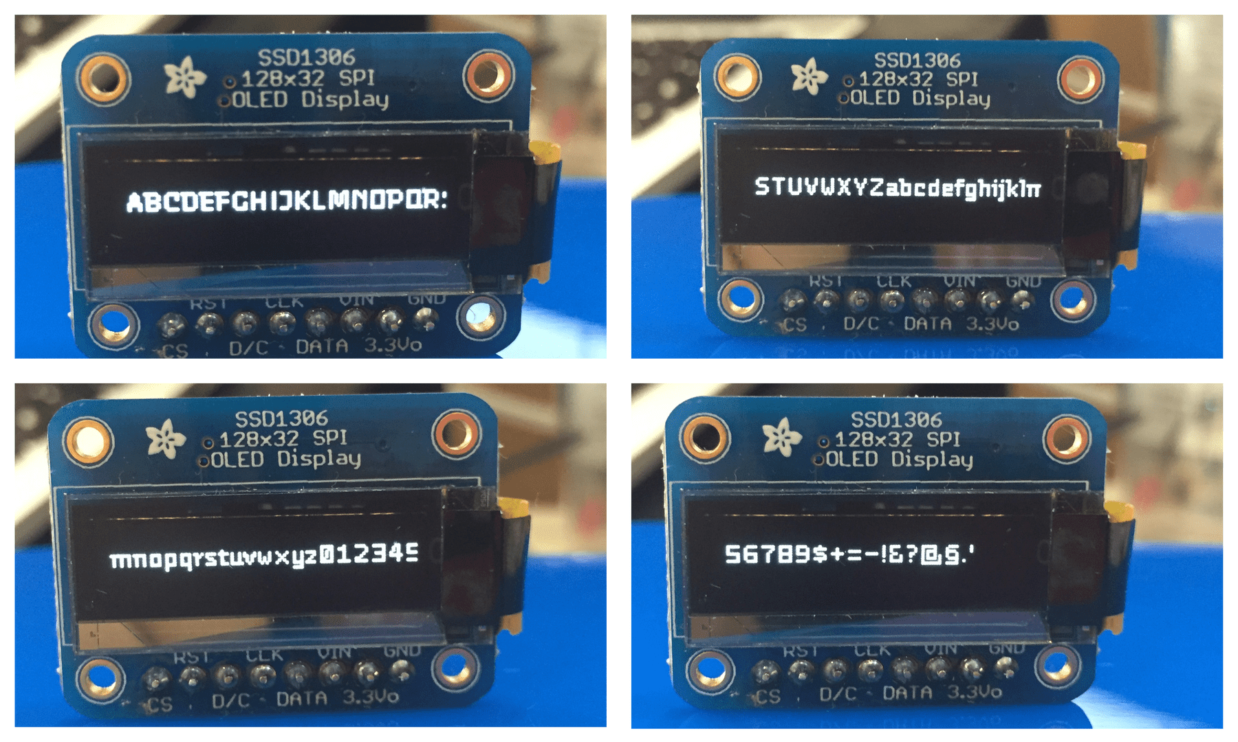
I decided to create the typeface that would be easily translated into pixelfont without any additional hinting rules. In order to do that I had to design my typeface on top the pixelgrid. I used specially designed oled screen, that showed me the final results of my work (my oled screen is on the picture above). ¶¶ At some point I decided to treat this “pixelfont” as a starting point for regular type family that could work in different applications (for example print). The typeface in order to fit into the pixel grid had really strange widths and spacing.
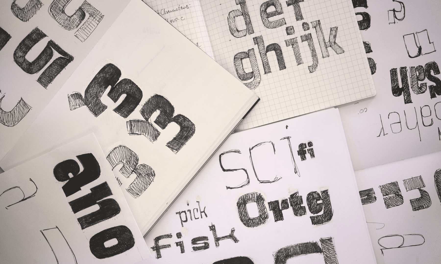
In my process, quick sketches were essential. Before I started to work on Gamer, I haven’t drawn “nice”, well-defined set of letters. I treat drawing as a research, so I was testing quickly different ways of creating interesting shapes, that potentially could work well on the pixel grid. Because of that, I feel up the whole pile of the sketchbooks with quick examples, of how the letters could look like.
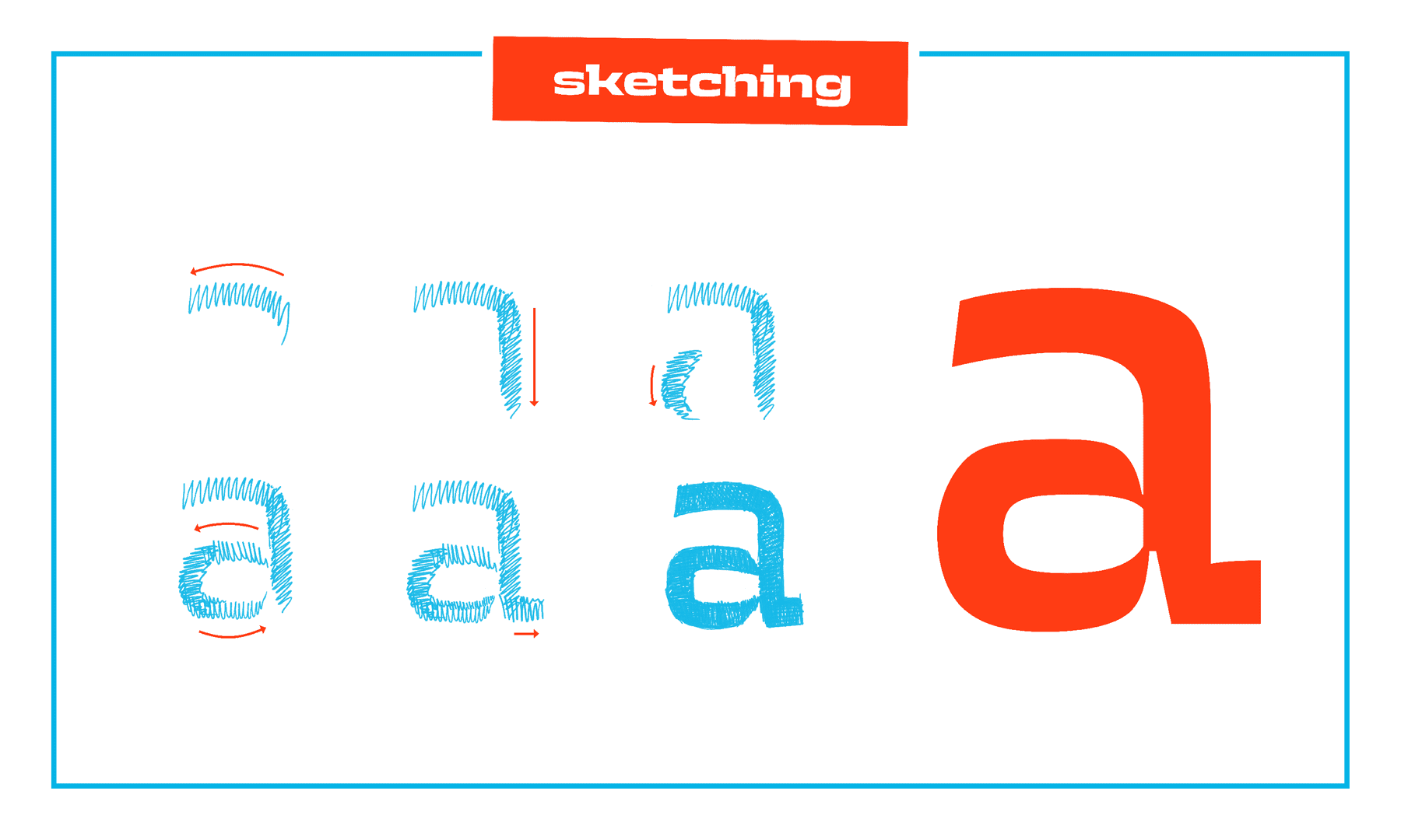
At some point, I found the method of drawing, that established the final style of my typeface. Most of the Gamer’s strokes that I drew were slightly curved. I tried to avoid circular shapes. Every transition from horizontal to vertical stroke was depicted as a separate step. That created super-elliptic shapes with an interrupted construction.
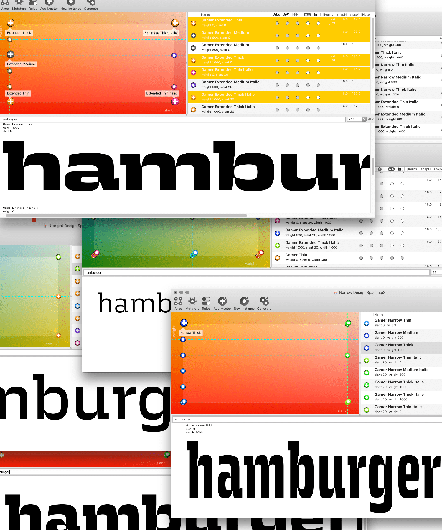
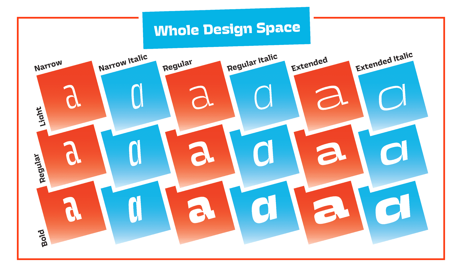
I wanted to challenge myself with the huge design space. From the persepctive I’m still not sure if it was a good idea. I know that by making this decision I’ve learned a lot.
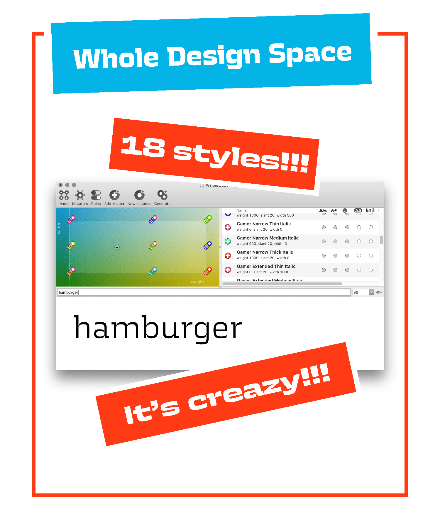
I ended up with 18 different master files. I learned how to design, proof and walk through different places in three dimentional design space with width, weight and slant axis. This was a lot of work. After a year, I’m still recovering from looking at those letterforms.