Model
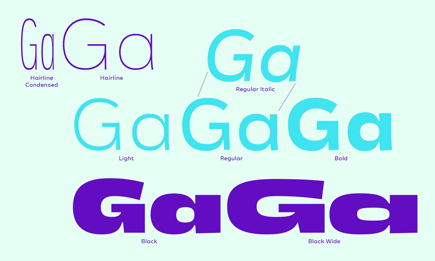
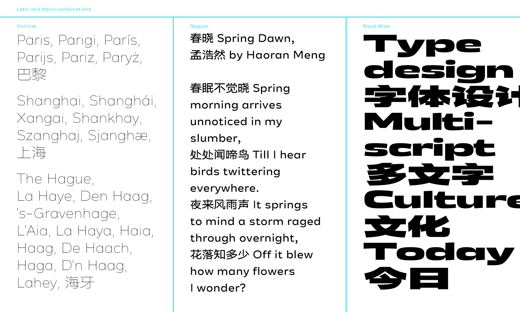
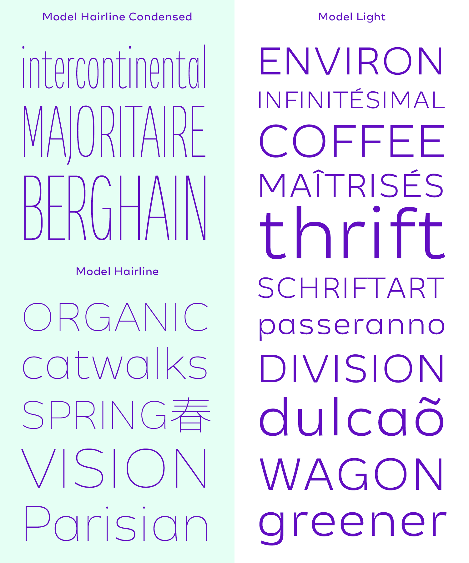
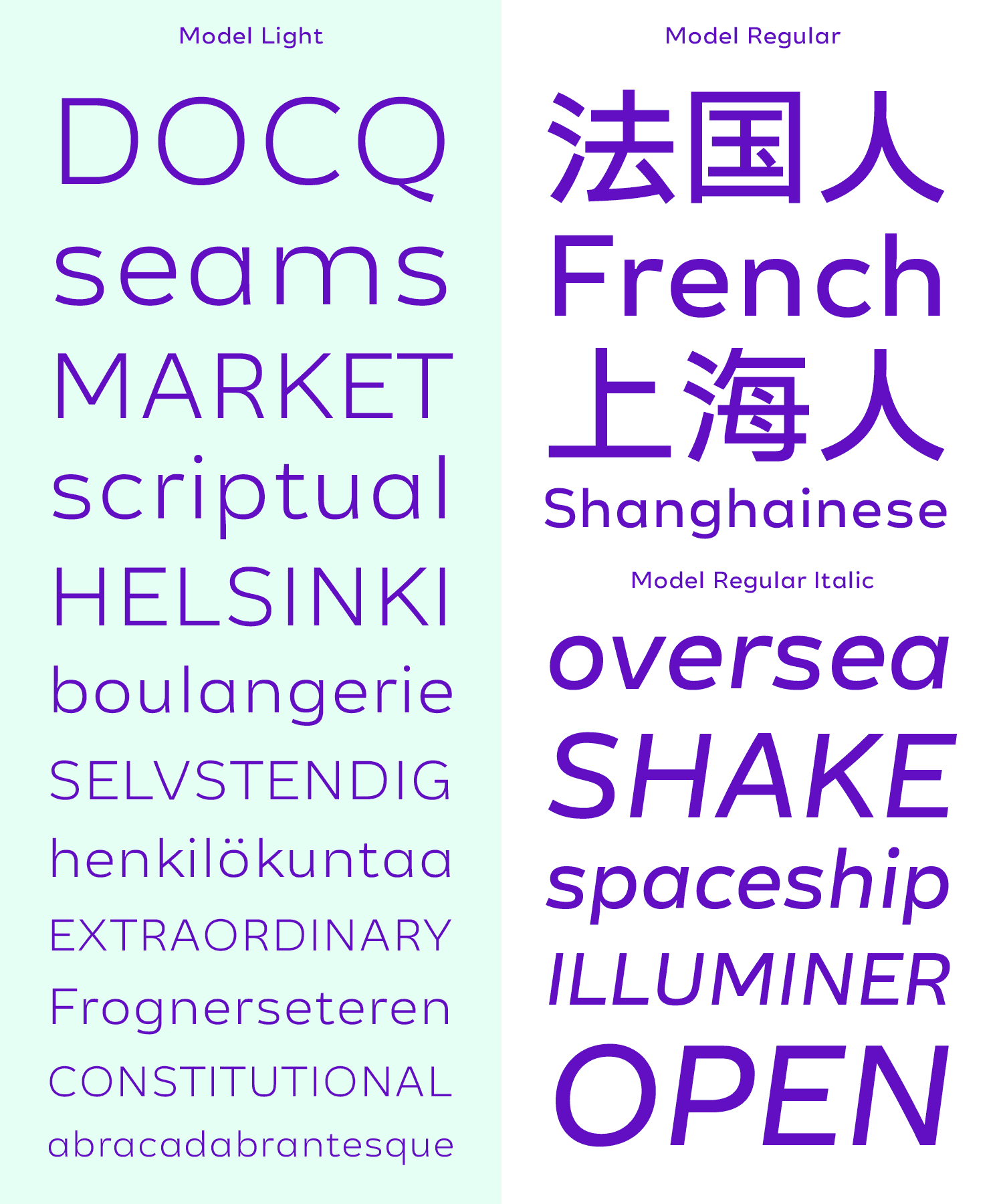
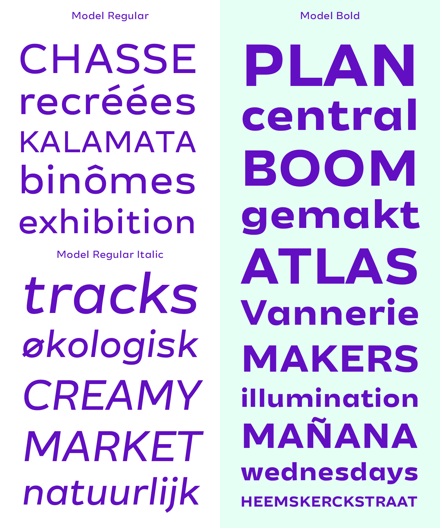
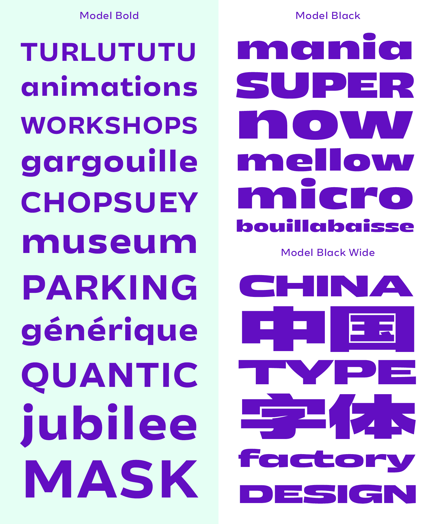
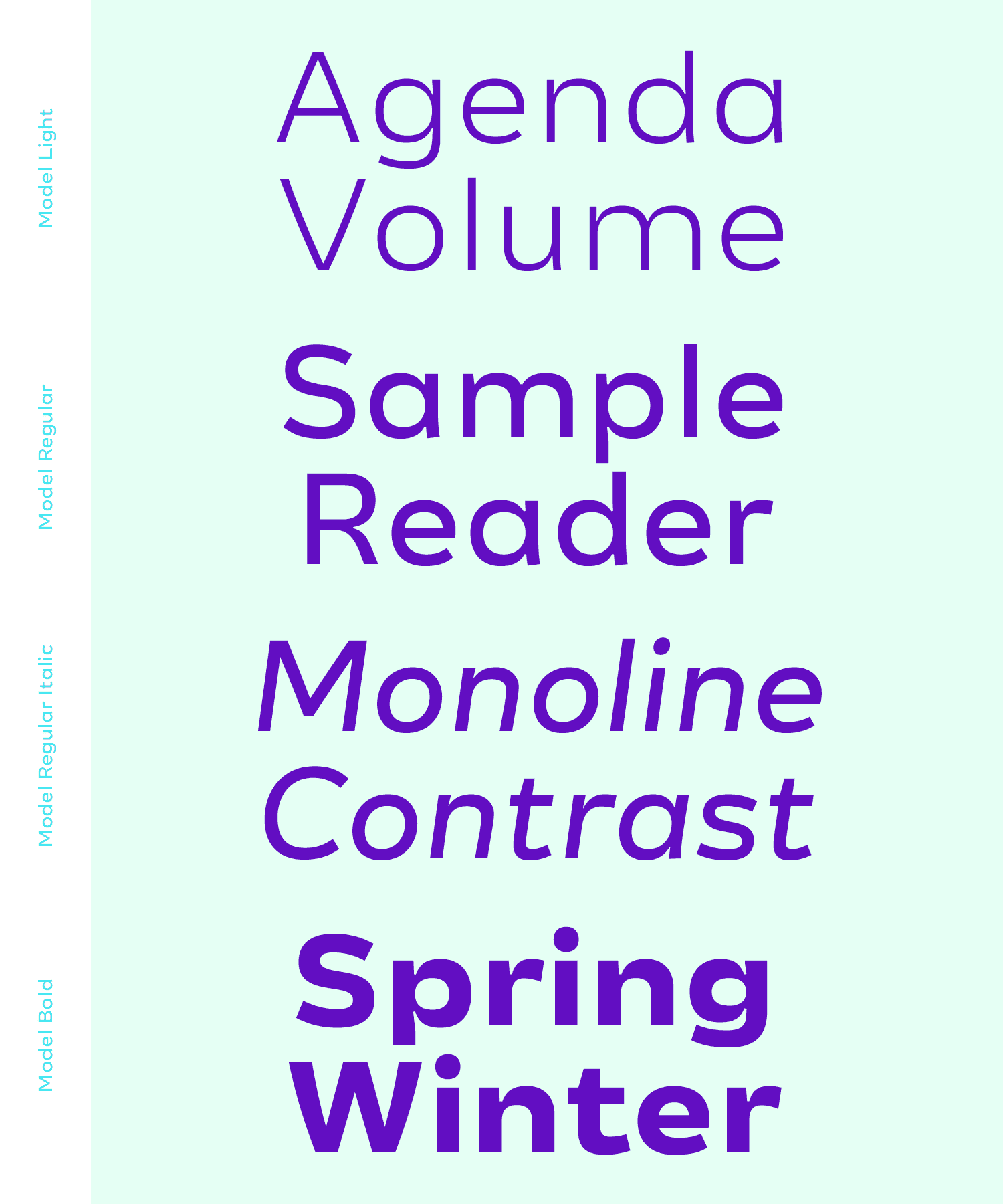
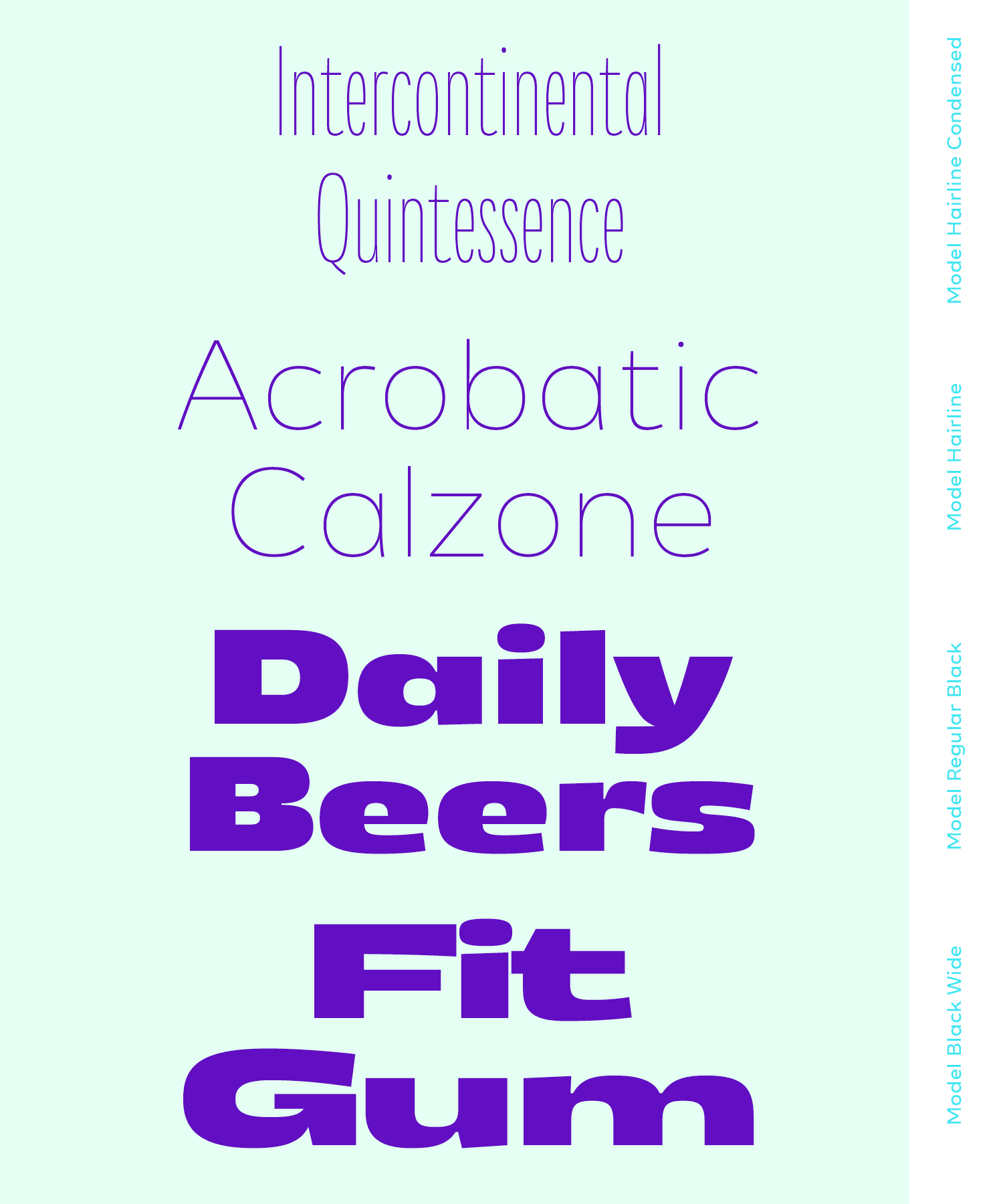
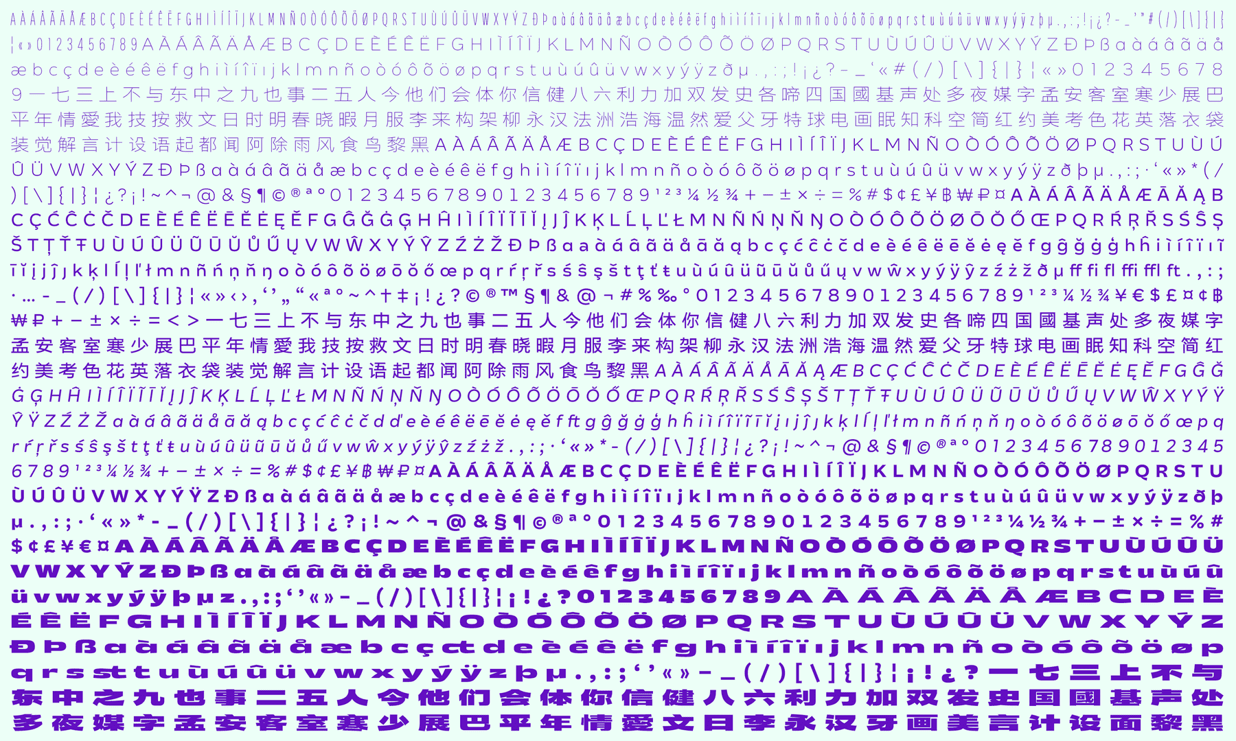
Model is a sans serif family with its core part in the text weights for small size reading, and extensions towards the extremes for display sizes. It is the result of researches, explorations and studies in the smallest details, and their influence in reading experience. I paid my attention in the balance between conventional structures of sans serif typefaces, optical corrections for legibility, and details from hand drawn shapes to give it personality. ¶ The display cousins are explorations in four opposite extremes while keeping as much as possible the same DNA as the text family. ¶ With Hairline, Regular and Black Wide, there is also the basis of an interpretation into Chinese Hanzi, another part of my study in multiscript type design between Latin and Chinese scripts.
Lisa Huang
FranceChinese by origin, born and grew up in France, Lisa studied mostly in Paris in graphic design before going further in type and typography with Type@Cooper Condensed program in 2015 in New York City and a couple of years in design companies such as BETC Design and type foundry Black[Foundry] both in Paris. Then, as her latest study experience in type design, she got graduated from Type and Media in 2018 at the KABK in The Hague. ¶ Lisa’s interest in type and graphic design relies strongly in multi-cultural projects and works, especially mixing Latin / French and Chinese cultures. ¶ She recently founded a graphic and type design studio with her partner in life and crime Thomas Kim called Polyform Studio based in Paris (for now!).
Process Notes
My main intention from the beginning of the program was to learn and explore as much as possible, so I thought that too much constraints of a too precise brief wasn’t a good idea. The only direction I started right away with was to design a sans serif typeface, as it is the style I have less experience with and there are plenty of optical details to care about, along with the challenge to draw something different compared to what exist already. The balance between a legible and easy to read typeface, a typeface with personality, plus on a large span of styles, is the perfect challenge to take on this course!
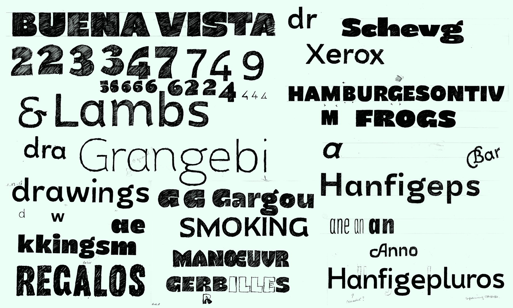
Planning the design space is not only one of the most important cornerstone of the graduation project, but also a good way to plan the overall thing with the constraints of capabilities and time in mind… As you can see, I was being too naive at the beginning because I wanted to do it all from two very extremes styles and very much in between… Reality made me choose the ones most important and relevant to work on, breaking down the design space into a much more feasible and realistic project.
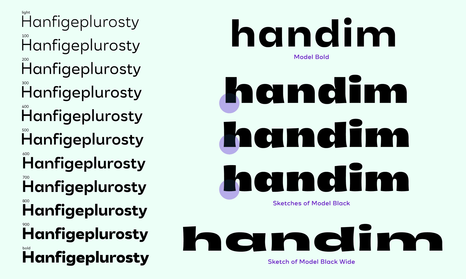
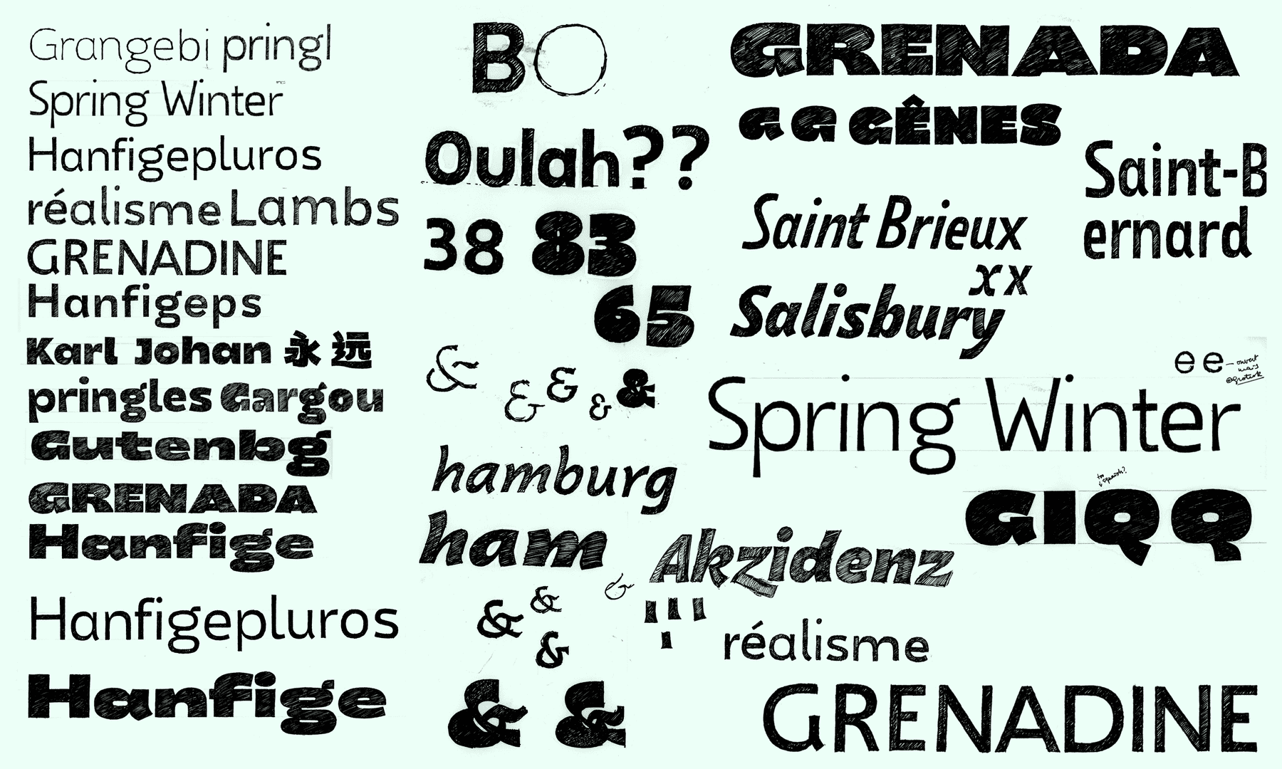
Once the proportions are (more or less) fixed, interpolations from two different weights allowed to find out the ‘right’ weight for a Regular. As one of the most used weight in a text family, Regular needed to have its own proper master and shouldn’t be an interpolation result. Then, there were explorations for proportions and details for Black and Black Wide, some appeared less relevant than others…
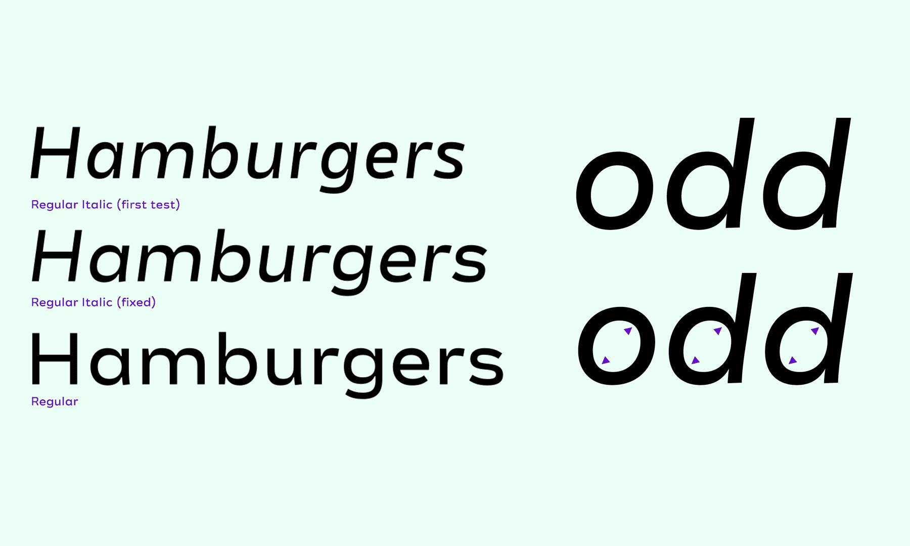
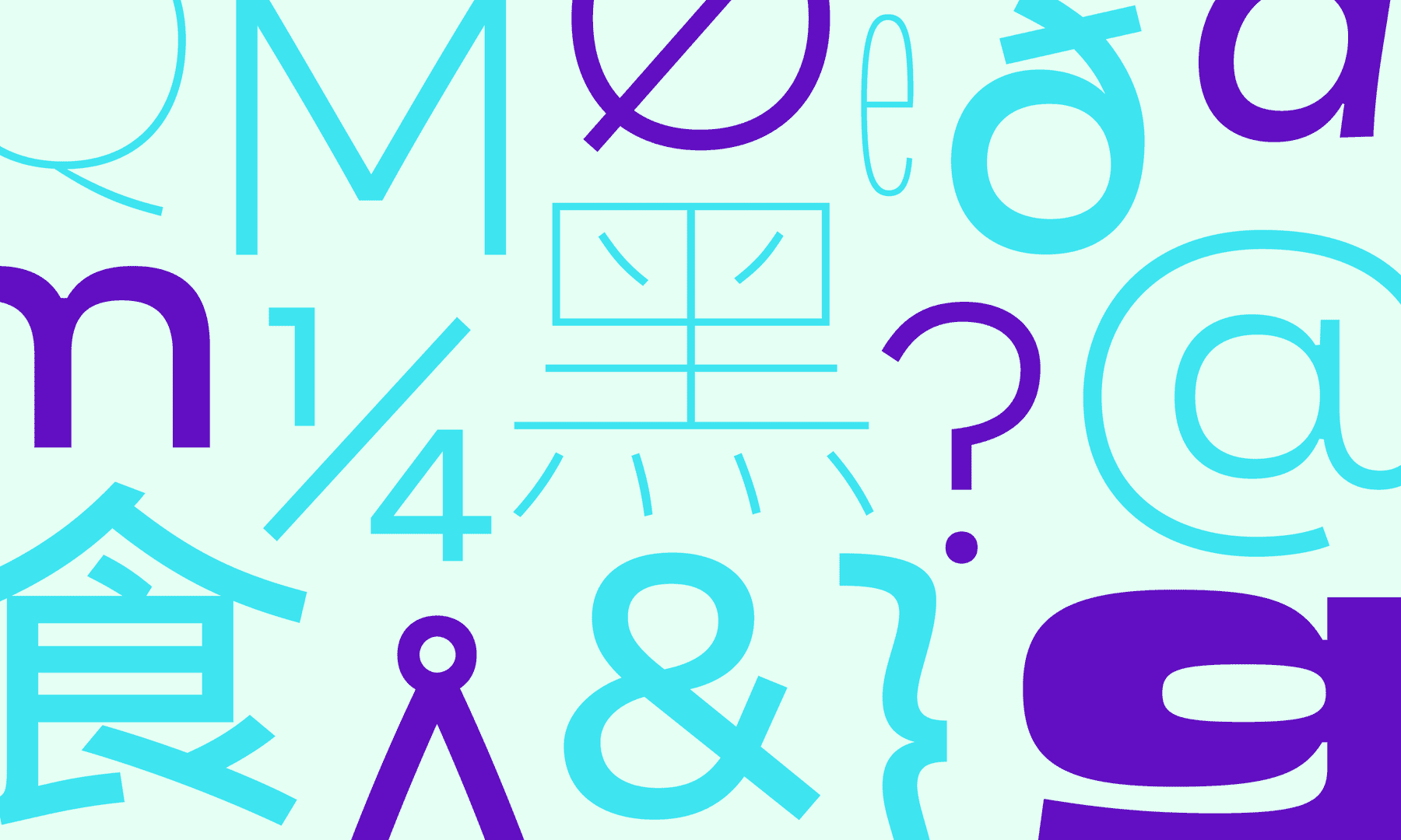
Explorations for Regular Italic with different angles and widths, combined with Regular. I started to redraw the letters so they would not look like simply slanted letters from the roman version. But slanted roman letters can be also a good basis. I also found out a bizarrerie with rounded letters and tilt angle of the viewer’s sight — tilt your head to the right and they would seem more squarish, can you see it? I tried to remove this as much as possible, until I found out that this is something I can’t fight against. When do you tilt your head to read a text anyway?
With so many weights and widths, there were several rounds of corrections to find out the balance that would influence the same location in a letter but in every other weights and widths in a consistent way. Some weights, especially the Black Wide, had the most exceptions, to keep the shape of the letter over the search for originality.
The italic version of Regular was an adventure apart in itself. Here are the main characteristics (besides the odd thing showed above).
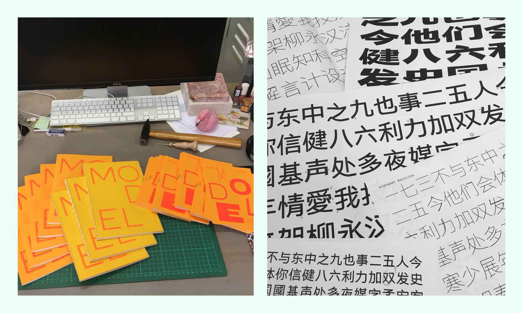
Height with central space, color and darkness, stroke endings… All these combined with the fact that Chinese characters are by nature a from a different script. So matching them both together was like trying to eat a croissant with chopsticks! I started to sketch some Chinese characters only on the very last few weeks to keep the main attention on Latin. They are all still in a very much in-progress stage, but it was definitely lots of fun to work on this part, and I intend to keep going on!